Summary
Redesigning a legacy app’s UI? Don’t trip over cure worse-than-the-disease mistakes like stripping features, ignoring user habits, skipping mobile testing, or ditching UI familiarity. This article spotlights pitfalls encountered during a UI overhaul and shares how to navigate them for a smooth, user-centered redesign.
In one of our frontend modernization projects, we encountered a sobering reality: improperly relocated critical features could vanish from users’ workflows entirely. Why? Because users, conditioned by years of muscle memory, rarely thought to look elsewhere.
This scenario reflects a common UI/UX wisdom: redesigns aren’t just visual, they’re psychological. Users invest in existing workflows, and familiarity often trumps efficiency. When you disrupt learned behaviors, without clear signposting, even elegant upgrades can fail. In this article, we’ll dissect why modern UI migrations stumble, how to balance innovation with intuition, and what strategies help preserve functionality while modernizing workflows into fast, intuitive platforms.
When Does a Company Need a UI/UX Redesign?
App redesigns shouldn’t be driven solely by aesthetics or chasing trends. They become imperative when the cost of the current design starts actively hindering users and the business. For example:
- Inefficiency and Rising Labor Costs. When routine tasks require excessive clicks, navigation, or cognitive load, productivity suffers. It increases operational costs and potentially requires more staff to handle the same workload;
- Ballooning Training and Onboarding Time. If employees struggle to learn the system, the design is failing. Poor intuitiveness translates directly into higher training costs, longer ramp-up times, and delayed productivity gains;
- Unsustainable Support Burden. A surge in helpdesk tickets, user confusion, and repeated questions about basic functionality is a glaring red flag. High support costs drain IT resources and indicate the interface is not self-explanatory;
- User Frustration and Resistance. Increased complaints, workarounds (like using old, unsupported methods), or outright avoidance of certain app functions signal deep dissatisfaction in app design;
- Inability to Scale or Integrate. An outdated, rigid UI framework can make adding new functionality or adapting to new workflows prohibitively difficult or expensive, stifling business agility.
A strategic UI/UX redesign addresses these pain points head-on, transforming the application from a liability back into a productive asset. However, there are redesign traps you need to avoid during the migration.
Read Also The Game-Changing Role of App Modernization in the Finance Industry
Common Traps During Legacy App Modernization
Moving from recognizing the need for a redesign to actually executing it reveals the core tension: balancing innovation with ingrained user behavior. The “Legacy Trap” here, is a situation where the comfort of the known design clashes with the potential of the new one.
Trap 1: Users Ignore New Features They Actually Need
If users can’t find core features post-redesign, your system becomes unusable, risking productivity, compliance, and trust. Familiar interfaces represent predictability, efficiency, and reduced cognitive load. Years of use forge powerful mental shortcuts, and users know exactly where to click without conscious thought. Migrations that disrupt this create anxiety and slow them down (“Where did that go?!”). Reverting to old design patterns, even in a shiny new UI, is often a quest for psychological safety and regained efficiency.
Read Also Using Human-Centered Design to Create Better Products (ex. Migraine Tracking App)
Trap 2: Redesigns Can Accidentally Make an App Feel Foreign
Legacy UIs often shape how users understand a system, not just how they use it. Maybe they always access “Reports” next to “Dashboards,” or expect certain actions to live in a side panel. When a redesign reshuffles or hides these elements (e.g., behind icons or global menus), the user’s internal map breaks. Without a clear new structure to anchor them, they feel lost, and productivity drops.
Trap 3: Great Functionality Gets Buried Under Good Intentions
When features are relocated, renamed, grouped differently, or accessed via new interactions (like gestures or hover states) this happens:
- “Out of Sight, Out of Mind”. Users conditioned to find a feature in Panel A won’t instinctively look in Menu B after its migration. If it’s not where the old mental map says it should be, it might as well not exist;
- No Trigger to Search. If the user’s task flow didn’t naturally lead them past the new location, and no clear visual clue signposted the change, they had no reason to explore. The thought to look for the feature in its new home simply doesn’t arise;
- Perceived Removal. If users can’t readily find a feature after its migration, they often conclude it was removed entirely. The outcome is abandonment, regardless of the feature’s actual presence.
Read Also From Old to Gold: Transforming Legacy Systems with Modernization Techniques (with Real Examples)
How We Refined Our UI Redesign Strategy for Better Results
During our healthcare CRM redesign, we prioritized minimalism but later identified a critical clinician pattern: diagnosis history access was essential, not optional. Early wireframes replaced the legacy toggle with an unclear button, assuming archive viewing was infrequent. This prompted an immediate redesign before launch.
A Feature “Hidden” Right in Front of the Users’ Eyes
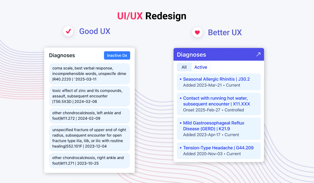
The legacy interface featured a dedicated panel for patient diagnoses with clear filtering:
- Active Diagnoses displayed by default (priority view for clinicians);
- Historical Diagnoses accessible via a prominent “Inactive Dx” toggle.
During the UI redesign, we minimized the toggle into a subtle button in the top-right corner of the app and assumed mnemonic recognition could replace explicit affordances. If the change had gone unnoticed, potential post-launch problems for real users would include:
- Missed Connections. Doctors overlooking resolved comorbidities, compromising treatment plans;
- Workflow Paralysis. Nurses manually cross-referencing paper records to fill gaps;
- Support Overload. Help desks flooded with queries like “Where’s the diagnosis history?” or “Why can’t I see prior conditions?”
Restoring Critical Visibility Through Rapid Iteration
Our iterative approach brought the diagnosis module into development early and avoided burying it in a monolithic release. Here’s how our migration team restored critical UI element visibility:
- Code Review Revelation. During backlog refinement, the developer assigned to refactoring applied deep scrutiny baked into our iterative process. While dealing with the diagnosis module, he noticed the buttons’ obscure implementation and questioned its discoverability. It surfaced the toggle’s obscurity before it reached clinical users;
- Urgent Redesign. We replaced the old button with a two-state toggle button labeled “All” and “Active” with clear visual differentiation (color + text) between states.
Lessons Learned: Redesigning Without Breaking Trust
Our encounter with the “Legacy Trap” highlights the gritty realities of established applications’ migration to a new UI. Here are the critical, battle-tested lessons we now embed into every app modernization and UI redesign project:
- Respect User Tolerance for Complexity (Especially Experts). Experienced users aren’t afraid of complexity, they don’t like disruption. Power users often value dense, efficient workflows honed over years. While design simplification is often a goal, never dumb down functionality crucial for complex tasks. Prioritize making intricate workflows manageable over hiding them. This migration rule helps us build interfaces tailored to real-world workflows, reducing training and support overhead;
- Functionality is the Foundation, Not an Afterthought. A beautiful interface that fails core tasks is a design failure. Redesign must prioritize robust functionality, seamless data handling, and deep integration with the user’s existing ecosystem. Visual polish should enhance these, never obscure or compromise them;
- Balance is Everything: Improve, But Keep Things Familiar. Users expect design improvement, not reinvention. Radically altering familiar structures guarantees friction. The key is incremental change. Identify core, trusted interaction patterns (“Functional Anchors”) and preserve them during migration where possible. Layer modern improvements around these anchors. Minimize the learning curve by changing only what truly needs changing, and provide clear mapping from old to new;
- Dig Deeper Than UI: Understand Code & Configurability Dependencies. App redesign isn’t just skin-deep. Don’t underestimate how tightly coupled UI elements could be to complex backend logic and role-specific configurations. A superficial UI migration can break critical workflows if underlying dependencies aren’t mapped. Therefore, it’s vital to audit the app codebase and configurability early to understand why the old UI was structured that way. Also, it helps us build scalable architectures and deliver modular, API-driven backends;
- Map the Entire Ecosystem. No app is an island. Outdated enterprise apps live within intricate webs of integrations (other software, databases, APIs), infrastructure, and established user workflows involving multiple tools. Changing a button during migration can break an integration or disrupt a cross-application process. Thus, catalog all dependencies and integrations before you redesign. This rule enables Future-Proof Design, resulting in seamless integration with modern data layers and visualization tools while ensuring adaptability to evolving needs without costly redevelopment;
- Invest in Contextual Onboarding & Clear Communication. Don’t make users hunt for relocated features. Don’t assume that discovery will happen naturally. Proactively signal design changes: use highlights, temporary tooltips, visual cues (like “moved” tags), or even optional guided tours at the point of need. Communicate why things moved before users encounter frustration;
- Embrace “Progressive App Modernization”. Phased rollouts reduce risk. Instead of a “big bang” UI migration, consider releasing changes incrementally, module by module or user group by user group. This allows for feedback, course correction, and gives users time to adapt without being overwhelmed. It also isolates potential design issues to smaller segments.
The Core Lesson: A successful legacy UI/UX redesign isn’t about building the objectively best interface. It’s about building the most effective migration strategy that enables painless transition from the old world to the new for companies that rely on outdated systems, need a usability upgrade, or want to integrate new functionalities. By respecting the expertise and habits users bring with them, while unlocking genuine improvements.
Read Also Data Migration in Software Modernization. Balancing Automation and Developer’s Expertise
UI/UX Modernization As a Dialogue
Our journey through UI/UX redesigns and migrations shows that successful app modernization respects the past while unlocking the future. It’s not about imposing a “better” interface but architecting a bridge between user trust and new potential. Metrics like adoption rates or task speed follow when you prioritize continuity, control, and context. Redesigns succeed when they treat legacy workflows as valuable data. Users’ loyalty is earned through years of reliability, and modernizing their tools should deepen that trust instead of shattering it.
Whether you’re revitalizing enterprise software or consumer apps, remember that the organic migration to the new UI doesn’t happen by accident. It comes from letting users move at their pace while proving that change served their goals. Ready to redesign without casualties? Contact us, and our UI/UX design specialists will transform your legacy app into a resilient, user-loved asset.
Frequently Asked Questions
Because people don’t just learn features — they learn where those features live. When familiar design changes, users don’t automatically go hunting. If a key tool moves or looks different after the migration, they might assume it’s gone entirely. Redesigns must balance innovation with user intuition.
It starts with deep discovery: before the migration starts, map your users’ real workflows, behaviors, and mental models before redesigning anything. Validate proposed UI changes with real users, not just internal teams. During rollout, use onboarding cues (like tooltips, guided tours, or visual highlights) to guide users through changes and confirm adoption through analytics.
Use progressive modernization — phase design changes in over time instead of launching a complete overhaul all at once. Allow users to switch between old and new views where possible, start with low-risk modules, and collect feedback in real time. This lets users adapt gradually and gives your migration team room to correct issues before they scale.
A successful UI redesign isn’t just prettier — it’s measurably better. Key metrics include:
- Feature discoverability: Are users finding and using key features faster?
- Task completion time: Has the time to perform common actions decreased?
- Error rate: Are users making fewer mistakes?
- Support tickets: Have usability-related complaints dropped?
- Adoption rate: Are users willingly switching to the new interface without reverting to the old one?
Post-launch user feedback and product analytics (e.g., heatmaps, funnel drop-offs) are also critical to understanding whether your redesign and migration truly work in practice.
AI can support UI/UX modernization and migration in several smart ways:
- Behavior analysis: AI can analyze usage patterns and detect friction points or underused features.
- Predictive design: Machine learning models can recommend layout improvements based on how similar users interact with interfaces.
- Personalization: AI can adjust interfaces in real-time based on individual user preferences or roles.
- Accessibility audits: Tools powered by AI can flag accessibility issues faster than manual reviews.
Used wisely, AI doesn’t replace designers — it amplifies insight and helps you redesign with real behavior data, not just assumptions.