Summary
The article compares three front‑end stacks — React, Vue.js and Webix — by building the same data dashboard in each and measuring how long it takes, how many components are needed and the workflow implications. The findings: React required 34 hours and 20 components, Vue.js took 30 hours and 13 components + 8 modules, whereas Webix finished in just 17 hours thanks to its built‑in widgets and unified library.
The progress in web development is a double-edged sword. Countless libraries and frameworks give you freedom of choice, but sometimes such a variety confuses. A large number of options may lead to so-called choice overload, a situation where decision-making becomes too overwhelming, and people prefer not to choose at all. Today, we’ll try to help you avoid this situation when choosing a library for building a web app UI.
We’ll use React, Vue.js, and Webix to build a data dashboard for a web application. It won’t be yet another article about the pros and cons of these libraries described with dry theoretical formulations or technical details understandable to a select few specialists. Instead, we’ll try to satisfy the interest of business decision-makers in determining labor costs required for solving a specific problem with different tools.
There are many different libraries, and we do not claim these three are the best. We chose React, Vue.js, and Webix because our experience of using them outweighs all other options. We will remain neutral, refrain from expressing our opinions, and let the facts speak for ourselves.
What We Will Build
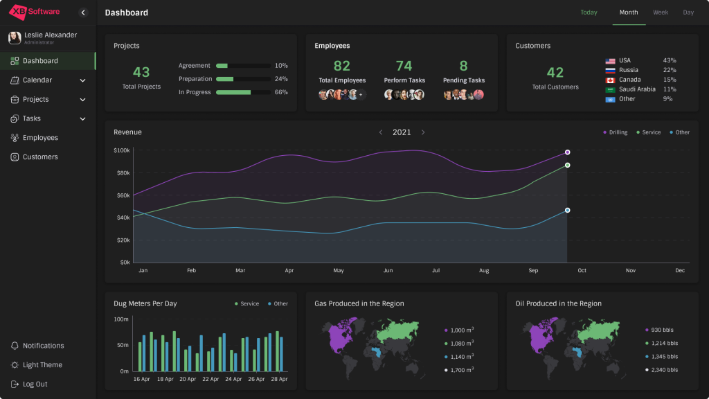
Above, you can see the data dashboard with a typical structure:
- Sidebar;
- Header;
- Dashboard body.
We can decompose these parts into a set of smaller elements to understand what we’ll need to build to solve our task.
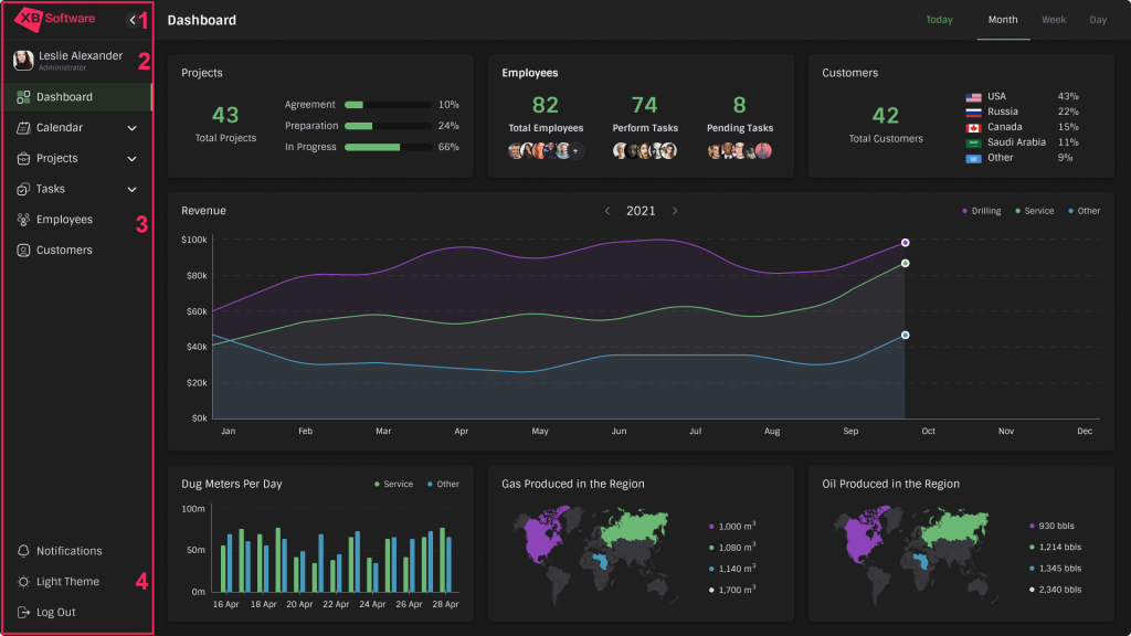
Sidebar
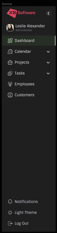
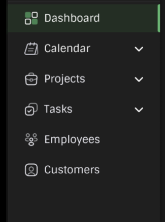
The sidebar of this data dashboard includes the following components:
- Logo and button that expands or collapses the menu;
- Administrator info;
- Hierarchical menu;
- Buttons at the bottom.
Dashboard Header
It’s a simple dashboard part. It has a title and a couple of buttons:
Dashboard Body
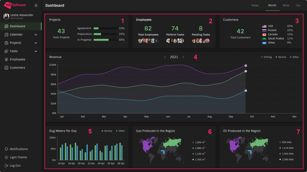
The dashboard body displays tons of data. It’s the most complex part of our solution that includes many different elements. Here they are:
- Projects;
- Employees;
- Customers;
- Revenue;
- Dug Meters Per Day;
- Gas Produced in the Region;
- Oil Produced in the Region.
NOTE: If you’re not interested in the technical details of dashboard implementation, you can proceed to the Summing Up the Results section, where we will determine which library coped with the task faster and figure out why.
React Dashboard
One of React’s features is its component-based development approach. Usually, components are reused multiple times, especially in big projects. Therefore, the component-based system allows for speeding up the development process. While creating this specific dashboard, we built 20 components and spent 34 hours.
Getting Started
First of all, we need to create a new empty project. You can use any package manager, such as Yarn or npm. Also, we’ll need Vite, a tool for developing and building a project. Here are the commands we need:
|
1 2 3 |
$ yarn create vite $ cd dashboard-react $ yarn dev |
Next, we need to delete these useless files:
- src/App.css
- src/assets/react.svg
- public/vite.svg
Also, let’s remove all unnecessary stuff from the files src/App.tsx and src/index.css
Now, we can install the following third-party libraries :
- Recharts, a composable charting library;
- React Simple Maps for creating SVG maps in our React app;
- Emotion for more convenient work with styles.
To install them and also install type definitions for react-simple-maps, we can use the following commands:
|
1 2 |
$ yarn add @emotion/react @emotion/styled react-simple-maps recharts $ yarn add -D @types/react-simple-maps |
With the dashboard before our eyes, we can understand what colors we need. Let’s create a file with some useful constants src/constants/index.ts where we can place them:
|
1 2 3 4 5 6 7 8 9 10 11 12 13 14 15 16 17 18 19 20 21 22 |
// src/constants/index.ts const ACCENT_COLOR = '#6CB875'; export const Colors = { bgMain: '#191919', bgSecond: '#1F1F1F', white: '#FFFFFF', font: '#FFFFFF', menuHoverBg: 'rgba(46, 81, 46, 0.3)', menuHoverLine: ACCENT_COLOR, map0: '#39393D', map1: '#8D44B9', map2: ACCENT_COLOR, map3: '#4599BD', map4: '#DCDCE6', black: '#141414', accent: ACCENT_COLOR, accentAlpha: 'rgba(108, 184, 117, 0.8)', grey: '#DCDCE6', helpText: '#878595', black2 |
Now that all the preparations are over, we can start implementing the UI components. Code for each component is placed inside the src/components/ComponentName folder and consists of the following files:
- ComponentName.tsx is the main file that contains the logic and the JSX markup of the component;
- index.ts exports the component to allow other components to import it from a single entry point without having to specify the file extension or the exact file name;
- styles.ts contains the styles.
In the examples below, we’ll provide the contents of the *.tsx files. You can download the complete source code using the link at the end of the React chapter to learn what other parts of code do.
Creating the Building Blocks for Larger Components
React doesn’t provide any ready-to-use widgets or controls. Before implementing the components for our dashboard, we must ensure that all the tiny building blocks, such as buttons and menus, are available. In this chapter, we’ll create these components that will eventually become integral parts of more complex ones.
ButtonIcon

We’ll need this component later to allow users to expand or collapse the sidebar. ButtonIcon is a button that displays the icon you pass to it.
|
1 2 3 4 5 6 7 8 9 10 11 12 |
// src/components/ButtonIcon/ButtonIcon.tsx import { ButtonIconStyled } from './styles'; type ButtonIconProps = React.PropsWithChildren<{}>; export default function ButtonIcon({ children }: ButtonIconProps) { return ( <ButtonIconStyled> {children} </ButtonIconStyled> ); } |
MenuItem

MenuItem is a button that displays any passed icon and text and also has an option to determine whether it has a submenu. We’ll use it to implement the menu from the Sidebar and buttons at its bottom:
|
1 2 3 4 5 6 7 8 9 10 11 12 13 14 15 16 17 18 19 20 21 22 23 24 |
// src/components/MenuItem/MenuItem.tsx import { IconDownArrow } from 'src/components/Icons'; import { MenuItemDropDownArrowStyled, MenuItemStyled } from './styles'; type MenuItemProps = { title: string; href: string; icon: React.ReactNode; dropdown?: boolean; }; export default function MenuItem({ title, href, icon, dropdown }: MenuItemProps) { return ( <MenuItemStyled href={href}> {icon} {title} {dropdown && ( <MenuItemDropDownArrowStyled> <IconDownArrow /> </MenuItemDropDownArrowStyled> )} </MenuItemStyled> ); } |
User

This component displays the user’s avatar, name, and role:
|
1 2 3 4 5 6 7 8 9 10 11 12 13 14 15 16 17 18 19 20 21 22 23 24 25 26 27 28 29 30 31 32 |
// src/components/User/User.tsx import { NameRoleWrapperStyled, UserAvatarStyled, UserNameStyled, UserRoleStyled, UserStyled, } from './styles'; interface UserProps { avatarUrl: string; username: string; role: string; } export default function User({ avatarUrl, username, role }: UserProps) { return ( <UserStyled> <UserAvatarStyled src={avatarUrl} /> <NameRoleWrapperStyled> <UserNameStyled> {username} </UserNameStyled> <UserRoleStyled> {role} </UserRoleStyled> </NameRoleWrapperStyled> </UserStyled> ); } |
HeadItem

HeadItem is a button with title, active, and children parameters. If we don’t pass the title, the children will be displayed. The active parameter determines whether the button is active or not. We’ll use it to add menu items to the Header.
|
1 2 3 4 5 6 7 8 9 10 11 12 13 14 |
// src/components/HeadItem/HeadItem.tsx import { HeadItemStyled } from './styles'; type HeadItemPops = React.PropsWithChildren<{ title?: string; active?: boolean; onClick?: () => void; }>; export default function HeadItem({ title, children, active = false, onClick }: HeadItemPops) { return ( <HeadItemStyled active={active} onClick={onClick}>{title || children}</HeadItemStyled> ); } |
Total

The Total component displays the total number of anything you decide to count. In our case, it’ll be used to show the total number of projects or customers in corresponding components. It displays a number and text and also can include an extra block with any additional content:
|
1 2 3 4 5 6 7 8 9 10 11 12 13 14 15 16 17 18 19 20 21 22 23 24 25 26 27 28 29 |
// src/components/Total/Total.tsx import { TotalMoreStyled, TotalNumberStyled, TotalStyled, TotalTextStyled, } from './style'; type TotalProps = React.PropsWithChildren<{ title: string; value: number | string; }>; export default function Total({ title, value, children }: TotalProps) { return ( <TotalStyled> <TotalNumberStyled>{value}</TotalNumberStyled> <TotalTextStyled>{title}</TotalTextStyled> {children && ( <TotalMoreStyled> {children} </TotalMoreStyled> )} </TotalStyled> ); } |
Legend
This component explains the meaning of different chart elements. We’ll implement a basic LegendItem component that renders a circle with the required text. Then, we’ll use it in the Legend and LegendHorizontal components. The first is intended for components like the Gas component, whereas the second is a horizontal-oriented chart legend for charts like the Revenue component.
|
1 2 3 4 5 6 7 8 9 10 11 12 13 14 15 16 17 18 19 20 21 22 23 24 25 26 27 28 29 30 31 32 33 34 35 36 37 38 39 40 41 42 43 44 45 46 47 48 49 50 51 52 53 54 55 56 57 58 59 |
// src/components/Legend/LegendItem.tsx import { LegendCircleStyled, LegendTitleStyled } from './styles'; export interface LegendItemProps { value: number | string; colorType: number; postfix?: React.ReactNode; } export default function LegendItem({ colorType, postfix, value }: LegendItemProps) { return ( <> <LegendCircleStyled colorType={colorType} /> <LegendTitleStyled>{value}{postfix}</LegendTitleStyled> </> ) } // src/components/Legend/Legend.tsx import LegendItem, { LegendItemProps } from './LegendItem'; import { LegendStyled } from './styles'; interface LegendProps { data: Array<LegendItemProps>; postfix?: React.ReactElement; } export default function Legend({ data, postfix }: LegendProps) { return ( <LegendStyled> {data.map(({ colorType, value }) => ( <LegendItem key={colorType} colorType={colorType} value={value} postfix={postfix} /> ))} </LegendStyled> ); } // src/components/Legend/LegentHorizontal.tsx import LegendItem, { LegendItemProps } from './LegendItem'; import { LegendHorizontalItemStyled, LegendHorizontalStyled } from './styles'; interface LegendHorizontalProps { data: Array<LegendItemProps>; } export default function LegendHorizontal({ data }: LegendHorizontalProps) { return ( <LegendHorizontalStyled> {data.map(({ colorType, value, postfix }, idx) => ( <LegendHorizontalItemStyled key={colorType + '_' + idx}> <LegendItem colorType={colorType} value={value} postfix={postfix} /> </LegendHorizontalItemStyled> ))} </LegendHorizontalStyled> ) } |
Text
It’s a simple component that displays the text. We will need it to sign the components’ names (e.g., Projects, Customers, Employees, etc.) and progress bars so that users can navigate the interface effortlessly:
|
1 2 3 4 5 6 7 8 9 10 11 12 13 14 15 |
// src/components/Text/Text.tsx import { TextStyled, TitleStyled } from './styles'; type TextProps = React.PropsWithChildren<{ variant?: 'text' | 'title'; }>; export default function Text({ children, variant = 'text' }: TextProps) { return variant !== 'title' ? ( <TextStyled>{children}</TextStyled> ) : ( <TitleStyled>{children}</TitleStyled> ); } |
Progress
The Progress component is a progress bar that displays the completion scale as a percentage. To implement it, we’ll need the Text component we created previously.
|
1 2 3 4 5 6 7 8 9 10 11 12 13 14 15 16 17 18 19 20 21 22 23 24 25 26 27 28 29 |
// src/components/Progress/Progress.tsx import Text from 'src/components/Text'; import { PogressWrapperStyled, ProgressStyled, } from './styles'; interface ProgressProps { title: string | number; value: number; } export default function Progress({ title, value }: ProgressProps) { return ( <PogressWrapperStyled> <Text> {title} </Text> <ProgressStyled max="100" value={value} /> <Text> {value}% </Text> </PogressWrapperStyled> ); } |
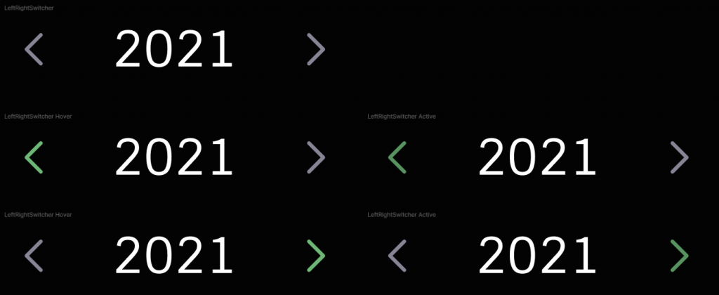
LeftRightSwitcher
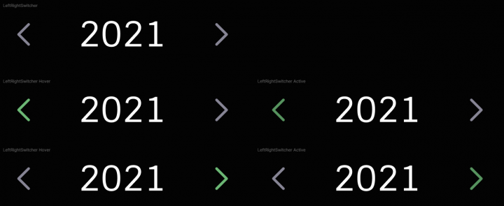
LeftRightSwitcher is a slider that allows users to change displayed data by clicking the left or right button and correspondingly switching one year backward or forward:
|
1 2 3 4 5 6 7 8 9 10 11 12 13 14 15 16 17 18 19 20 |
// src/components/LeftRightSwitcher/LeftRightSwitcher.tsx import { IconLeft, IconRight } from 'src/components/Icons'; import { LeftRightSwitcherStyled } from './styles'; interface LRSwitcherProps { title: string; onClickLeft?: () => void; onClickRight?: () => void; } export default function LeftRightSwitcher({ title, onClickLeft, onClickRight }: LRSwitcherProps) { return ( <LeftRightSwitcherStyled> <IconLeft onClick={onClickLeft} /> <span>{title}</span> <IconRight onClick={onClickRight} /> </LeftRightSwitcherStyled> ); } |
Panel
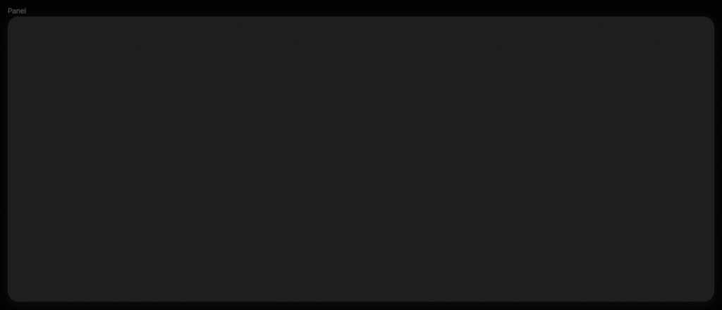
The Panel component displays a panel with any content that we pass. We’ll use these panels as tiles to organize the layout of the dashboard body:
|
1 2 3 4 5 6 7 8 9 10 11 12 13 |
// src/components/Panel/Panel.tsx import { PanelStyled } from './styles'; type PanelProps = React.PropsWithChildren; export default function Panel({ children }: PanelProps) { return ( <PanelStyled> {children} </PanelStyled> ); }; |
Building the Dashboard Layout with Sidebar and Header
Header
The Header component is the top part of the dashboard with the title and additional content:
|
1 2 3 4 5 6 7 8 9 10 11 12 13 14 15 16 17 18 19 |
// src/components/Header/Header.tsx import { HeaderStyled, HeaderTitleStyled } from './styles'; type HeaderProps = React.PropsWithChildren<{ title: string; }>; export default function Header({ title, children }: HeaderProps) { return ( <HeaderStyled> <HeaderTitleStyled> {title} </HeaderTitleStyled> {children} </HeaderStyled> ); } |
Sidebar (Vue.js, Webix)
We can compose the Sidebar component from the components we’ve already created. We’ll need ButtonIcon, User, and MenuItem. Here’s how we make them work together:
|
1 2 3 4 5 6 7 8 9 10 11 12 13 14 15 16 17 18 19 20 21 22 23 24 25 26 27 28 29 30 31 32 33 34 35 36 37 38 39 40 41 42 43 44 45 46 47 48 49 50 51 52 53 54 55 56 57 58 59 |
// src/components/Sidebar/Sidebar.tsx import MenuItem from 'src/components/MenuItem'; import { IconCalendar, IconCustomers, IconDash, IconEmployees, IconLeft, IconLight, IconLogOut, IconNotifications, IconProjects, IconTasks, } from 'src/components/Icons'; import User from 'src/components/User'; import ButtonIcon from 'src/components/ButtonIcon'; import avatarUrl from 'src/assets/useravatar.png'; import logoUrl from 'src/assets/logo.svg'; import { SidebarBottomStyled, SidebarSpecSpaceStyled, SidebarStyled, LogoStyled, } from './styles'; export default function Sidebar() { return ( <SidebarStyled> <SidebarSpecSpaceStyled> <LogoStyled> <img src={logoUrl} /> </LogoStyled> <ButtonIcon> <IconLeft /> </ButtonIcon> </SidebarSpecSpaceStyled> <SidebarSpecSpaceStyled> <User avatarUrl={avatarUrl} username="Leslie Alexander" role="Administrator" /> </SidebarSpecSpaceStyled> <MenuItem title="Dashboard" href="#" icon={<IconDash />} /> <MenuItem title="Calendar" href="#" icon={<IconCalendar />} dropdown /> <MenuItem title="Projects" href="#" icon={<IconProjects />} dropdown /> <MenuItem title="Tasks" href="#" icon={<IconTasks />} dropdown /> <MenuItem title="Employees" href="#" icon={<IconEmployees />} /> <MenuItem title="Customers" href="#" icon={<IconCustomers />} /> <SidebarBottomStyled> <MenuItem title="Notifications" href="#" icon={<IconNotifications />} /> <MenuItem title="Light Theme" href="#" icon={<IconLight />} /> <MenuItem title="Log Out" href="#" icon={<IconLogOut />} /> </SidebarBottomStyled> </SidebarStyled> ); }; |
Layout
Now that preparations are over, we can use these components to build a layout standard for all dashboard pages. Let’s create a new folder src/Layout with two files inside: styles.ts и index.tsx. In the last one, we’ll describe the part of the app similar for all pages that includes both Header and Sidebar:
|
1 2 3 4 5 6 7 8 9 10 11 12 13 14 15 16 17 18 19 20 21 22 23 24 25 26 27 28 |
// src/Layout/index.tsx import Header from 'src/components/Header'; import Sidebar from 'src/components/Sidebar'; import { MainStyled, PannelsStyled, ViewStyled } from './styles'; type LayoutProps = React.PropsWithChildren<{ pageName: string; headerContent?: React.ReactNode; }>; export default function Layout({ pageName, children, headerContent }: LayoutProps) { return ( <MainStyled> <Sidebar /> <ViewStyled> <Header title={pageName}> {headerContent} </Header> <PannelsStyled> {children} </PannelsStyled> </ViewStyled> </MainStyled > ); } |
Building the Dashboard Body Components
Projects (Vue.js, Webix)
To build the Projects component from the screenshot above, we’ll need the Progres component to display progress as a percentage, the Text component to display the name of this widget, and the Total component that counts the overall number of projects:
|
1 2 3 4 5 6 7 8 9 10 11 12 13 14 15 16 17 18 19 20 21 22 23 24 25 26 27 28 29 30 31 32 33 34 35 |
// src/components/Projects/Projects.tsx import projectsData from 'src/mock/projects'; import Progress from 'src/components/Progress'; import Text from 'src/components/Text'; import Total from 'src/components/Total'; import { ContentStyled, PogressesStyled, TotalStyled, WrapperStyled, } from './styles'; export default function Projects() { return ( <WrapperStyled> <Text variant="title"> Projects </Text> <ContentStyled> <TotalStyled> <Total title="Total Projects" value={projectsData.total} /> </TotalStyled> <PogressesStyled> {projectsData.data.map(({ id, amount, state }) => ( <Progress key={id} title={state} value={amount} /> ))} </PogressesStyled> </ContentStyled> </WrapperStyled> ); } |
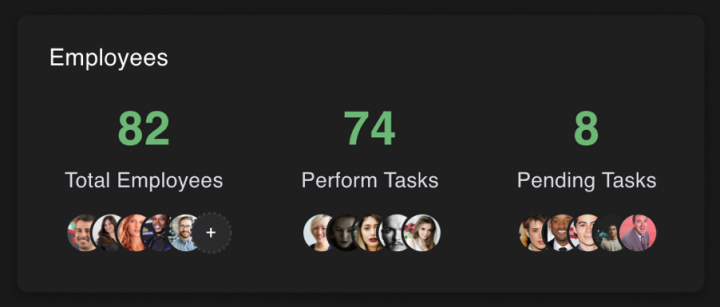
Employees (Vue.js, Webix)
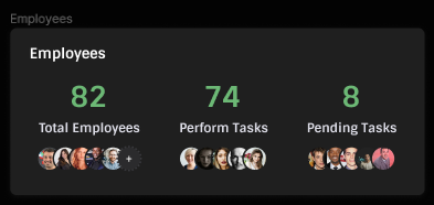
Let’s think about what we’ll need to build this one. Obviously, the Text component to display this element’s name, and the Total component since here we count the number of employees according to different criteria. Also, we’ve implemented the ImagesStyled component to style a group of images and display them below each Total component:
|
1 2 3 4 5 6 7 8 9 10 11 12 13 14 15 16 17 18 19 20 21 22 23 24 25 26 27 28 29 30 31 32 |
// src/components/Employees/Employees.tsx import Total from 'src/components/Total'; import Text from 'src/components/Text'; import { IconAddEmployee } from 'src/components/Icons'; import employeesData from 'src/mock/employees'; import { ContentStyled, ImagesStyled } from './styles'; export default function Employees() { return ( <> <Text variant="title"> Employees </Text> <ContentStyled> {employeesData.data.map(({ id, text, total, icons }) => ( <Total key={id} title={text} value={total}> <ImagesStyled> {icons.map((src, idx) => src ? ( <img key={src} src={src} /> ) : ( <IconAddEmployee key={idx} /> ))} </ImagesStyled> </Total> ))} </ContentStyled> </> ); } |
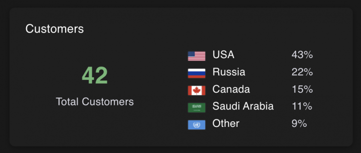
Customers (Vue.js, Webix)
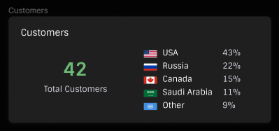
In addition to the Text and Total components we used earlier, here, we’ll also add a small table named CustomerTableStyled that displays the percentage of employees by country with flag icons to make shown info more intuitive:
|
1 2 3 4 5 6 7 8 9 10 11 12 13 14 15 16 17 18 19 20 21 22 23 24 25 26 27 28 29 30 31 32 33 34 35 36 |
// src/components/Customers/Customers.tsx import { Fragment } from 'react'; import customersData from 'src/mock/customers'; import Text from 'src/components/Text'; import Total from 'src/components/Total'; import { ContentStyled, CustomerTableStyled, TotalWrapperStyled } from './styles'; export default function Customers() { return ( <> <Text variant="title"> Customers </Text> <ContentStyled> <TotalWrapperStyled> <Total title="Total Customers" value={customersData.total} /> </TotalWrapperStyled> <CustomerTableStyled> {customersData.data.map(({ id, country, flag, proportion }) => ( <Fragment key={id}> <img src={flag} /> <div>{country}</div> <div>{proportion}%</div> </Fragment> ))} </CustomerTableStyled> </ContentStyled> </> ); } |
Revenue (Vue.js, Webix)
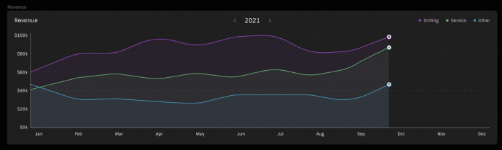
Besides self-made components, we’ll also use Recharts, a third-party charting library we previously installed. With its help, we’ll create the AreaChart component and configure all its elements, such as axes, tooltips, etc.
Speaking of our own components, we’ll need Text, LegendHorizontal for horizontally-oriented chart legend, and LeftRightSwitcher to allow users to choose a specific year to display:
|
1 2 3 4 5 6 7 8 9 10 11 12 13 14 15 16 17 18 19 20 21 22 23 24 25 26 27 28 29 30 31 32 33 34 35 36 37 38 39 40 41 42 43 44 45 46 47 48 49 50 51 52 53 54 55 56 57 58 59 60 61 62 63 64 65 66 67 68 69 70 71 72 73 74 75 76 77 78 79 80 81 82 83 84 85 86 87 88 89 90 91 92 93 94 95 96 97 98 99 100 101 102 103 104 |
// src/components/Revenue/Revenue.tsx import { AreaChart, XAxis, YAxis, CartesianGrid, Tooltip, Area } from 'recharts'; import { revenueData } from 'src/mock/revenueDug'; import Text from 'src/components/Text'; import { LegendHorizontal } from 'src/components/Legend'; import LeftRightSwitcher from 'src/components/LeftRightSwitcher'; import { HeaderStyled } from './styles'; const legendData = [{ colorType: 1, value: 'Drilling', }, { colorType: 2, value: 'Service', }, { colorType: 3, value: 'Other', }]; export default function Revenue() { return ( <> <HeaderStyled> <Text variant="title"> Revenue </Text> <LeftRightSwitcher title="2020" /> <LegendHorizontal data={legendData} /> </HeaderStyled> <AreaChart width={1531} height={345} data={revenueData} margin={{ top: 0, right: 0, left: 0, bottom: 0 }} > <defs> <linearGradient id="colorUv" x1="0" y1="0" x2="0" y2="1"> <stop offset="5%" stopColor="rgba(143, 69, 189, 0.08)" stopOpacity={1} /> <stop offset="95%" stopColor="rgba(143, 69, 189, 0.08)" stopOpacity={1} /> </linearGradient> <linearGradient id="colorPv" x1="0" y1="0" x2="0" y2="1"> <stop offset="5%" stopColor="rgba(108, 184, 117, 0.08)" stopOpacity={1} /> <stop offset="95%" stopColor="rgba(108, 184, 117, 0.08)" stopOpacity={1} /> </linearGradient> <linearGradient id="colorKv" x1="0" y1="0" x2="0" y2="1"> <stop offset="5%" stopColor="rgba(69, 153, 189, 0.08)" stopOpacity={1} /> <stop offset="95%" stopColor="rgba(69, 153, 189, 0.08)" stopOpacity={1} /> </linearGradient> </defs> <XAxis dataKey="month" stroke="#fff" fontSize={14} /> <YAxis tickCount={6} tickFormatter={(value: any) => `$${value}k`} stroke="#fff" fontSize={14} /> <CartesianGrid horizontal vertical={false} strokeDasharray="10 10" stroke="#39393D" /> <Tooltip /> <Area type="monotone" dataKey="drilling" stroke="#8f45bd" fillOpacity={1} fill="url(#colorUv)" /> <Area type="monotone" dataKey="service" stroke="#6cb875" fillOpacity={1} fill="url(#colorPv)" /> <Area type="monotone" dataKey="other" stroke="#4599bd" fillOpacity={1} fill="url(#colorKv)" /> </AreaChart> </> ); } |
DugMeters (Vue.js, Webix)
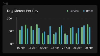
We’ll use the Recharts library again, but it’ll be a different chart type this time. The BarChart is precisely what we need. Also, we’ll use the Text component and LegendHorizontal component since the chart legend has a horizontal orientation:
|
1 2 3 4 5 6 7 8 9 10 11 12 13 14 15 16 17 18 19 20 21 22 23 24 25 26 27 28 29 30 31 32 33 34 35 36 37 38 39 40 41 42 43 44 45 46 47 48 49 50 51 52 53 54 55 56 57 58 59 60 61 62 |
// src/components/Dug/Dug.tsx import { BarChart, XAxis, YAxis, CartesianGrid, Tooltip, Bar } from 'recharts'; import { dugData } from 'src/mock/revenueDug'; import Text from 'src/components/Text'; import { LegendHorizontal } from 'src/components/Legend'; import { BarWrapperStyled, HeaderWrapperStyled } from './styles'; const legendData = [{ colorType: 2, value: 'Service', }, { colorType: 2, value: 'Other', }]; export default function Dug() { return ( <> <HeaderWrapperStyled> <Text variant="title"> Dug Meters Per Day </Text> <LegendHorizontal data={legendData} /> </HeaderWrapperStyled> <BarWrapperStyled> <BarChart width={480} height={182} data={dugData} margin={{ top: 0, bottom: 0, left: 0, right: 0 }} > <CartesianGrid horizontal vertical={false} strokeDasharray="10 10" stroke="#39393D" /> <XAxis dataKey="date" stroke="#fff" fontSize={14} /> <YAxis tickCount={3} tickFormatter={(value: any) => `${value}m`} stroke="#fff" fontSize={14} /> <Tooltip /> <Bar dataKey="service" fill="#6CB875" radius={[2, 2, 0, 0]} /> <Bar dataKey="other" fill="#4599BD" radius={[2, 2, 0, 0]} /> </BarChart> </BarWrapperStyled> </> ); } |
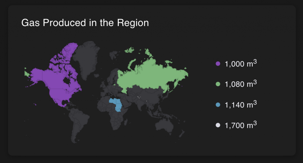
GasProduced (Vue.js, Webix)
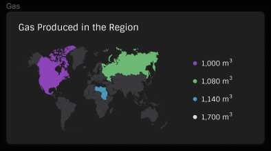
We’ll need another third-party library to build this one. This time, we’ll rely on react-simple-maps to create a map. We’ll also use our own Legend component (not the horizontal one this time) and Text component.
|
1 2 3 4 5 6 7 8 9 10 11 12 13 14 15 16 17 18 19 20 21 22 23 24 25 26 27 28 29 30 31 32 33 34 35 36 37 38 39 40 41 42 43 44 45 46 47 48 |
// src/components/Gas/Gas.tsx import { ComposableMap, Geographies, Geography } from 'react-simple-maps'; import { Colors } from 'src/constants'; import Text from 'src/components/Text'; import { MapKeys } from 'src/types'; import Legend from 'src/components/Legend'; import { gas } from 'src/mock/gasOli'; import { ContentStyled, MapWrapperStyled } from './styles'; export default function Gas() { return ( <> <Text variant="title"> Gas Produced in the Region </Text> <ContentStyled> <MapWrapperStyled> <ComposableMap> <Geographies geography="/map.json"> {({ geographies }) => geographies.map((geo) => { const key = `map${geo.properties?.gas || 'Default'}` as MapKeys; return ( <Geography key={geo.rsmKey} geography={geo} fill={Colors[key]} stroke="rgba(0,0,0,0)" /> ); })} </Geographies> </ComposableMap> </MapWrapperStyled> <Legend postfix={<> m<sup>3</sup></>} data={gas.data.map(({ selected, value }) => ({ colorType: selected, value, }))} /> </ContentStyled> </> ); } |
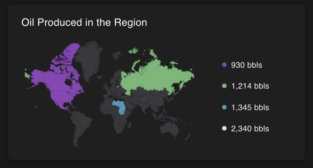
OilProduced (Vue.js, Webix)
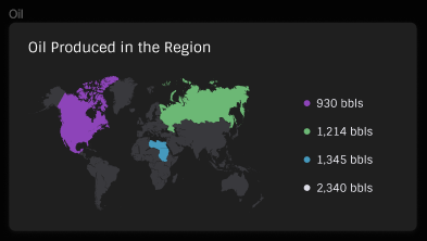
This component is pretty similar to the previous one, so we can follow the same pattern.
|
1 2 3 4 5 6 7 8 9 10 11 12 13 14 15 16 17 18 19 20 21 22 23 24 25 26 27 28 29 30 31 32 33 34 35 36 37 38 39 40 41 42 43 44 45 46 47 48 49 |
// src/components/Oil/Oil.tsx import { ComposableMap, Geographies, Geography } from 'react-simple-maps'; import { Colors } from 'src/constants'; import Text from 'src/components/Text'; import { MapKeys } from 'src/types'; import Legend from 'src/components/Legend'; import { oil } from 'src/mock/gasOli'; import { ContentStyled, MapWrapperStyled } from './styles'; export default function Oil() { return ( <> <Text variant="title"> Gas Produced in the Region </Text> <ContentStyled> <MapWrapperStyled> <ComposableMap> <Geographies geography="/map.json"> {({ geographies }) => geographies.map((geo) => { const key = `map${geo.properties?.oil || 'Default'}` as MapKeys; return ( <Geography key={geo.rsmKey} geography={geo} fill={Colors[key]} stroke="rgba(0,0,0,0)" /> ); })} </Geographies> </ComposableMap> </MapWrapperStyled> <Legend postfix={<> bbls</>} data={oil.data.map(({ selected, value }) => ({ colorType: selected, value, }))} /> </ContentStyled> </> ); } |
Composing the Dashboard Body
Now, we can build the dashboard body with all these components. Each of them will be placed within the Panel component we made earlier, and then we’ll compose a tiled interface from these panels. Let’s create a new folder src/pages and a new file Dashboard.tsx inside it, where we put all required code:
|
1 2 3 4 5 6 7 8 9 10 11 12 13 14 15 16 17 18 19 20 21 22 23 24 25 26 27 28 29 30 31 32 33 34 35 36 37 38 39 40 41 42 43 44 45 46 47 |
// src/pages/Dashboard.tsx import Customers from 'src/components/Customers'; import Dug from 'src/components/Dug'; import Employees from 'src/components/Employees'; import Gas from 'src/components/Gas'; import Oil from 'src/components/Oil'; import Panel from 'src/components/Panel'; import Projects from 'src/components/Projects'; import Revenue from 'src/components/Revenue'; import { ThreePannelsStyled } from 'src/styles'; export default function Dashboard() { return ( <> <ThreePannelsStyled> <Panel> <Projects /> </Panel> <Panel> <Employees /> </Panel> <Panel> <Customers /> </Panel> </ThreePannelsStyled> <Panel> <Revenue /> </Panel> <ThreePannelsStyled> <Panel> <Dug /> </Panel> <Panel> <Gas /> </Panel> <Panel> <Oil /> </Panel> </ThreePannelsStyled> </> ); } |
Next, we need to update the src/App.tsx file to put together header, sidebar, and dashboard body:
|
1 2 3 4 5 6 7 8 9 10 11 12 13 14 15 16 17 18 19 20 21 22 |
// src/App.tsx import HeadItem from './components/HeadItem'; import Layout from './Layout'; import Dashboard from './pages/Dashboard'; function App() { return ( <Layout pageName="Dashboard" headerContent={( <> <HeadItem title="Today" /> <HeadItem title="Month" active /> <HeadItem title="Week" /> <HeadItem title="Day" /> </> )}> <Dashboard /> </Layout> ); }; export default App; |
That’s it. The React dashboard is ready.
You can download the source code of this dashboard using the link below. To install all dependencies, use the yarn command. To run the project, use the yarn dev command.
Vue.js Dashboard
One of the main Vue.js features is its component-based development approach. Also, it uses the SFC (Single-File Components) file format resulting in fewer files and less code compared to React. Nonetheless, nothing stops developers from splitting components into multiple files and creating a project structure similar to what React has. It depends on the prerequisites of a specific developer which way to choose. While building the dashboard with Vue.js, we created 13 components and 8 modules and spent 30 hours.
Getting Started
First, we need to create a new empty project using any package manager, such as Yarn or npm. Also, we’ll need Vite for developing and building the project:
|
1 2 3 |
$ yarn create vite $ cd dashboard-vue $ yarn dev |
Next, we can delete some files we don’t need:
- src/assets/vue.svg
- public/vite.svg
- src/components/HelloWorld.vue
And edit the src/App.vue and src/index.css files to remove everything useless.
Some third-party libraries are also required:
- Chart.js is a flexible JavaScript charting library;
- vue-google-charts is a wrapper for Google Charts lib;
- Sass is a preprocessor scripting language for more convenient work with the styles.
To install them, we can use the following commands:
|
1 2 |
$ yarn add vue-google-charts chart.js $ yarn add -D sass |
At last, we can proceed with building the components that will become building blocks for larger app modules. Each of them is a separate file inside the src/components folder. For example, we’ll start with the src/components/ButtonIcon.vue file. Larger modules are placed within the src/module folder. For example, src/module/Customers.vue
Vue.js places both JavaScript and CSS code for a component inside a single file, and we’ll only focus on the JS part of the story. You can download the complete source code using the link at the end of the Vue.js chapter to learn what other parts of code do.
Creating Module Components
React doesn’t provide any ready-to-use widgets or controls. Before implementing the components for our dashboard, we must ensure that all the tiny building blocks, such as buttons and menus, are available. In this chapter, we’ll create these components that eventually will become the integral parts of more complex ones.
ButtonIcon
We’ll use this button to allow users to expand or collapse the sidebar. ButtonIcon is a button that displays the icon you pass to it and emits a ‘click’ event when clicked:
|
1 2 3 4 5 6 7 8 9 10 11 12 13 14 15 |
// src/components/ButtonIcon.vue <script setup lang="ts"> const emit = defineEmits<{ (e: 'click', payload: MouseEvent): void }>(); function onClick(payload: MouseEvent) { emit('click', payload); } </script> <template> <button @click="onClick"><slot /></button> </template> |
MenuItem
MenuItem is a button that displays a passed icon and text. It has an option to determine whether it has a submenu. We’ll use it to implement the menu from the Sidebar and buttons at its bottom:
|
1 2 3 4 5 6 7 8 9 10 11 12 13 14 15 16 17 18 19 20 21 22 23 24 |
// src/components/MenuItem.vue <script setup lang="ts"> import { IconDownArrow } from './Icons'; defineProps<{ title: string; href: string; isDropdown?: boolean; isActive?: boolean; }>(); </script> <template> <a :class="[{ active: isActive }, 'menu-item']" :href="href"> <slot /> {{ title }} <template v-if="isDropdown"> <div class="menu-item__dropdown-icon"> <IconDownArrow /> </div> </template> </a> </template> |
User
The User component displays the user’s avatar, name, and role:
|
1 2 3 4 5 6 7 8 9 10 11 12 13 14 15 16 17 18 19 20 21 22 23 24 25 |
// src/components/User.vue <script setup lang="ts"> defineProps<{ avatarUrl: string; username: string; role: string; }>() </script> <template> <div class="user"> <img class="user__avatar" :src="avatarUrl" /> <div class="user__about"> <div class="user__about__name"> {{ username }} </div> <div class="user__about__role"> {{ role }} </div> </div> </div> </template> |
HeadItem

HeadItem is a button with title, active, and children parameters. If we don’t pass the title, the children will be displayed. The active parameter determines whether the button is active or not. We’ll use it to add menu items to the Header:
|
1 2 3 4 5 6 7 8 9 10 11 12 13 14 15 16 17 18 19 20 21 22 23 24 25 26 27 28 |
// src/components/HeadItem.vue <script setup lang="ts"> defineProps<{ title?: string; isActive?: boolean; }>(); const emit = defineEmits<{ (e: 'click', payload: MouseEvent): void }>(); function onClick(payload: MouseEvent) { emit('click', payload); } </script> <template> <div :class="[{ active: isActive }, 'head-item']" @click="onClick" > <template v-if="title"> {{ title }} </template> <slot v-else /> </div> </template> |
Total
The Total component displays the number and the caption. It can also include an additional block with any extra content. We’ll use it later in such modules as Projects and Customers, for example:
|
1 2 3 4 5 6 7 8 9 10 11 12 13 14 15 16 17 18 19 20 21 22 23 24 25 |
// src/components/Total.vue <script setup lang="ts"> defineProps<{ value: number | string; title: string; isShowMore?: boolean; }>(); </script> <template> <div class="total"> <div class="total__number"> {{ value }} </div> <div class="total__text"> {{ title }} </div> <div v-if="isShowMore" class="total__more"> <slot /> </div> </div> </template> |
Legend
This component explains the meaning of info displayed in charts. We’ll implement a basic LegendItem component that renders a circle with the required text. Then, we’ll use it in the “regular” Legend and horizontal-oriented LegendHorizontal components:
|
1 2 3 4 5 6 7 8 9 10 11 12 13 14 15 16 17 18 19 20 21 22 23 24 25 26 27 28 29 30 31 32 33 34 35 36 37 38 39 40 41 42 43 44 45 46 47 48 49 50 51 52 53 54 55 56 57 58 59 60 61 62 63 64 65 66 67 68 69 70 71 72 73 74 75 76 77 78 79 |
// src/components/LegendItem.vue <script setup lang="ts"> export interface LegendItemProps { value: string; colorType: number; }; defineProps<LegendItemProps>(); function colorPick(colorType: number) { switch (colorType) { case 0: return 'legend-item__circle_0'; case 1: return 'legend-item__circle_1'; case 2: return 'legend-item__circle_2'; case 3: return 'legend-item__circle_3'; case 4: default: return 'legend-item__circle_4'; } } </script> <template> <div :class="['legend-item__circle', colorPick(colorType)]" /> <div class="legend-item__value"> {{ value }} <slot /> </div> </template> // src/components/Legend.vue <script setup lang="ts"> import LegendItem, { LegendItemProps } from './LegendItem.vue'; defineProps<{ data: Array<LegendItemProps>; }>(); </script> <template> <div class="legend"> <template v-for="item in data"> <LegendItem :value="item.value" :color-type="item.colorType" > <slot /> </LegendItem> </template> </div> </template> // src/components/LegendHorizontal.vue <script setup lang="ts"> import LegendItem, { LegendItemProps } from './LegendItem.vue'; defineProps<{ data: Array<LegendItemProps>; }>(); </script> <template> <div class="legend-horizontal"> <template v-for="item in data"> <div class="legend-horizontal__item"> <LegendItem :value="item.value" :color-type="item.colorType" > <slot /> </LegendItem> </div> </template> </div> </template> |
Progress
The Progress component is a progress bar that displays the completion scale as a percentage:
|
1 2 3 4 5 6 7 8 9 10 11 12 13 14 15 16 17 18 19 20 21 22 23 24 25 26 27 |
// src/components/Progress.vue <script setup lang="ts"> defineProps<{ title: string | number; value: number; }>() </script> <template> <div class="progress"> <div class="progress__title"> {{ title }} </div> <progress class="progress__progress" max="100" :value="value" title="title" /> <div class="progress__percent"> {{ value }}% </div> </div> </template> |
LeftRightSwitcher
LeftRightSwitcher is a slider that allows users to change displayed data by clicking the left or right button and correspondingly switching one year backward or forward:
|
1 2 3 4 5 6 7 8 9 10 11 12 13 14 15 16 17 18 19 20 21 22 23 24 25 26 27 28 29 30 |
// src/components/LeftRightSwitcher.vue <script setup lang="ts"> import { IconLeft, IconRight } from './Icons'; defineProps<{ title: string; }>(); const emit = defineEmits<{ (e: 'clickLeft', payload: MouseEvent): void (e: 'clickRight', payload: MouseEvent): void }>(); function onClickLeft(payload: MouseEvent) { emit('clickLeft', payload); } function onClickRight(payload: MouseEvent) { emit('clickRight', payload); } </script> <template> <div class="lr-switcher"> <IconLeft @click="onClickLeft" /> <span>{{ title }}</span> <IconRight @click="onClickRight" /> </div> </template> |
Panel
The Panel component displays a panel with any content that we pass to it. We’ll use these panels as tiles to organize the layout of the dashboard body:
|
1 2 3 4 5 6 7 8 9 |
// src/components/Panel.vue <script setup lang="ts"></script> <template> <div> <slot /> </div> </template> |
Title
This component displays titles of bigger components, e.g. Customers, Employees, and others:
|
1 2 3 4 5 6 7 8 9 |
// src/components/Title.vue <script setup lang="ts"></script> <template> <div> <slot /> </div> </template> |
GeoChart
GeoChart is a wrapper with various settings for displaying the customized map. We’ll use it in such modules as as Gas and Oil later:
|
1 2 3 4 5 6 7 8 9 10 11 12 13 14 15 16 17 18 19 20 21 22 23 24 25 26 27 28 29 30 31 32 33 34 35 36 37 38 39 40 41 42 43 44 |
// src/components/GeoChart.vue import { defineComponent, h } from 'vue'; import { GChart } from 'vue-google-charts'; export const type = 'GeoChart'; export const options = { width: 301, height: 178, backgroundColor: '#1f1f1f', colorAxis: { colors: ['#39393D', '#8D44B9', '#6CB875', '#4599BD', '#DCDCE6'], values: [0, 1, 2, 3, 4], }, defaultColor: '#39393D', datalessRegionColor: '#39393D', legend: 'none', }; export default defineComponent({ name: 'GeoChart', props: { geoProps: { type: Array<Array<string | number>>, required: true, }, }, components: { GChart, }, setup(props) { return () => h(GChart, { data: props.geoProps, options, type, settings: { packages: ['geochart'], }, }); }, }); |
Building the Layout With Header and Sidebar
Header
This one represents the top part of the dashboard with the title and additional components:
|
1 2 3 4 5 6 7 8 9 10 11 12 13 |
// src/components/Header.vue <script setup lang="ts"> defineProps<{ title: string }>(); </script> <template> <header> <div class="head-title">{{ title }}</div> <slot /> </header> </template> |
Sidebar (React, Webix)
Sidebar is a module built from smaller components. Therefore, its course code is placed inside the src/module folder. For the Sidebar module, we’ll use such components as, ButtonIcon, MenuItem, and User:
|
1 2 3 4 5 6 7 8 9 10 11 12 13 14 15 16 17 18 19 20 21 22 23 24 25 26 27 28 29 30 31 32 33 34 35 36 37 38 39 40 41 42 43 44 45 46 47 48 49 50 51 52 53 54 55 56 57 58 59 60 61 62 63 64 65 66 67 68 69 70 71 72 73 74 75 76 |
// src/module/Sidebar.vue <script setup lang="ts"> import ButtonIcon from '../components/ButtonIcon.vue'; import MenuItem from '../components/MenuItem.vue'; import { IconCustomers, IconDash, IconCalendar, IconProjects, IconTasks, IconEmployees, IconNotifications, IconLight, IconLogOut, IconLeftBtn, } from '../components/Icons'; import User from '../components/User.vue'; import logoUrl from '../assets/logo.svg'; import avatarUrl from '../assets/useravatar.png'; </script> <template> <aside class="sidebar"> <div class="sidebar__box-with-line"> <a class="sidebar__box-with-line__logo" href="/"> <img :src="logoUrl" /> </a> <button-icon> <IconLeftBtn /> </button-icon> </div> <div class="sidebar__box-with-line"> <User :avatarUrl="avatarUrl" username="Leslie Alexander" role="Administrator" /> </div> <div class="sidebar__items"> <menu-item title="Dashboard" href="#" isActive> <IconDash /> </menu-item> <menu-item title="Calendar" href="#" isDropdown> <IconCalendar /> </menu-item> <menu-item title="Projects" href="#" isDropdown> <IconProjects /> </menu-item> <menu-item title="Tasks" href="#" isDropdown> <IconTasks /> </menu-item> <menu-item title="Employees" href="#"> <IconEmployees /> </menu-item> <menu-item title="Customers" href="#"> <IconCustomers /> </menu-item> </div> <div class="sidebar__items_bottom"> <menu-item title="Notifications" href="#"> <IconNotifications /> </menu-item> <menu-item title="Light Theme" href="#"> <IconLight /> </menu-item> <menu-item title="Log Out" href="#"> <IconLogOut /> </menu-item> </div> </aside> </template> |
Layout
Let’s create a new folder src/Layout with a file Main.vue inside. Here, we’ll describe the part of the application similar for all pages. It includes such elements as Header and Sidebar:
|
1 2 3 4 5 6 7 8 9 10 11 12 13 14 15 16 17 18 19 20 21 22 |
// src/layout/Main.vue <script setup lang="ts"> import Header from '../components/Header.vue'; import Sidebar from '../module/Sidebar.vue'; </script> <template> <Sidebar /> <main> <Header title="Dashboard"> <slot name="headerContent" /> </Header> <div class="view"> <div class="view__grid"> <slot /> </div> </div> </main> </template> |
Building the Dashboard Modules Using the Created Components
Projects (React, Webix)
For this module, we’ll need the Progres component to display progress as a percentage, the Title component to display the module’s name, and the Total component that counts the overall number of projects:
|
1 2 3 4 5 6 7 8 9 10 11 12 13 14 15 16 17 18 19 20 21 22 23 24 25 26 27 28 29 30 |
// src/module/Projects.vue <script setup lang="ts"> import Total from '../components/Total.vue'; import Progress from '../components/Progress.vue'; import projectsData from '../mock/projects'; import Title from '../components/Title.vue'; </script> <template> <Title>Projects</Title> <div class="prj__content"> <div class="prj__total"> <Total title="Total Projects" :value="projectsData.total" /> </div> <div class="prj__progress"> <template v-for="item in projectsData.data"> <Progress :value="item.amount" :title="item.state" /> </template> </div> </div> </template> |
Employees (React, Webix)
In addition to the Title and Total components, we’ll create the <div class=”emp__images”> container that iterates through the data array and renders tiny employee icons:
|
1 2 3 4 5 6 7 8 9 10 11 12 13 14 15 16 17 18 19 20 21 22 23 24 25 26 27 28 29 |
// src/module/Employees.vue <script setup lang="ts"> import Total from '../components/Total.vue'; import Title from '../components/Title.vue'; import employeesData from '../mock/employees'; import { IconAddEmployee } from '../components/Icons'; </script> <template> <Title>Employees</Title> <div class="emp__content"> <template v-for="item in employeesData.data"> <Total :value="item.total" :title="item.text" isShowMore > <div class="emp__images"> <template v-for="src in item.icons"> <img v-if="src" :src="src" /> <IconAddEmployee v-else /> </template> </div> </Total> </template> </div> </template> |
Customers (React, Webix)
Besides the components we’re already familiar with, here, we’ll also create the <div class=”cus__table”> container that iterates over each item in the customersData.data array to create a table that displays the percentage of customers by country with flag icons:
|
1 2 3 4 5 6 7 8 9 10 11 12 13 14 15 16 17 18 19 20 21 22 23 24 25 26 27 28 |
// src/module/Customers.vue <script setup lang="ts"> import Total from '../components/Total.vue'; import Title from '../components/Title.vue'; import customersData from '../mock/customers'; </script> <template> <Title>Customers</Title> <div class="cus__content"> <div class="cus__total"> <Total title="Total Customers" :value="customersData.total" /> </div> <div class="cus__table"> <template v-for="item in customersData.data"> <img :src="item.flag" :alt="item.country" /> <div>{{ item.country }}</div> <div>{{ item.proportion }}%</div> </template> </div> </div> </template> |
Revenue (React, Webix)
This chart’s legend has horizontal orientation, so we’ll need the LegendHorizontal component. Title will let users know what widget they’re looking at and LeftRightSwitcher will help them to choose a specific year to display. For the chart itself, we’ll use the Chart.js library:
|
1 2 3 4 5 6 7 8 9 10 11 12 13 14 15 16 17 18 19 20 21 22 23 24 25 26 27 28 29 30 31 32 33 34 35 36 37 38 39 40 41 42 43 44 45 46 47 48 49 50 51 52 53 54 55 56 57 58 59 60 61 62 63 64 65 66 67 68 69 70 71 72 73 74 75 76 77 78 79 80 81 82 83 84 85 86 87 88 89 90 91 92 93 94 95 96 97 98 99 100 101 102 103 |
// src/module/Revenue.vue <script lang="ts"> import Chart, { ChartItem } from 'chart.js/auto'; import Title from '../components/Title.vue'; import LeftRightSwitcher from '../components/LeftRightSwitcher.vue'; import LegendHorizontal from '../components/LegendHorizontal.vue'; import { revenueData } from '../mock/revenueDug'; export default { components: { Title, LeftRightSwitcher, LegendHorizontal, }, data() { return { legendData: [ { colorType: 1, value: 'Drilling' }, { colorType: 2, value: 'Service' }, { colorType: 3, value: 'Other' }, ], }; }, mounted() { if (this.$refs.chart) { new Chart(this.$refs.chart as ChartItem, { type: 'line', data: revenueData, options: { responsive: true, plugins: { tooltip: { mode: 'index', }, legend: { display: false, }, }, interaction: { mode: 'nearest', axis: 'x', intersect: false, }, elements: { line: { tension: 0.3, borderWidth: 2, }, }, scales: { x: { grid: { display: false, }, border: { color: '#878595', }, ticks: { color: '#fff', font: { size: 14, }, }, }, y: { beginAtZero: true, ticks: { count: 6, stepSize: 20, callback: (value) => `$${value}k`, color: '#fff', font: { size: 14, }, }, grid: { display: true, color: '#39393D', }, border: { color: '#878595', dash: [10, 10], dashOffset: 10, } }, } }, }); } }, } </script> <template> <div class="rev__head"> <Title>Revenue</Title> <LeftRightSwitcher title="2021" /> <LegendHorizontal :data="legendData" /> </div> <canvas ref="chart"></canvas> </template> |
DugMeters (React, Webix)
For this module, we’ll use the same set of components, but configure the chart differently since it displays different type of data:
|
1 2 3 4 5 6 7 8 9 10 11 12 13 14 15 16 17 18 19 20 21 22 23 24 25 26 27 28 29 30 31 32 33 34 35 36 37 38 39 40 41 42 43 44 45 46 47 48 49 50 51 52 53 54 55 56 57 58 59 60 61 62 63 64 65 66 67 68 69 70 71 72 73 74 75 76 77 78 79 80 81 82 83 84 85 86 |
// src/module/Dug.vue <script lang="ts"> import Title from '../components/Title.vue'; import LegendHorizontal from '../components/LegendHorizontal.vue'; import { dugData } from '../mock/revenueDug'; import Chart, { ChartItem } from 'chart.js/auto'; export default { components: { Title, LegendHorizontal, }, data() { return { legendData: [ { colorType: 2, value: 'Service' }, { colorType: 3, value: 'Other' }, ], }; }, mounted() { if (this.$refs.chart) { new Chart(this.$refs.chart as ChartItem, { type: 'bar', data: dugData, options: { responsive: true, plugins: { legend: { display: false, }, }, scales: { x: { grid: { display: false, }, border: { color: '#878595', }, ticks: { maxTicksLimit: 7, color: '#fff', font: { size: 14, }, }, }, y: { beginAtZero: true, ticks: { count: 3, stepSize: 50, callback: (value) => `${value}m`, color: '#fff', font: { size: 14, }, }, grid: { display: true, color: '#39393D', }, border: { color: '#878595', dash: [10, 10], dashOffset: 10, } }, }, }, }); } }, }; </script> <template> <div class="dug__head"> <Title>Dug Meters Per Day</Title> <LegendHorizontal :data="legendData" /> </div> <canvas ref="chart"></canvas> </template> |
GasProduced (React, Webix)
As you can see, this module shows a map. That’s what we need vue-google-charts for. We’ll also use our own Legend component (the vertical one) and TItle component:
|
1 2 3 4 5 6 7 8 9 10 11 12 13 14 15 16 17 18 19 20 21 22 23 24 25 26 27 28 29 30 31 32 33 34 35 36 37 38 |
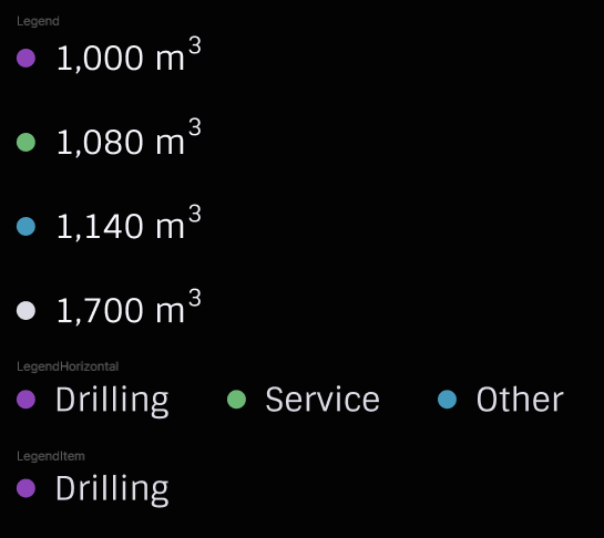
// src/module/Gas.vue script setup lang="ts"> import GeoChart from '../components/GeoChart'; import Legend from '../components/Legend.vue'; import Title from '../components/Title.vue'; const legendData = [ { colorType: 1, value: '1,000' }, { colorType: 2, value: '1,080' }, { colorType: 3, value: '1,140' }, { colorType: 4, value: '1,700' }, ]; const geoData = [ ['Country', 'Gas Produced in the Region'], ['Canada', 1], ['Mexico', 1], ['United States', 1], ['Russia', 2], ['South Sudan', 3], ['Sudan', 3], ['Egypt', 3], ['Libya', 3], ]; </script> <template> <div class="gas__head"> <Title>{{ geoData[0][1] }}</Title> </div> <div class="gas__content"> <GeoChart :geo-props="geoData" /> <Legend :data="legendData">m<sup>3</sup></Legend> </div> </template> |
OilProduced (React, Webix)
This component is pretty similar to the previous one, so we can follow the same pattern.
|
1 2 3 4 5 6 7 8 9 10 11 12 13 14 15 16 17 18 19 20 21 22 23 24 25 26 27 28 29 30 31 32 33 34 35 36 37 38 |
// src/module/Oil.vue <script setup lang="ts"> import GeoChart from '../components/GeoChart'; import Legend from '../components/Legend.vue'; import Title from '../components/Title.vue'; const legendData = [ { colorType: 1, value: '1,000' }, { colorType: 2, value: '1,080' }, { colorType: 3, value: '1,140' }, { colorType: 4, value: '1,700' }, ]; const geoData = [ ['Country', 'Oil Produced in the Region'], ['Canada', 1], ['Mexico', 1], ['United States', 1], ['Russia', 2], ['South Sudan', 3], ['Sudan', 3], ['Egypt', 3], ['Libya', 3], ]; </script> <template> <div class="oil__head"> <Title>{{ geoData[0][1] }}</Title> </div> <div class="oil__content"> <GeoChart :geo-props="geoData" /> <Legend :data="legendData">bbls</Legend> </div> </template> |
Composing the Dashboard Body
All the modules are ready, which means we can compose the dashboard body using them. Let’s create the src/pages folder with the file Dashboard.vue inside. There, we’ll import all the modules we’ve created, and put each of them within the Panel component. From these panels, we will build the Dashboard body:
|
1 2 3 4 5 6 7 8 9 10 11 12 13 14 15 16 17 18 19 20 21 22 23 24 25 26 27 28 29 30 31 32 33 34 35 36 37 38 39 40 41 42 |
// src/pages/Dashboard.vue <script setup lang="ts"> import Panel from '../components/Panel.vue'; import Customers from '../module/Customers.vue'; import Employees from '../module/Employees.vue'; import Projects from '../module/Projects.vue'; import Revenue from '../module/Revenue.vue'; import Dug from '../module/Dug.vue'; import Gas from '../module/Gas.vue'; import Oil from '../module/Oil.vue'; </script> <template> <div class="three-panels"> <Panel> <Projects /> </Panel> <Panel> <Employees /> </Panel> <Panel> <Customers /> </Panel> </div> <Panel> <Revenue /> </Panel> <div class="three-panels"> <Panel> <Dug /> </Panel> <Panel> <Gas /> </Panel> <Panel> <Oil /> </Panel> </div> </template> |
The last step is to update the src/App.vue file:
|
1 2 3 4 5 6 7 8 9 10 11 12 13 14 15 16 17 18 19 20 21 22 |
// src/App.vue <script setup lang="ts"> import HeadItem from './components/HeadItem.vue'; import Main from './layout/Main.vue'; import Dashboard from './pages/Dashboard.vue'; </script> <template> <Main> <template #headerContent> <HeadItem title="Today" /> <HeadItem title="Month" isActive /> <HeadItem title="Week" /> <HeadItem title="Day" /> </template> <Dashboard /> </Main> </template> <style scoped></style> |
The Vue.js dashboard is ready.
You can download the source code of the dashboard using the link below to try it yourself. To install dependencies, use the yarn command. To run the project, use the yarn dev command.
Webix Dashboard
With Webix, it doesn’t require much effort since it provides access to ready-to-use components, including complex visualization widgets such as Chart and GeoChart. We spent 17 hours building the dashboard with this library.
Getting Started
We’ll use a demo app built with Webix Jet as a starting point. It’ll help us save some time since we won’t have to create the project structure for our solution manually. For example, we can download this jet-start demo from GitHub. It’ll give us a ready-to-use project structure, but there are some files we don’t actually need. Let’s delete everything from the views folder and create a new file named main.js inside. We’ll place all the code we need for building our dashboard’s side menu and header in this file. Now, we can start creating something.
Building the Sidebar (React, Vue.js)
The configuration for the widgets we will use is written in the config() method of the TopView class. This method returns the interface of the component that will be initialized. We’ll start from the top of the dashboard’s sidebar and implement all the elements one by one.
Logo and Button
Let’s build it as a layout with two columns. The first column uses the template widget, a non-editable area usually used for rendering plain text or a single data record. In our case, it’ll contain a logo. The second column has an inner layout consisting of three rows. The first and third of these rows are empty spacer components, while the second one contains the button control:
|
1 2 3 4 5 6 7 8 9 10 11 12 13 14 15 16 17 18 19 20 21 22 23 24 25 26 27 28 29 30 31 32 33 34 35 36 |
export default class TopView extends JetView { config() { const header = { css: 'logo-and-button', borderless: true, padding: { right: 20, bottom: 1 }, cols: [ { view: 'template', css: 'logo', template: `<img src='${logo}' style='margin-top: -5px;'/>`, height: 68, }, { rows: [ {height: 20, css: 'menu-background'}, { view: 'button', width: 28, height: 28, value: `<img src=${arrowButton} />`, css: 'header-button' }, {css: 'menu-background'} ] } ] }; /* other components */ } } |
Admin Info
We’ll build this part of the dashboard solution using the template widget again. Notice that specifying the view type as “template” is optional in Webix, and the following code will work perfectly fine despite the differences with the previous example:
|
1 2 3 4 5 6 7 8 9 10 11 12 13 |
const adminInfo = { css: 'admin', height: 68, template: () => { return `<div class='tile'> <img src='${admin}' /> <div style='margin-left: 10px'> <p class="name">Leslie Alexander</p> <p class="job">Administrator</p> </div> </div>`; } }; |
Hierarchical Menu
Here, we’ll use the sidebar widget from the Webix library. It allows for using menus with hierarchical structure in your software solutions. In the data property of the widget, we’ll pass data as an array of objects to be rendered as menu elements following the template described in the template property:
|
1 2 3 4 5 6 7 8 9 10 11 12 13 14 15 16 17 18 19 20 21 22 |
const menu = { view: 'sidebar', id: 'menu', css: 'menu', layout: 'y', select: true, width: 260, template: '<img src="#icon#" class="sidebar-icon"> <span>#value#</span><img src="#expand#" class="expand-icon"/>', data: [ { value: 'Dashboard', id: 'dashboard', icon: dashboardIcon, expand: '' }, { value: 'Calendar', id: 'calendar', icon: calendarIcon, expand: arrowButton }, { value: 'Projects', id: 'projects', icon: projectsIcon, expand: arrowButton }, { value: 'Tasks', id: 'tasks', icon: tasksIcon, expand: arrowButton }, { value: 'Employees', id: 'employees', icon: employeesIcon, expand: '' }, { value: 'Customers', id: 'customers', icon: customersIcon, expand: '' } ], on: { onBeforeSelect: (id) => { return id === 'dashboard'; } } }; |
For navigation purposes, we’ll enable the menu within the init() method of the same class. This method specifies the component initialization behavior.
|
1 2 3 |
init() { this.use(plugins.Menu, 'menu'); } |
Check out the documentation page to learn more about the Webix Jet menu plugin.
Buttons at the Bottom
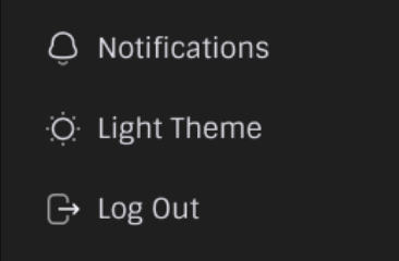
Three elements in this part of the dashboard will differ only in text and icon. Therefore, we can create a new method that will generate the buttons:
|
1 2 3 4 5 6 7 8 9 10 11 |
generateButton(icon, text) { return {rows: [ { view: 'button', css: 'bottom-buttons', value: `<img src=${icon} class="sidebar-icon" style="margin-right: 11px"> <span>${text}</span>`, height: 30 }, {height: 20} ]}; } |
Next, we can describe the layout containing these buttons:
|
1 2 3 4 5 6 7 8 9 |
const bottomButtons = { rows: [ {css: 'menu-background'}, this.generateButton(notificationsIcon, 'Notifications'), this.generateButton(lightThemeIcon, 'Light Theme'), this.generateButton(logoutIcon, 'Log Out'), {height: 8} ] }; |
That’s it. The side menu for our software solution is ready!
Building the Dashboard Header
To build the dashboard header for our solution, we’ll need the template widget we’re already familiar with, the toolbar widget, and the tabbar widget. We’ll describe the layout consisting of three columns. The first two will contain the template widget with the required text. The third one will contain the tabbar widget working as a panel with clickable elements:
|
1 2 3 4 5 6 7 8 9 10 11 12 13 14 15 16 17 18 19 20 21 22 23 24 25 26 27 28 29 30 31 32 |
const toolbar = { view: 'toolbar', height: 68, css: 'toolbar', cols: [ { type: 'header', template: 'Dashboard', css: 'toolbar-header-left', borderless: true }, { type: 'header', template: 'Today', css: 'toolbar-header-right', borderless: true }, { view: 'tabbar', value: 'month', borderless: true, css: 'toolbar-tabbar', optionWidth: 90, width: 270, options: [ { id: 'month', value: 'Month' }, { id: 'week', value: 'Week' }, { id: 'day', value: 'Day' } ] } ] }; |
That’s all the code we need to build the header for our solution.
Building the Dashboard Body
We can use previously created elements to describe the main page structure:
|
1 2 3 4 5 6 7 8 9 10 11 12 13 |
const main = { cols: [ { rows: [{ css: 'sidebar', rows: [header, adminInfo, {height: 6}, menu, bottomButtons] }] }, { rows: [ toolbar, { $subview: true } ] } ] }; return main; |
In this code, we can see the object that contains the following: $subview: true. Subview is a component that can be settled within other components. We’ll place all the content of our page inside it.
Now, inside the views folder, let’s create a new folder named dashboard, where we’ll place all the components of the dashboard body. Inside, create the index.js file where we’ll describe the page structure. It’ll include the layout widget with the space type that comprises three rows, each of which will have a similar component. The first and third rows will contain three columns. The second row will contain another row inside.
Thanks to the Menu plugin, for this solution, we can describe the inner content of these rows and columns as $subview: ‘file in the dashboard folder’. We can right away create files in the dashboard folder, each corresponding to the name of our solution’s component (e.g., projects.js, employees.js, customers.js, etc.):
|
1 2 3 4 5 6 7 8 9 10 11 12 13 14 15 16 17 18 19 20 21 22 23 24 25 26 27 28 29 30 31 32 33 34 35 36 37 38 39 40 41 42 |
import { JetView } from 'webix-jet'; export default class TopView extends JetView { config() { return { type: 'space', css: 'dashboard-layout', paddingY: 14, paddingX: 14, rows: [ { type: 'space', css: 'dashboard-layout', margin: 24, cols: [ { $subview: 'dashboard.projects' }, { $subview: 'dashboard.employees' }, { $subview: 'dashboard.customers' } ] }, { type: 'space', paddingY: 0, css: 'dashboard-layout', rows: [ { $subview: 'dashboard.revenue' } ] }, { type: 'space', css: 'dashboard-layout', margin: 24, cols: [ { $subview: 'dashboard.dug' }, { $subview: 'dashboard.gas' }, { $subview: 'dashboard.oil' } ] } ] }; } } |
Projects (React, Vue.js)
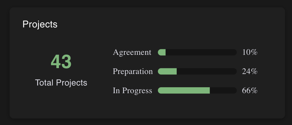
To build the Projects component of the dashboard solution, we’ll need the template widget and layout widget. In the projects.js file, let’s create a class Projects and describe the component header in its config() method:
|
1 2 3 4 5 6 7 8 9 10 |
export default class Projects extends JetView { config() { const header = { view: 'template', css: 'header', borderless: true, height: 24, template: 'Projects' }; } |
Using the template widget, we can describe the inner part of this dashboard component consisting of two blocks. The first one will contain the text with a number, and the second one will contain text and state strings built based on incoming data:
|
1 2 3 4 5 6 7 8 9 10 11 12 13 14 15 16 17 18 19 20 21 22 23 24 25 26 27 28 29 30 31 32 33 |
const totalProjects = { view: 'template', borderless: true, localId: 'projects', css: 'card-info', minWidth: 448, template: (obj) => { const resultArray = []; const leftPart = `<div> <p class='quantity'>${obj.total}</p> <p class='title'>Total Projects</p> </div>`; if (obj.data) { obj.data.forEach(element => { resultArray.push(` <div class='projects-state'> <span style='width: 75px' class='state'>${element.state}</span> <div class='progress-bar'> <div class='progress-bar-result' style="width: ${149 * element.amount / 100}px;"></div> </div> <span class='state'>${element.amount}%</span> </div> `); }); } return ` ${leftPart} <div style='padding-top: 30px'> ${resultArray.join('')} </div> `; } }; |
We’ll use the models folder to allow our solution to store the data. Inside the folder, we can create the projectData.js file with the following code:
|
1 2 3 4 5 6 7 8 9 10 11 |
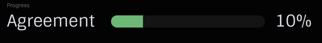
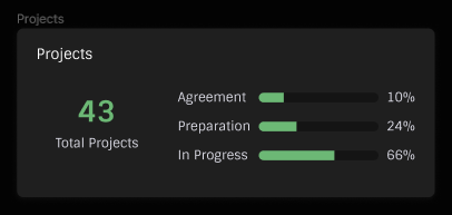
const projectData = [ { id: 1, total: 43, data: [ { id: 2, state: 'Agreement', amount: 10 }, { id: 3, state: 'Preparation', amount: 24 }, { id: 4, state: 'In Progress', amount: 66 } ] } ]; export default projectData; |
Since all required parts of this dashboard component are ready, we can describe the overall structure and implement the data parsing functionality in the init() method. For this, use the following code in the projects.js file:
|
1 2 3 4 5 6 7 8 9 10 11 12 13 14 15 16 17 18 19 20 21 22 23 24 25 26 27 |
const main = { css: 'card', padding: { top: 20, left: 24, right: 24 }, rows: [ header, { padding: { left: 24 }, rows: [ totalProjects ] } ] }; return main; } init() { this.$$('projects').parse(projectData); } } |
That’s how we build the Projects component.
Employees (React, Vue.js)
The Employees component also looks pretty similar, so the code looks pretty much the same: You can use the same approach for building the Customers components, making the required adjustments to ensure they fit our solution and display the data correctly.
|
1 2 3 4 5 6 7 8 9 10 11 12 13 14 15 16 17 18 19 20 21 22 23 24 25 26 27 28 29 30 31 32 33 34 35 36 37 38 39 40 41 42 43 44 45 46 47 48 49 50 51 52 53 54 55 56 57 58 59 60 61 62 63 64 65 66 67 68 69 |
import { JetView } from 'webix-jet'; import employeesData from '../../models/employeesData'; export default class Employees extends JetView { config() { const header = { view: 'template', css: 'header', borderless: true, height: 24, template: 'Employees' }; const employees = { view: 'template', borderless: true, localId: 'employees', css: 'card-info employees', minWidth: 438, template: (obj) => { const array = []; if (Object.values(obj).length) { obj.data.forEach(element => { let icons = []; if (element.employeesIcons) { icons = element.employeesIcons.map((elem, index) => `<span class=${index > 4 ? 'add-icon' : ''}><img src=${elem} style='left: ${index * 19}px'/></span>`); } array.push(`<div style='position: relative'> <p class='quantity'>${element.total}</p> <p class='title'>${element.text}</p> <div class='block-with-icons'>${icons.join('')}</div> </div>`); }); } return ` ${array.join('')} `; } }; const main = { css: 'card', padding: { top: 20, left: 24, right: 24 }, height: 210, rows: [ header, { padding: { left: 12, right: 12 }, rows: [ employees ] } ] }; return main; } init() { this.$$('employees').parse(employeesData); } } |
Customers (React, Vue.js)
You can use the same approach for building the Customers components, making the required adjustments to ensure they fit our solution and display the data correctly.
|
1 2 3 4 5 6 7 8 9 10 11 12 13 14 15 16 17 18 19 20 21 22 23 24 25 26 27 28 29 30 31 32 33 34 35 36 37 38 39 40 41 42 43 44 45 46 47 48 49 50 51 52 53 54 55 56 57 58 59 60 61 62 63 64 65 66 67 68 69 70 71 |
import { JetView } from 'webix-jet'; import customersData from '../../models/customersData'; export default class Customers extends JetView { config() { const header = { view: 'template', css: 'header', borderless: true, height: 24, template: 'Customers' }; const customers = { view: 'template', borderless: true, localId: 'customers', css: 'card-info customers', template: (obj) => { const array = []; const firstPart = `<div> <p class='quantity'>${obj.total}</p> <p class='title'>Total Customers</p> </div>`; if (Object.values(obj).length) { obj.data.forEach(element => { array.push(`<div style='display: flex'> <img src='${element.flag}'/> <p style='width: 100px'>${element.country}</p> <p class='proportion'>${element.proportion}%</p> </div>`); }); } return ` ${firstPart} <div class='all-countries'> ${array.join('')} </div> `; } }; const main = { css: 'card', padding: { top: 20, left: 24, right: 24 }, height: 210, rows: [ header, { padding: { left: 46, right: 36 }, rows: [ customers ] } ] }; return main; } init() { this.$$('customers').parse(customersData); } } |
Revenue (React, Vue.js)
We can use the Webix chart widget to build the dashboard’s Revenue component. It can turn data into different chart types like line, spline, area, bar, pie, 3D-pie, donut, scatter, and radar.
Read Also Best JavaScript Libraries for Data Visualization (Featuring Webix and DHTMLX)
Let’s take a closer look at how this component displays the data:
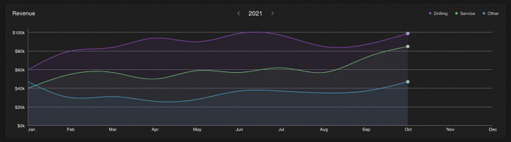
As you can see, the top part contains a header that displays such data as the currently selected year and chart legend. We can build each of them using the template widget. Here’s the code from the revenue.js file that we need for this:
|
1 2 3 4 5 6 7 8 9 10 11 12 13 14 15 16 17 18 19 20 21 22 23 24 25 26 27 28 29 30 31 32 33 |
const header = { view: 'template', css: 'header', borderless: true, height: 24, template: 'Revenue' }; const year = { view: 'template', css: 'header year', borderless: true, template: `<img src='${arrow}'/>2021<img src='${arrow}'/>` }; const legend = { view: 'template', css: 'header legend', borderless: true, template: ` <div> <span style='background: ${colors.drilling}'></span> <p>Drilling</p> </div> <div> <span style='background: ${colors.service}'></span> <p>Service</p> </div> <div> <span style='background: ${colors.other}'></span> <p>Other</p> </div>` }; |
Next, we’ll use the chart widget with type: splineArea property to define the chart type that will be used for data visualization. Using xAxis and yAxis properties, we can define horizontal and vertical axes. We can add objects with value and color properties to describe our diagrams in the series property. According to the layout, we will use additional lines with the spline type to create the volumetric upper part of our diagram:
|
1 2 3 4 5 6 7 8 9 10 11 12 13 14 15 16 17 18 19 20 21 22 23 24 25 26 27 28 29 30 31 32 33 34 35 36 37 38 39 40 41 42 43 44 45 46 47 48 49 50 51 52 53 54 55 56 57 58 59 60 61 62 63 64 65 66 67 68 69 70 71 72 73 74 75 76 77 78 79 80 81 82 83 84 85 |
const chart = { view: 'chart', localId: 'revenue', type: 'splineArea', css: 'chart', height: 389, alpha: 0.08, xAxis: { template: (num) => { return `<span>${num.month}</span>`; }, lines: false, lineColor: '#878595', color: '#878595' }, yAxis: { start: 0, end: 105, step: 20, template: (num) => { return num % 20 ? '' : `$${num}k`; }, lineColor: '#878595', color: '#878595' }, series: [ { value: '#drilling#', color: colors.drilling }, { type: 'spline', value: '#drilling#', item: { borderColor: '#FFFFFF', color: colors.drilling, radius: (obj) => { return obj.month === 'Oct' ? 3 : 0; }, type: 'r' }, line: { color: colors.drilling } }, { value: '#service#', color: colors.service }, { type: 'spline', value: '#service#', item: { borderColor: '#FFFFFF', color: colors.service, radius: (obj) => { return obj.month === 'Oct' ? 3 : 0; }, type: 'r' }, line: { color: colors.service } }, { value: '#other#', color: colors.other }, { type: 'spline', value: '#other#', item: { borderColor: '#FFFFFF', color: colors.other, radius: (obj) => { return obj.month === 'Oct' ? 3 : 0; }, type: 'r' }, line: { color: colors.other } }, ] }; |
Finally, let’s gather all these components together:
|
1 2 3 4 5 6 7 8 9 10 11 12 13 14 15 16 17 18 19 20 |
const main = { css: 'card', padding: { top: 20, left: 24, right: 24 }, rows: [ { cols: [ header, year, legend ] }, chart ] }; return main; |
DugMeters (React, Vue.js)
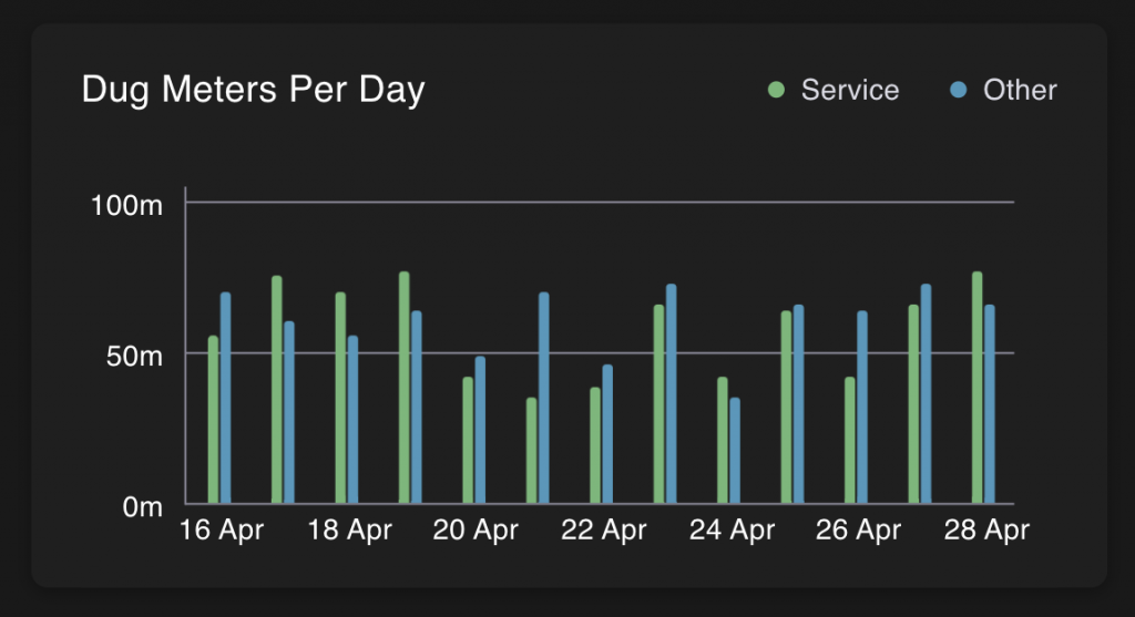
By implementing the DugMeters component, we start dealing with the dashboard elements’ bottom row. We can build it like the previous component using the Webix chart widget. However, our data type, in this case, differs from the previous example. Therefore, in this part of our solution, we can use the type: ‘bar’ property to use another chart type. Also, we can adjust the number of units being compared.
|
1 2 3 4 5 6 7 8 9 10 11 12 13 14 15 16 17 18 19 20 21 22 23 24 25 26 27 28 29 30 31 32 33 34 35 36 37 38 39 40 41 42 43 44 45 46 47 48 49 50 51 52 53 54 55 56 57 58 59 60 61 62 63 64 65 66 67 68 69 70 71 72 73 74 75 76 77 78 79 80 81 82 83 84 85 86 87 88 89 |
import { JetView } from 'webix-jet'; import { dugData, colors } from '../../models/revenueAndDugDatas'; export default class Revenue extends JetView { config() { const header = { view: 'template', css: 'header', borderless: true, height: 24, template: 'Dug Meters Per Day' }; const legend = { view: 'template', css: 'header legend', borderless: true, template: ` <div> <span style='background: ${colors.service}'></span> <p>Service</p> </div> <div> <span style='background: ${colors.other}'></span> <p>Other</p> </div>` }; const chart = { view: 'chart', localId: 'dug', type: 'bar', css: 'chart', preset: 'stick', xAxis: { template: (num) => { return num.day % 2 ? '': `<span>${num.day} ${num.month}</span>`; }, lines: false, lineColor: '#878595', color: '#878595' }, yAxis: { start: 0, end: 105, step: 50, template: (num) => { return num % 50 ? '' : `${num}m`; }, lineColor: '#878595', color: '#878595' }, series: [ { value: '#service#', color: colors.service }, { value: '#other#', color: colors.other } ] }; const main = { css: 'card', padding: { top: 20, left: 24, right: 24 }, rows: [ { cols: [ header, legend ] }, chart ] }; return main; } init() { this.$$('dug').parse(dugData); } } |
GasProduced (React, Vue.js)
For this part of our solution, we’ll use the GeoChart widget. It allows us to display the data related to different countries using Google GeoChart. Also, we should not forget about the header and chart legend:
|
1 2 3 4 5 6 7 8 9 10 11 12 13 14 15 16 17 18 19 20 21 22 23 24 25 26 27 28 29 30 31 32 33 34 35 36 37 38 39 40 41 42 43 44 |
const header = { view: 'template', css: 'header', borderless: true, height: 24, template: 'Gas Produced in the Region' }; const chart = { view: 'geochart', localId: 'gas', key: 'AIzaSyAi0oVNVO-e603aUY8SILdD4v9bVBkmiTg', css: 'chart', tooltip: '', chart: { legend: 'none', colorAxis: { minValue: 0, maxValue: 2, colors: ['#8D44B9', '#4599BD', '#6CB875'] }, backgroundColor: '#1F1F1F', datalessRegionColor: '#39393D', width: 301 } }; const legend = { view: 'template', localId: 'geoLegend', css: 'header legend geo', borderless: true, width: 131, template: (obj) => { const resultArray = []; if (obj.data) { obj.data.forEach(element => { resultArray.push(` <div> <span style='background: ${colors[element.selected]}'></span> <p>${element.value} m<sup>3</sup></p> </div> `); }); } return resultArray.join(''); } }; |
The last step is to combine all the parts to build the component we need:
|
1 2 3 4 5 6 7 8 9 10 11 12 13 14 15 16 17 18 19 20 21 22 23 24 |
const main = { css: 'card', padding: { top: 20, left: 24, right: 24 }, rows: [ header, { cols: [ chart, { rows: [ {height: 50}, legend ] } ] } ] }; return main; |
OilProduced (React, Vue.js)
This component has many similarities with the previous one. It looks the same and works with similar data. This circumstance allows us to implement it like the Gas Produced component with some extra widget configs.
|
1 2 3 4 5 6 7 8 9 10 11 12 13 14 15 16 17 18 19 20 21 22 23 24 25 26 27 28 29 30 31 32 33 34 35 36 37 38 39 40 41 42 43 44 45 46 47 48 49 50 51 52 53 54 55 56 57 58 59 60 61 62 63 64 65 66 67 68 69 70 71 72 73 74 75 76 77 78 79 80 |
import { JetView } from 'webix-jet'; import { countries, oil, colors } from '../../models/gasAndOilDatas'; export default class Oil extends JetView { config() { const header = { view: 'template', css: 'header', borderless: true, height: 24, template: 'Oil Produced in the Region' }; const chart = { view: 'geochart', localId: 'oil', css: 'chart', tooltip: '', chart: { legend: 'none', colorAxis: { minValue: 0, maxValue: 2, colors: ['#8D44B9', '#4599BD', '#6CB875'] }, backgroundColor: '#1F1F1F', datalessRegionColor: '#39393D', width: 301 } }; const legend = { view: 'template', localId: 'geoLegend', css: 'header legend geo', borderless: true, width: 131, template: (obj) => { const resultArray = []; if (obj.data) { obj.data.forEach(element => { resultArray.push(` <div> <span style='background: ${colors[element.selected]}'></span> <p>${element.value} bbls<sup></sup></p> </div> `); }); } return resultArray.join(''); } }; const main = { css: 'card', padding: { top: 20, left: 24, right: 24 }, rows: [ header, { cols: [ chart, { rows: [ {height: 50}, legend ] } ] } ] }; return main; } init() { this.$$('oil').parse(countries); this.$$('geoLegend').parse(oil); } } |
That’s all we need to build the dashboard.
You can download the source code of our Webix solution using the link below. To run the demo, use the npm start command.
Summing Up the Results
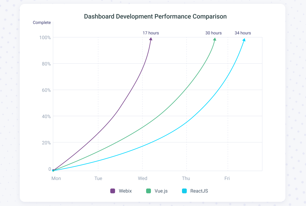
Above, you can see a graph showing relative performance when working with different libraries and hours spent implementing the dashboard. As you can see, creating it with React takes twice as long as with Webix. So, if you decided to develop a dashboard with Webix and started at the beginning of the week, it would be ready by the beginning of Wednesday. In the case of React, you would have to wait until Friday. Let’s find out where this difference comes from.
React doesn’t provide ready-to-use components. Luckily, plenty of third-party components, paid and free, were developed by many companies and enthusiasts. When building a React app, there’s always a choice between implementing a component from scratch and using the made solution. It’s natural to prefer the second option, but the initial impulse vanishes pretty quickly after you estimate how long it’ll take to customize such a solution. Plus, after the product release, you’ll have to customize the component again to adapt it to new functionality. And don’t forget about the bugs. There are always bugs. Spending resources on fixing them is another argument against using third-party components.
Usually, for each project, developers create new components from scratch, except when they need to use complex and standard ones, like grid or scheduler. Other types of components are usually built following the project requirements. That’s what happened in our case. We took three third-party libraries and made the remaining 20 components ourselves. As a result, we spent 34 hours on our React project.
Vue.js is similar to React in many aspects because it was one of the sources of inspiration for Vue.js creators. That’s why many features specific to React can also be found in Vue.js. For instance, Vue.js delivers no ready-to-use components, but you can choose paid or free third-party solutions. Once again, you must decide which option will work best for you.
With ready-made components, you can deliver the functional app faster to demonstrate to first customers or potential investors. But this path also brings multiple difficulties when fixing bugs or customizing something. You can’t escape this fate since all projects have bugs and change requests. Therefore, components are often written from scratch, except for complex and more or less standard ones, such as grids or Gantt charts. In our Vue.js project, we used two third-party components and wrote the remaining 21 components ourselves. As a result, we spent 30 hours, which is slightly less compared to React.
Webix provides access to a wide range of widgets. There’s more than enough to create our dashboard without installing third-party libraries. And since all widgets are supplied in one package, they are consistent and easy to work with. If the dashboard included, for example, a complex chart that can’t be found among Webix widgets, it would be necessary to use a third-party library like Highcharts.
The availability of many widgets significantly speeds up and simplifies the development process. Moreover, using Webix UI Designer simplifies app styling to suit project requirements. However, widget customization may still be necessary, and it can most effectively be carried out by the Webix library developers, which means us. All these features of Webix resulted in 17 hours of development time since no customization was required.
Conclusions
The speed and efficiency of building a project with a library that offers all the necessary components in one package are high. While React and Vue.js developers were still working on their components, the Webix developer had already done everything, took some coffee, and offered his ideas for expanding the dashboard functionality. Development speed is one of the most important criteria for choosing a specific technology for your project, but there are others you should consider. Only you know the complete list of all requirements and their importance for your project, so the final choice is yours. Our mission was to help you avoid choice overload as efficiently as possible. Contact us if you struggle to find a suitable library for your project.