Economic Research Tool with Data Visualization Features
A comprehensive web-based tool for the analysis of core economic indicators and financial info with smart data visualization features. The application allows users to analyze leading economic indicators and financial data quickly and efficiently. Users can create personal insights using extensive data series.
Business Challenge
At some point, the vast amount of analytical info that you’ve collected during your work may turn from a source of insights into a useless jumble of data. One of the possible reasons for this is the absence of full-featured data analysis software. Its analysis and easy-to-understand visualizations can provide a fresh look at the endless lists of economic indicators.
Our development team was asked to build a comprehensive tool to provide better data visualization and analysis of economic and investment data. The app should have an intuitive user interface, provide advanced searching and filtering features, and allow users to visualize large amounts of information in charts, maps, tables, and diagrams. We were asked to develop an analysis and visualization tool that can work with more than 4 million data series accumulated from 1,500 information sources without any lags or glitches. Each user would be able to create individual insights that visualize the required information. Another requirement was to replace the existing obsolete software with this new platform and ensure painless data migration.
Solution
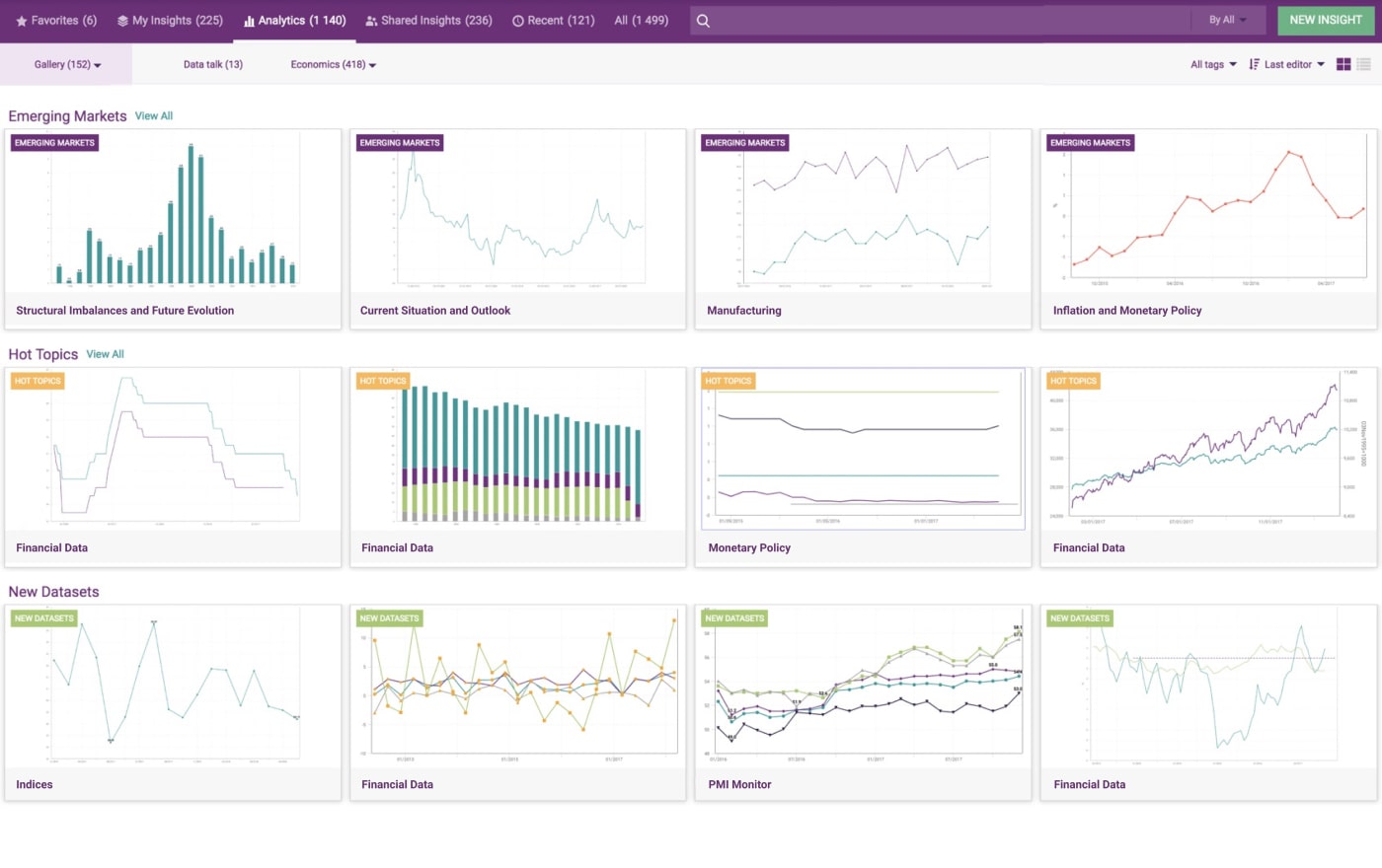
XB Software’s development team has developed an efficient solution that allows users to analyze important indicators and create personalized insights. The app consists of several main parts intended for data discovery, its further transformation, visualization, or extraction, and collaboration between users. The smart searching system enables users to find core economic and financial indicators required for analysis and reporting. For example, the system’s advanced filtering options allow users to review all recently updated or recently added economic indicators. With this system, users can perform the following operations:
- smart searching and easy visualization
- database browsing via a structured tree
- grouping series by custom indicators for simple analysis
- multi-dimensional filtering
- economic mapping of search queries
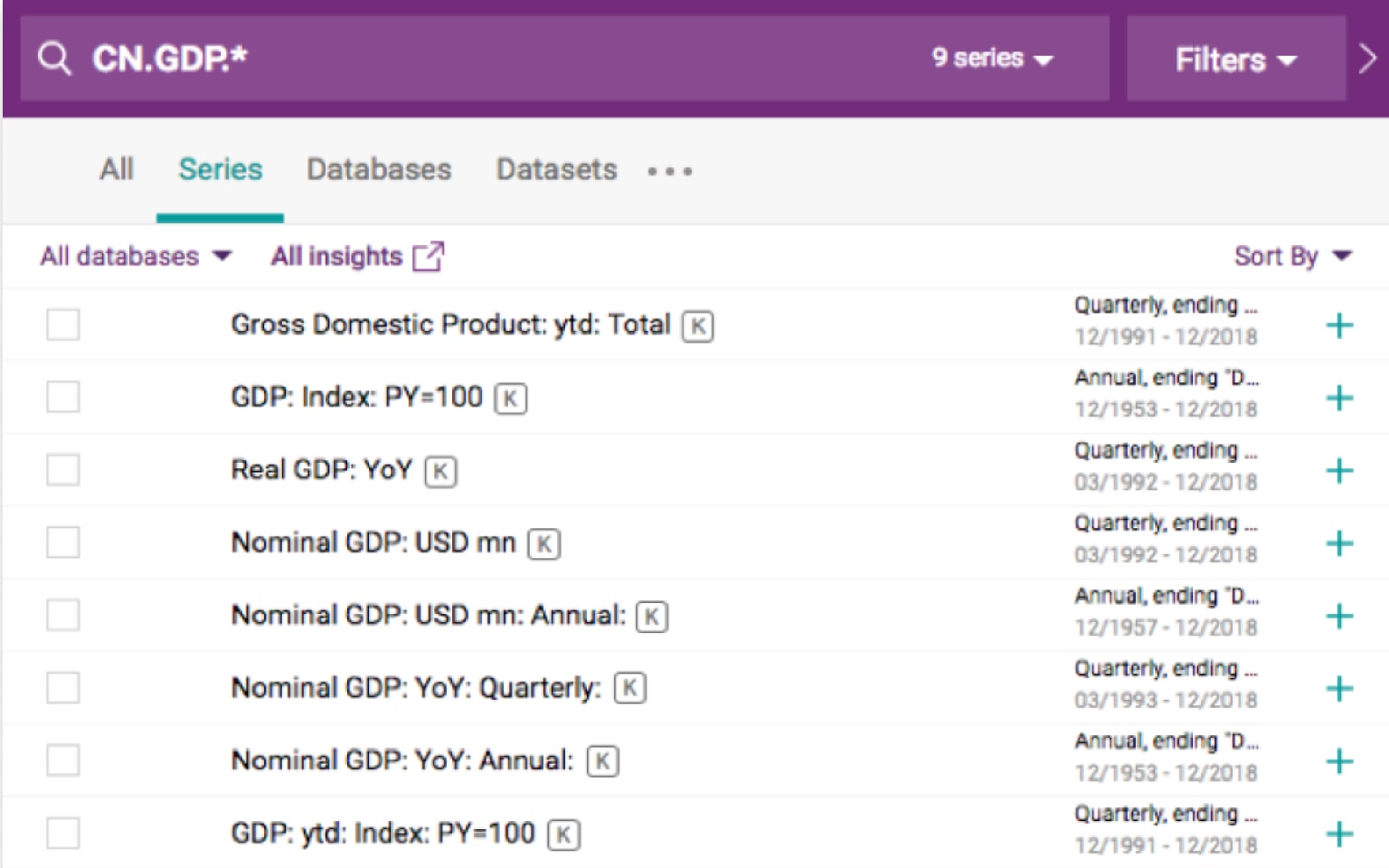
Users can input mnemonic codes in a search bar. While typing, the app will add suggestions to guide a user through the available options. For example, you can type CN.GDP.* to get all records related to China and the GDP indicator. Also, mnemonic codes can be used in an Excel table for smart and quick reports generation.
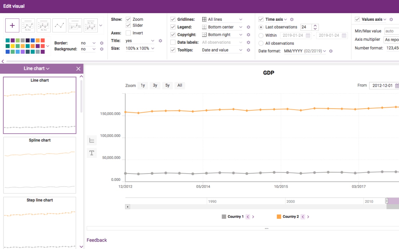
Drag-and-drop support allows users to move data from the Data Discovery section to the Data Selection area and visualize it as a list or data table in the blink of an eye. The system provides users with different types of data visualization. Among the available options, there are charts (with a pie chart recently added), tables, map, heatmap, histogram, and more. Users can choose custom colors for maps and define custom data labels.
Each user can either choose from a predefined list of options or create a custom visualization. The application allows them to change the following visualization aspects:
- chart type
- color palettes
- legend
- tooltips
- time axis
- value axis
Users can apply economic and mathematical functions, use quick calculations, and make economic forecasts and custom visualizations with a couple of clicks. For example, there’s a currency conversion function that supports US Dollars, Japanese Yen, UK Pounds, and other currencies. A built-in function editor lets users change the parameters of available functions. Also, the app supports data analysis tools such as Matlab and R.
All generated Insights, reports, and visualizations can be downloaded in these formats:
- Excel
- CSV
- PNG
- JPG
Also, you can create a visualization from the selected series right from the download window. For better customer support, the Email Us window lets you attach images or files. Also, you can send an email to several recipients from your team to invite them into a discussion with developers. To achieve these goals, developers have used the Webix UI library, PhantomJS, Backbone.js, Docker, AWS Elastic Beanstalk, and other cutting-edge technologies.
Interested in developing a similar solution or have your own idea in mind?
We are ready for any challenge, just contact us!

Project in Figures
8+
Months
Duration
Duration
13000+
Estimated
man-hours
man-hours
Applied Technologies


Result
Our development team has broad experience in creating custom data visualization solutions. Users can use our advanced searching and filtering features to access the economic indicators they require. Built-in mathematical functions significantly expand the possibilities of this system. All important indicators can be visualized in various ways. According to the feedback received from our customer, the adoption of this system allowed them to improve teamwork and collaboration thanks to smart alerts on information updates, sharing modes, and other features.
This solution allows users to:
- access any piece of data and create visualizations in a click
- discover underlying trends more efficiently
- make data-driven decisions
Let’s Talk About Your Project
What's next?

Vitaly Hornik
COO at XB Software, Ph.D. in IT (Computer Science), PMP
We don’t just deliver projects — we build partnerships.
What's next?
Requirements
A sales manager will contact you to understand a vision.
01
Estimation
We provide a detailed plan, timeline, and cost estimate.
02
Agreement
We finalize the contract and begin working immediately.
03