Summary
The article argues that modern web apps built with React enable highly interactive, real-time data visualization, overcoming the limitations of legacy reporting tools. Using React’s component-based architecture and a rich ecosystem (like Redux, Recharts, D3.js), developers can turn complex data into responsive dashboards that scale seamlessly. This approach streamlines decision-making by giving teams fast, intuitive access to actionable insights.
Timely and accurate data analysis is irreplaceable for smart decision-making. However, many businesses rely on tools that hinder their growth. For instance, legacy systems with outdated interfaces and limited reporting capabilities make extracting meaningful insights from data pretty challenging. Transitioning to a modern web app means enjoying a more intuitive and responsive experience. Such a leap streamlines data presentation and empowers decision-makers to respond quickly to market changes.
The question is what tech to choose for implementing a data visualization tool suitable for current needs and flexible enough to face upcoming challenges. React is currently on fire and not without a reason. Thanks to its component-based architecture, it enables developers to build interactive, scalable, and easily maintainable user interfaces. By breaking down complex data into reusable components, React makes it possible to integrate real-time data streams and dynamic visualizations that turn raw numbers into actionable insights.
Today, we’ll explore how React helps build scalable and user-friendly web applications for data visualization and reporting.
Challenges That Legacy Systems Cause
For many, legacy systems are a double-edged sword. While they may have served their purpose in the past, these outdated tools often become bottlenecks as businesses grow. Here are the most common challenges decision-makers face with legacy systems:
- Lack of Scalability. As your business grows, these systems struggle to handle increased data volumes or user demands, leading to performance issues and operational inefficiencies;
- Poor Integration Capabilities. If you rely on CRMs, project management software, analytics platforms, and other tools, we have bad news. Legacy systems often lack APIs or compatibility with newer technologies, making integration a costly and time-consuming ordeal;
- Outdated User Experience. Clunky interfaces and limited interactivity frustrate users and reduce productivity. In an era where sleek, intuitive designs are the norm, outdated systems can make even simple tasks feel cumbersome;
- Manual and Inefficient Reporting. Many legacy tools require manual data entry and offer limited reporting capabilities. Generating insights often involves exporting data to spreadsheets, leading to errors, delays, and missed opportunities for real-time decision-making;
- High Maintenance Costs. Everything, from patching security vulnerabilities to hiring specialists familiar with outdated technologies will increase costs quickly. Pretty often, these spends won’t even deliver significant value;
- Limited Accessibility. Desktop-based systems tie users to specific devices or locations. In today’s remote and mobile-first world, this lack of accessibility can hinder collaboration and flexibility;
- Fragmented Data Silos Many legacy systems store data in isolated silos, leading to information fragmentation. Without a unified data repository, organizations face significant hurdles in aggregating and analyzing data effectively. This disjointed approach hampers the ability to generate comprehensive insights and slows down decision-making processes.
Read Also: Dangers of Data Silos And Efficient Strategies for Eliminating Them
For decision-makers, these challenges aren’t just technical. They’re strategic. Outdated tools slow down operations, limit innovation, and ultimately impact the bottom line. The good news? Modern web applications built with technologies like React offer a way out.
Modernizing Data Visualization with React
React JS development has become a go-to solution for building modern web applications. One of its most significant advantages is its component-based architecture. This design philosophy allows developers to decompose complex interfaces into smaller, self-contained components. As a result, these components can be reused across the application, speeding up development time and simplifying maintenance.
A key benefit of using React for data visualization is its capability to handle dynamic, real-time data efficiently. React’s virtual DOM and effective state management ensure that updates are processed swiftly and seamlessly. This means that as data streams in from various sources, interactive charts and dashboards update in real time, providing users with the latest insights without lag or disruption.
React’s robust ecosystem further enhances its appeal. With a wide range of libraries available, such as Redux for managing application state and various charting libraries like Recharts and integrations with D3.js and Highcharts, developers have a comprehensive toolkit at their disposal. These resources enable the creation of sophisticated, interactive visualizations that can be tailored to specific business needs.
Another major advantage is React’s focus on building responsive and adaptive user interfaces. Modern businesses demand applications that perform well across all devices, from large desktop monitors to smartphones. React’s flexible design ensures that data visualization apps maintain their integrity and usability regardless of screen size or device type, which is critical for decision-makers who need access to insights on the go. Moreover, using motion UI in React applications allows enhancing user experience even more thanks to various animation and transition effects.
React empowers organizations to overcome the limitations of legacy systems. By providing a modern, modular, and efficient framework, it enables the development of data visualization applications that are not only visually appealing but also highly functional and scalable. This modern approach transforms static, outdated reporting tools into interactive platforms that drive smarter business decisions and foster innovation.
Core Features of a Modern React JS Data Visualization And Reporting App
Modern data visualization applications are designed to provide deep insights through interactive and responsive interfaces. Here are the core features that define such React web applications.
Interactive Dashboards
At the heart of a data visualization app lies an interactive dashboard. This feature allows users to explore data dynamically through customizable widgets, charts, and filters. Users can drill down into data points, toggle between different views, and apply real-time adjustments to gain a granular understanding of the information. An interactive dashboard transforms static reports into engaging, self-service tools that empower users to uncover trends and insights independently.
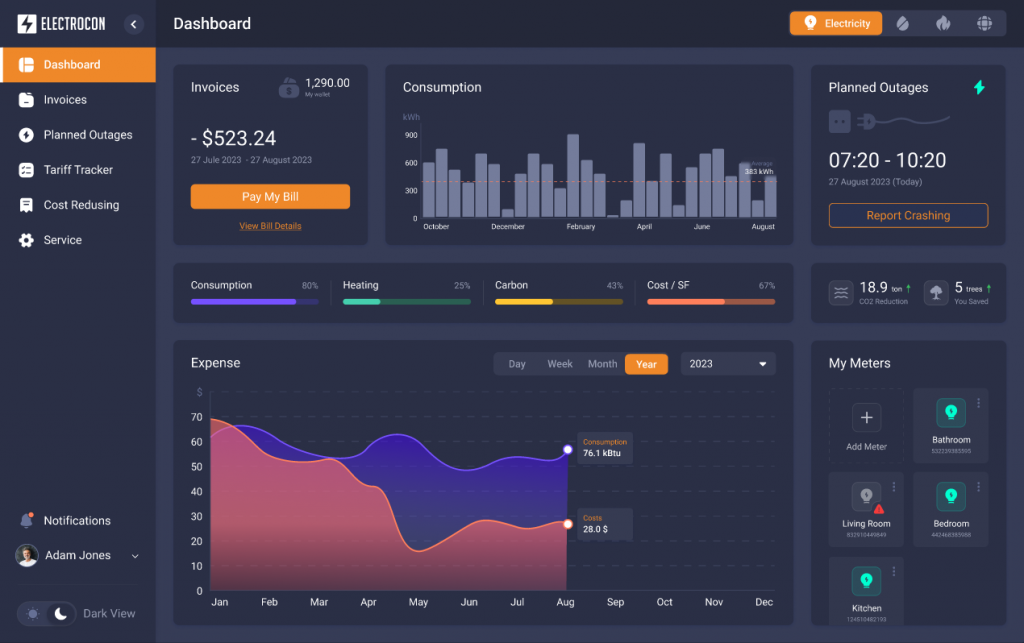
Source: Custom Energy Management Software
Dynamic Reporting Capabilities
A modern app offers dynamic reporting features that enable users to create, modify, and export customized reports with ease. With flexible report templates, users can design visualizations that highlight key metrics and performance indicators tailored to their specific needs. These dynamic reports are updated in real time as new data becomes available, ensuring that decision-makers always have the most current insights at their fingertips. Exporting reports in multiple formats (e.g., PDF, Excel, or PNG) can also invest in more efficient sharing and collaboration among the team members.
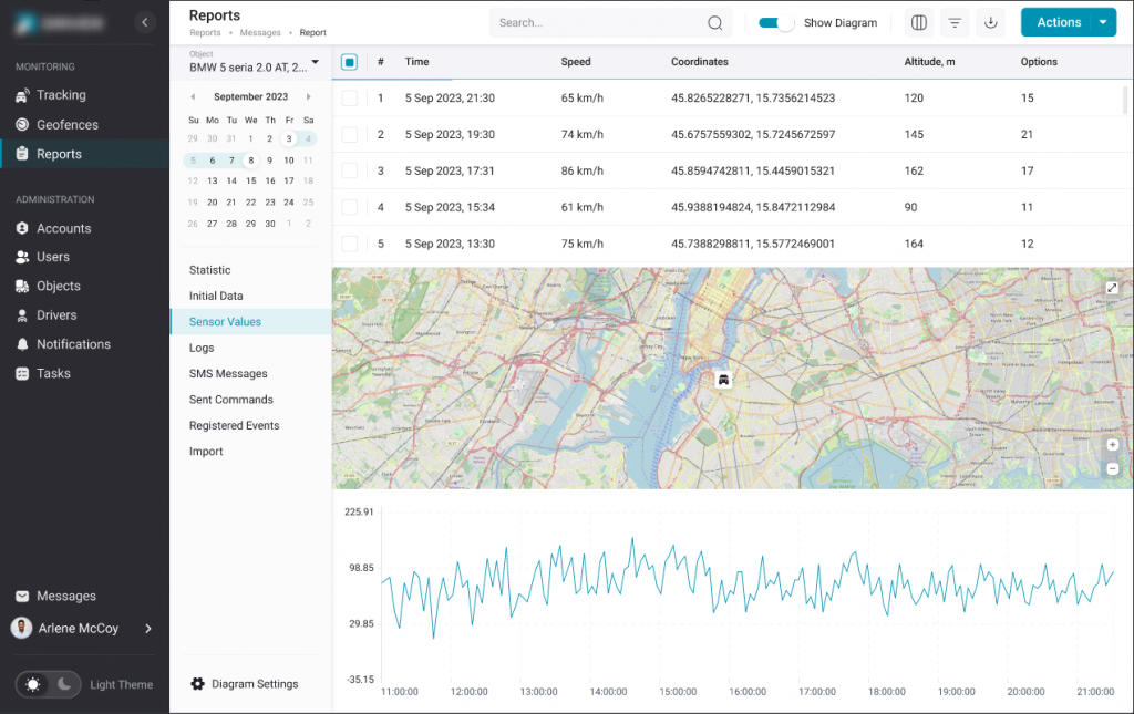
Source: Traccar-Based GPS Tracking System
Responsive and Adaptive User Interface
A responsive design is critical in today’s multi-device world. Modern data visualization apps are built with adaptive user interfaces that seamlessly adjust to various screen sizes and devices, from desktop monitors to smartphones. This ensures that users enjoy a consistent, intuitive experience regardless of where or how they access the app, promoting greater accessibility and user engagement.
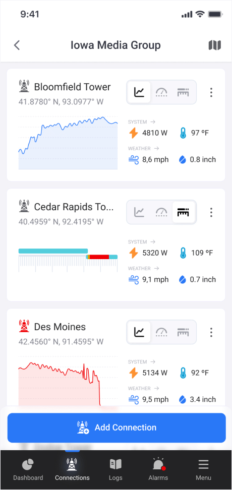
Source: Legacy App Modernization for TV Tower Data
API Integration and Cloud Scalability
Seamless integration with external APIs and cloud services is another essential feature. Modern visualization apps connect to diverse data sources, be it databases, IoT devices, or third-party platforms, to pull in real-time information. Leveraging cloud infrastructure ensures that the app can scale effortlessly, handling increasing volumes of data and user activity without compromising performance.
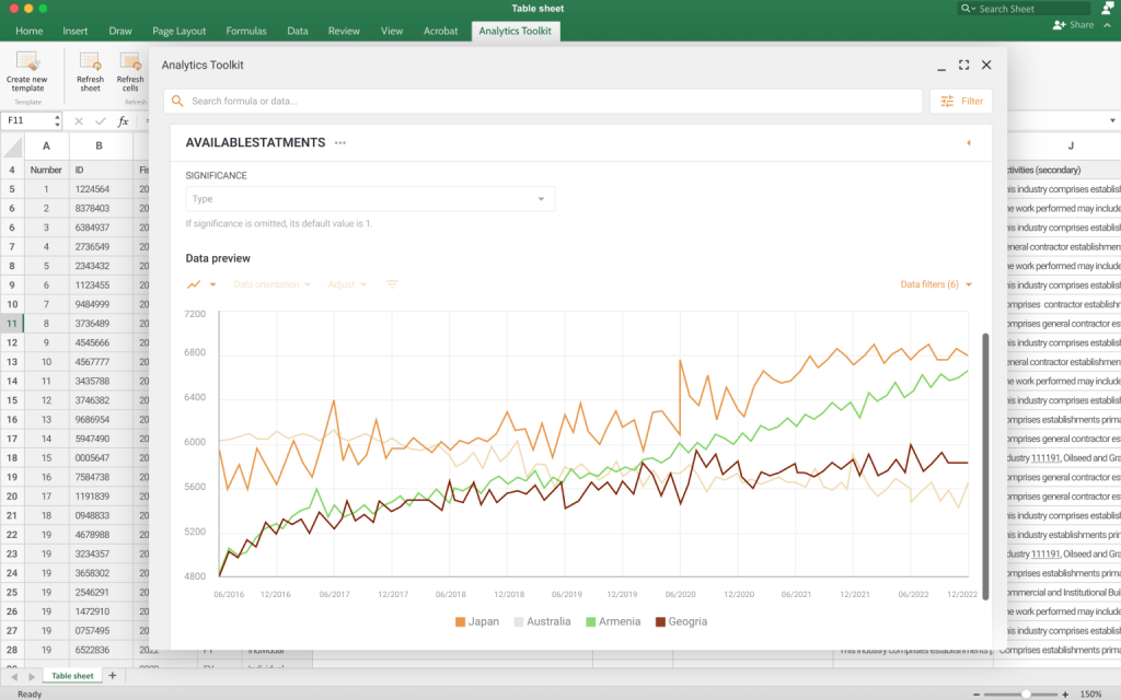
Source: Excel Add-In With Access to Real-time Data via API
Robust Data Security and Management
Lastly, modern data visualization applications incorporate robust data management and security protocols. This includes data encryption, role-based access control, and compliance with industry standards to protect sensitive information. Efficient data aggregation and processing mechanisms further ensure that insights are not only timely but also accurate and secure. Audit trails are date and time-stamped records of the history and details around various transactions and work events that can become pretty helpful for accountability and troubleshooting.
Best Practices We Follow to Deliver Top-Notch React JS Applications
Building a high-quality React JS application goes far beyond writing components — it requires a structured approach to architecture, performance, state management, and data handling. Below are the core best practices our team follows to ensure React apps stay fast, scalable, and maintainable, even when dealing with complex data visualization and real-time interactions. These principles help us deliver solutions that feel smooth for users and remain easy to extend as business needs evolve.
Challenge
One of the first challenges in building a data visualization app is creating a user interface (UI) that is both flexible and maintainable. With React’s component-based architecture, we tackle this challenge by breaking down the UI into modular, reusable components.
Data visualization apps often require complex UIs with multiple interactive elements, such as charts, grids, filters, and so on. Without a modular approach, the codebase can quickly become unwieldy, making it difficult to maintain, update, or scale the app as business needs evolve.
Solution
We design the UI as a collection of reusable components, each responsible for a specific function. For example:
- A <ChartWrapper /> component that can render different types of charts (e.g., bar, line, pie) based on the data provided;
- A <DataGrid /> component for displaying tabular data with sorting and filtering capabilities;
- A <FilterPanel /> component that allows users to dynamically adjust the data being visualized.
By breaking the UI into smaller, self-contained pieces, we ensure that each component is:
- Reusable: The same component can be used across different parts of the app, reducing duplication and saving development time;
- Maintainable: Updates or bug fixes can be made to a single component without affecting the rest of the app;
- Testable: Each component can be tested in isolation, ensuring reliability and consistency.
Challenge
Data visualization apps often rely on dynamic data that changes frequently. This could include real-time data updates (stock prices, sensor readings), user-driven interactions (filtering, sorting, or drilling down into data), asynchronous operations like API calls or database queries. Without proper state management, the app can become slow, unresponsive, or difficult to debug.
Solution
For apps with complex state logic, we use Redux to centralize state management. This ensures that data is consistent across the app and can be accessed from any component without prop drilling. By using a unidirectional data flow, Redux simplifies debugging and helps maintain a predictable state.
To optimize performance we can, among other things, prevent unnecessary re-renders and improve performance. For this purpose, we use memoization with React.memo or useMemo to cache expensive calculations. Further, debouncing postpones the execution until after a period of inactivity, while throttling limits the execution to a fixed number of times over an interval. Also, we implement lazy loading for components or data that are not needed immediately.
Challenge
Choosing the right data visualization library is crucial for building an app that is both powerful and user-friendly. Data visualization apps require charts and graphs that are not only visually appealing but also highly interactive and performant. We carefully evaluate the needs of each project to choose the suitable library, and our choice mostly lies between Highcharts and D3.js.
Solution
We choose Highcharts when we need simplicity and speed. It’s ideal for those customers who need quickout-of-the-box solutions. The official highcharts-react-official wrapper helps seamlessly integrate Highcharts with our React components. It encapsulates Highcharts configurations within a React-friendly interface, which simplifies the process of rendering charts as components. A simple API and pre-built chart types make it easy to get started. Features like tooltips, zooming, and drill-downs are built-in, requiring little additional code. Our developers use React’s state and props to dynamically update the chart when data changes.
Read Also Clash of the Libraries. Building a Data Dashboard with React, Vue.js, and Webix
Unlike Highcharts, D3.js doesn’t offer pre-built components, which gives us the flexibility to design bespoke visualizations. This is ideal when we need to implement unconventional data representations or highly customized animations that go beyond the capabilities of standard libraries. It suits better to customers who consider performance, scalability, and flexibility their critical requirements.
Challenge
Large datasets can quickly become a performance bottleneck, leading to slow rendering, unresponsive interfaces, and frustrated users. Visualizing large datasets (e.g., thousands or millions of data points) can strain both the browser and the app’s infrastructure. To overcome this, we rely on a combination of frontend and backend strategies that help us optimize performance and ensure a seamless user experience.
Solution
To reduce the load on the browser, we process and optimize data before rendering it. Key techniques, for example, include data aggregation, where we summarize large datasets into smaller, meaningful chunks (e.g., daily averages instead of raw hourly data). Lazy loading, once again comes to help when we need to load data incrementally as the user interacts with the app.
To save resources, for grids and lists, we render only the visible rows or columns using libraries like React Window. It reduces the number of DOM elements and improves performance. Using Web Workers we can offload heavy computations (e.g., data processing or calculations) to background threads to keep the main thread responsive.
To minimize the amount of data sent to the client, we handle as much processing as possible on the server. Pagination allows sending data in smaller, manageable chunks instead of loading everything at once. Caching allows us to store frequently accessed data in memory (e.g., using Redis) to reduce database queries and improve response times.
Conclusions
Building a data visualization app with React is a powerful way to transform raw data into actionable insights. By leveraging React’s component-based architecture, integrating the right libraries, and optimizing for performance, we create scalable, user-friendly solutions that empower businesses to make smarter, faster decisions.
From designing reusable components to handling large datasets and ensuring seamless interactivity, every step of the process is tailored to meet the unique needs of small-to-medium businesses and startups. Whether you’re modernizing a legacy system or building a new tool from scratch, React provides the flexibility and performance you need to stay ahead in today’s data-driven world.
Ready to take the next step? Contact us today to discuss how we can help you build a data visualization app that drives results. Let’s turn your data into a competitive advantage together.