Summary
The article highlights how misleading data visualizations can distort truth—using tricks like truncated axes, cherry-picked data, and over-complicated charts to fool viewers. It explains common pitfalls (e.g., wrong chart types, inconsistent scaling, and visual “chartjunk”) and shows how these design failures undermine trust, clarity, and the integrity of data. The piece also provides practical advice for designing honest, accurate, and clear data visuals that avoid these deceptive practices.
Data visualization plays a significant role in many parts of business, whether you just begin your first startup or have been leading a large enterprise for decades. With the right data visualization tools, a company can provide both its employees and customers with the data they need in order to have a better understanding of the company’s opinion, internal processes, and goals. Charts, bars, hierarchical diagrams, and other methods that are used for presenting information graphically help to get quick insights and analyze the needed data more efficiently.
We see the usage of data visualization methods everywhere: on billboards, TV, Internet, at work, in video games. But not every visualized data can be clear and easy to understand. Sometimes the creators of pie charts use wrong statistics, a 3D chart can be used inappropriately, or bar graphs may showcase misleading data. Any UX/UI designer or any other specialist who has the task to deal with the visual presentation of any data should be careful and not be caught on the hook of misleading data visualization. Therefore, let’s look at some examples of how you should not combine data analysis and design.
Sharing the Good News First
Before we show you what you shouldn’t do when developing custom software or when you are free to say ‘goodbye’ to an outsourcing company that showed you the results of its work, let’s please our eyes with the proper example of data visualization.
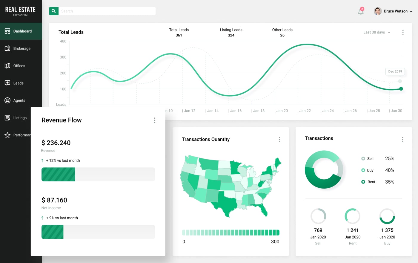
Source: 360° ERP System for Real Estate
What is wrong with this example, you may ask? Nothing, that’s the point. When a data visualization tool presents data properly, you will not question the accuracy of the showcased details and will understand how to read the data instantly. All the graphs are clear, and you absorb the information without issues. That’s how it should work, but sometimes we can run into misleading data visualization. That is why it is vital to follow common design principles, know how visual elements can impact user’s actions and decisions, as well as be able to not overdo with data visualization elements during the custom software development process.
Read Also Data Visualization Software: Making Visual Representation of Your Data Effective
If your software has bad data visualization, it will lead to certain failures and misinformation. Let’s take a look at which mistakes should be avoided in order to not guide a user to inefficient actions and wrong decisions:
- Invalid insights and data overload
If a dashboard of a solution shows the data that is irrelevant to a user or there is too much information to grasp, it will be bewildering to navigate and fully understand the implemented features. Don’t use too many different variables, categories, colors, and unsuitable visualization formats within a single image or page, because it might distract users.
- Unclear data and messy graphs
When a bar graph or a donut chart jumps at you with too many lines, colors, and parameters, it confuses and looks disorganized. Just imagine that you made a website that represents your real estate business, and you need to know the statistics on how many users visit your site each day and which countries they are from. You open your company’s software that you use for internal analysis, and you see a pie chart with over 50 different parts in it. You won’t simply understand where to start with, what to look at, and if you even need so much information at once when you just want to know the top 3 countries your users are from. It is very misleading.
- Inability to reveal weaknesses and pitfalls
It is impossible to improve and correct interrelationships between elements and data without having a good visual presentation. Misleading data visualizations, in most cases, create so much confusion that you won’t be able to understand where even the solution can be advanced. When you have every element in its place, you will be able to see opportunities without any distraction.
There are many techniques that you can follow and many imperfections that you should avoid. The variety of technologies that can be used during the development of a dashboard or a whole individual solution is also wide. Such options as React JS, Webix, DHTMLX, or other libraries and tools are utilized by many companies from different industries. It is possible to develop an application with good data visualization, which will help users to feel like they are on top of the world, because they now know the details they were interested in.
Read Also Best JavaScript Libraries for Data Visualization (Feat. Webix and DHTMLX)
Examples of Bad Data Visualization
If you don’t want to include bad data visualization elements and are ready to know how to improve your product, the best way is to look at the bad examples. Thus, you will be able to understand what you surely don’t want to see on the dashboard on your screen. So, let’s explore some interesting choices of using data visualization tools and discuss why they are misleading. Be prepared to be confused.
Example #1. The Cake Is a Lie
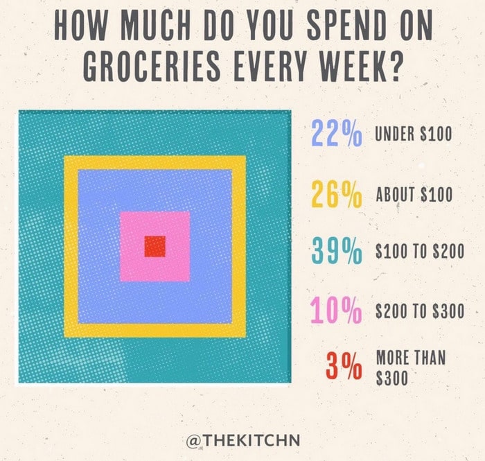
Sometimes, it is better to just make a simple bar or even a table with a couple of columns so that something like this won’t happen. Apparently, the designer was so eager to create a new version of a pie chart and so confused about which information is more important, the percentage or the amount of money, that they lied to viewers. 39% became equal to 22%, while 10% took more place than 26%.
This is very confusing and misleading data for a customer. The question is about the money that was spent, but the percentage jumps right into your face screaming about the colors it uses. As a result, it is not so simple to answer the question, and your brain is fatigued of figuring out what is going on.
Example #2. To Bee or Not to Bee
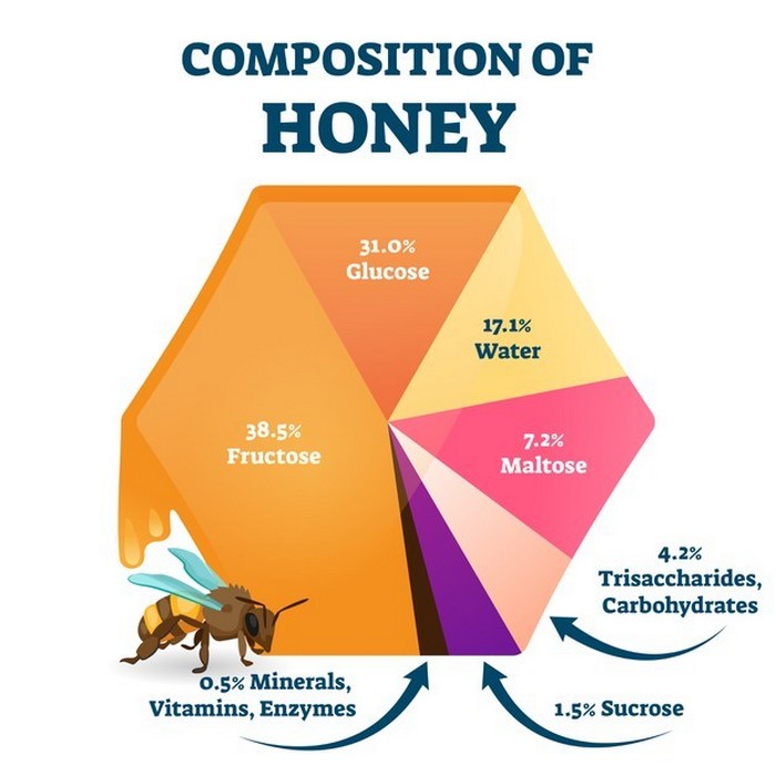
Bees make an important contribution to our planet, but what is the contribution of this pie chart? The sizes of the parts that were divided are not even closely the same as the indicated percentage. The part with 38.5% is more than two times larger than the part with 31%, which is hugely misleading information. Especially, considering that the size of the parts with 31%, 17.1%, and 7.2% is very similar. Thus, we have a beautiful but misleading design with incorrect data. As you can see, it can be really difficult to create various graphs manually, which is why data visualization tools exist.
Example #3. On Second Thought…
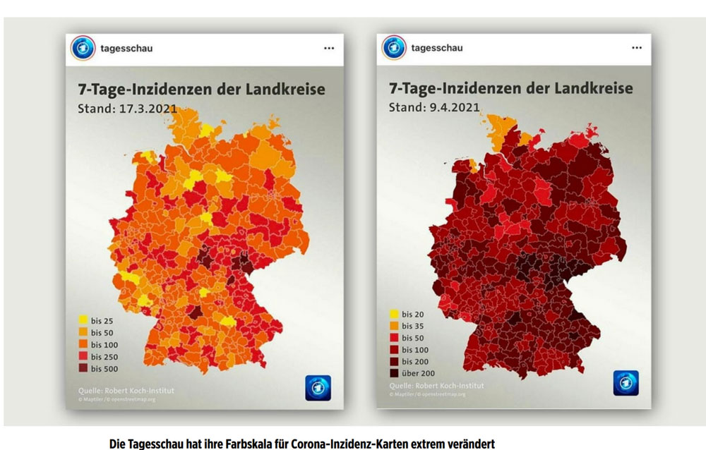
Here, we have the graph shown on German news about the outbreak of Coronavirus, which can genuinely be terrifying because of its visuals. The first graph is a perfect example of good data visualization. It is possible to see clearly where the outbreak has its most impact and where the least. But only a month later, a designer changed their mind, and we have just a map with only red dots. It misleads you easily, because you are starting to think that the situation is a lot worse than it was before. But then you see the numbers that are shown at the left corner and can analyze the data better.
This is not the right reaction that a viewer should have. Unless this was the exact intention of the image. Every color has a certain impact on a viewer, and red color is always associated with danger, which is why designers have to use it with caution. It is a common practice to use some secrets that can lead a user to the place you want. But the best practice is when a user doesn’t know about it, which is not the case in this example.
Read Also Using Human-Centered Design to Create Better Products (ex. Migraine Tracking App)
Example #4. Like a Fish Needs a Bicycle
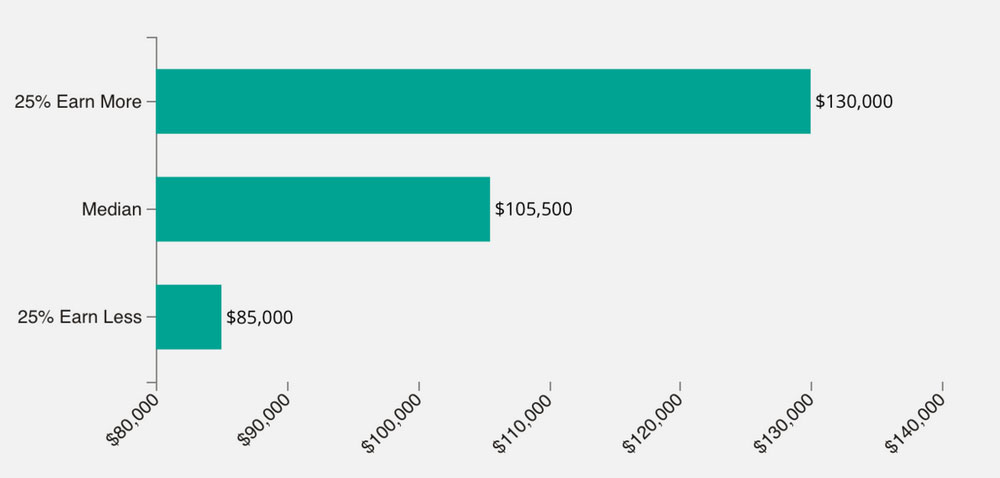
Imagine you are looking through available positions that will suit your professional skills, you open the new tab in your browser to know the average salary for a position you like, and you see this. Can you find the reason behind creating such a pointless bar chart? Probably, the reason was to insert at least some visual element in order to give your eyes some rest from the text. However, it doesn’t make any sense, because a description for any position is usually not so long to read. This image is as pointless as if there was a sticker of a bus with the text ‘It’s a Bus’ on it, which is glued on a real bus. That is why it is important to understand which information has to be analyzed by your software and why the data should even be analyzed.
Example #5. Going Overboard
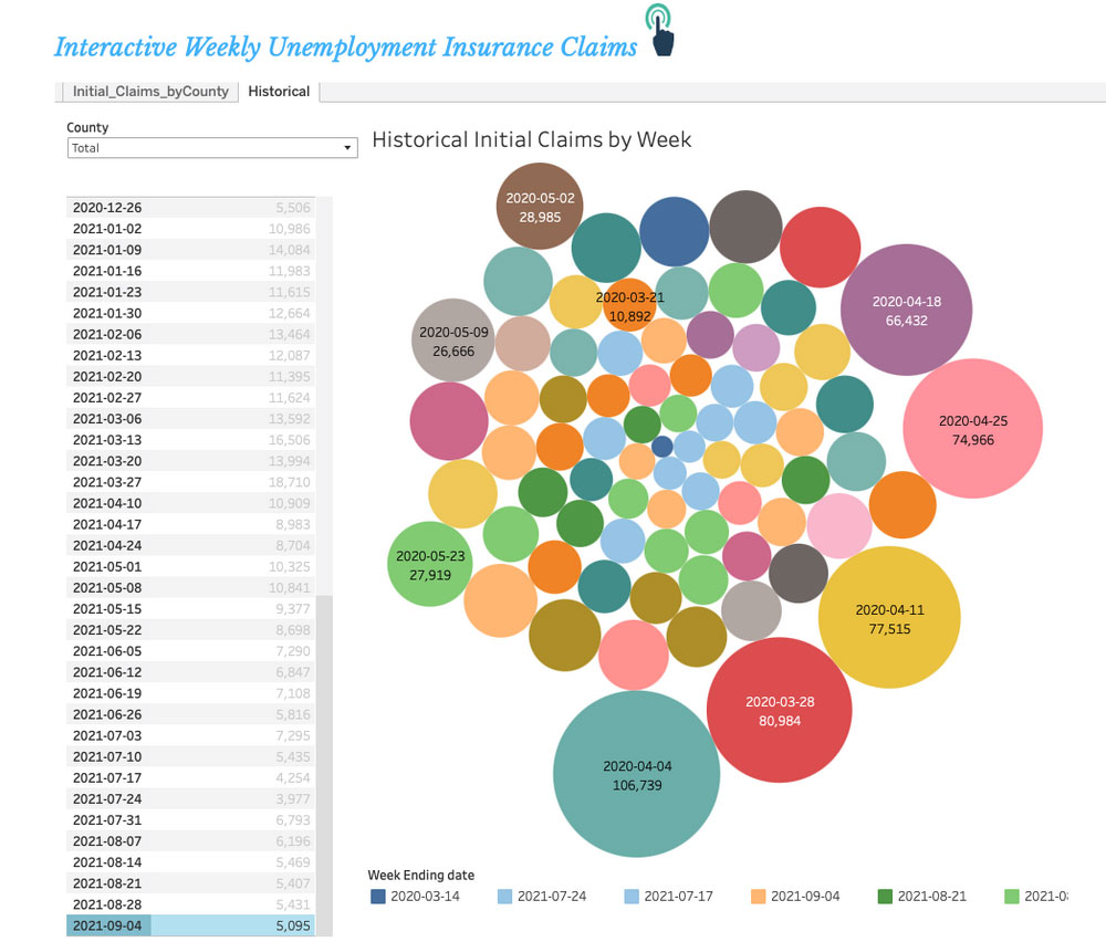
This is another bad example of when a designer wanted to think of a new usage of charts and made a pool of colorful dots. Can you find which ones represent the date ‘2020-03-14’? Are you sure that this is the blue dot that is at the top? Or, is it the small blue one that is right in the center? And, what about 8 light green dots, and why are they of different sizes as well? Which dates do they represent? It is really hard to navigate in this cluster of randomly colored dots of different sizes. This is not how it should be for a user. It should be intuitive, clear, and simple.
Example #6. A Rainbow-Colored Tornado
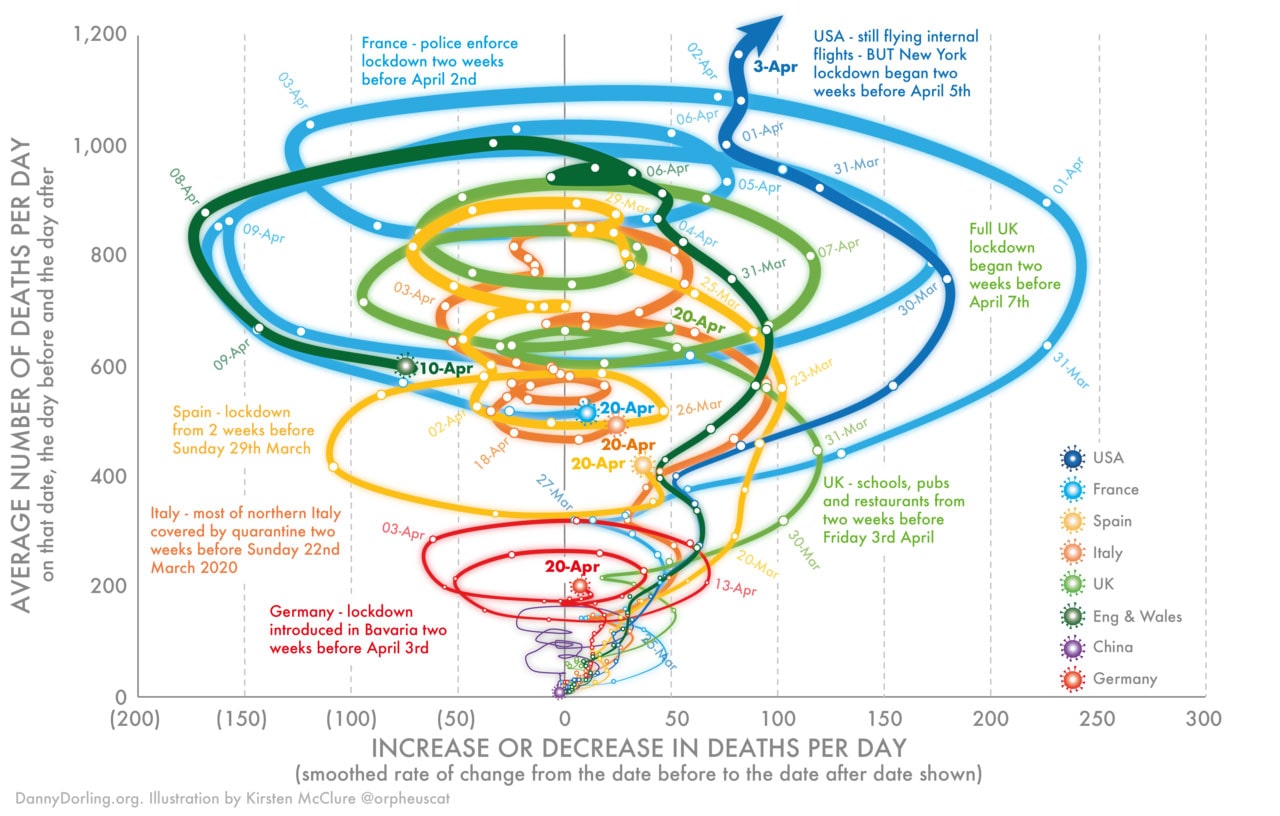
This is another example of an interesting but really bad design. Everything is all over the place, and the graph turned into a tornado. There are circles, lines, text, numbers – every variable you could imagine. The graph clearly gives a viewer an overload of information. Besides that, it shows an individual ‘line’ for England & Wales, while also has the ‘line’ for the UK. Why two parts of the United Kingdom were simultaneously included in two separate statistics is unknown. Just like it is unclear which countries and dates 4 closely-spaced circles represent right in the center of the graph where 600 and 0 meet.
Read Also Using Dynamic Tables for Advanced Data Modeling and Analysis
Conclusion
Creating data visualization tools for your solution is an important process that your team needs to go through carefully. Of course, it can be difficult, but when you know what you are doing and what you want to avoid, it is a lot easier. Let the team discuss all the details and define the goals. If data is visualized in a simple and easy-to-understand way, and the UX/UI designers follow the common principles, there is nothing to fear. The data visualization of your product definitely won’t get into the top 10 of horrible designs. If you want to be sure that the ratio of the data and visuals of your software are perfectly balanced, contact us to hire specialists and get a free consultation.