Summary
The article explores what data visualization software is, its key benefits, and how it helps organizations turn complex datasets into intuitive charts, graphs, dashboards, and interactive insights. It also discusses essential features to look for in visualization tools — such as customization, real‑time updates, and cross‑platform support — and how the right solution can improve decision‑making and business intelligence.
Today’s world of Big Data is full of various details because of the technologies that can give us access to any information. However, on the other hand, it can create an information overload, which is why companies, as well as individuals, are searching for the best ways of displaying information they are working with. In this situation, data visualization software becomes handy, and we are able to get access to information with the help of one tool and consume it with the help of the other.
Human eyes are drawn to patterns and colors, and our sight can easily be deceived or intentionally distracted by certain elements. Data visualization software follows this technique using graphs, charts, and other tools to give you an accessible way to understand the patterns and outliers. The key principle of the data visualization is to give you a clear idea of what the information means via visual context. Therefore, let’s explore the details of the data visualization software, which benefits you can expect to obtain, and which methods you need to pay attention to when choosing a data visualization tool or building your own one.
Benefits of Using Data Visualization Software
Before using any data visualization tool or thinking about the development process and discovering the benefits it can provide you with, you need to first understand what these products are. So, what is data visualization software? The answer is simple; this is an application that converts all the gathered data into various visual elements. Data visualization helps in delivering information in the most efficient way possible. It takes the raw data, models it, and then delivers it in order to reach the required conclusions. Thus, you obtain information in a fast and effective manner and are able to identify which areas of your business need improvement.
Data visualization is used across all industries and has some basic features each offering certain functionality. Thus, one of its main features is visual data representation, which is achieved by using tables, charts, graphs, and other visual elements. Interactive option is what data visualization software also offers. It means that users have an opportunity to make their own choice on which part of statistica to see and how it can be presented. Data connection is equally important in data visualization, which means that a data visualization application can easily access the information that is stored on your server. Such a tool also has the function that gives you an ability to import and export information. Thus, you can export a graph for further use or add some new important data. This option goes hand in hand with data sharing, meaning that you are able to permit or deny access to any visualized data.
There are many functions that data visualization software can offer you to help you work with information smoothly and effectively. The use of the data visualization software positively affects the decision-making process of an organization and can benefit your company in various ways:
- Identification of correlations in relationships between independent variables
With the help of data visualization, it is easier to perform this process and make better business decisions.
- Market examination and immediate reaction
It is possible to gather information from different markets and get insights to coordinate your business strategy better. By reviewing just several graphs on the screen, you get a clearer picture of the opportunities your company should grab. Data visualization tools help you to avoid making mistakes and pushes you to respond to findings swiftly.
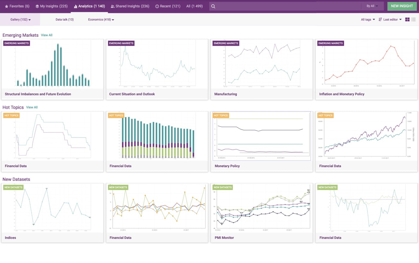
Source: A Comprehensive Economic Research Tool with Data Visualization Features
- Exploration of trends over time
Trends over time tell you the past and show you the future. It means that you will be able to see the full potential of your business and make predictions based on the statistics your application gathered. The rate and frequency of purchases customers do can tell you how new potential customers might act. Thus, you can better predict their possible reaction to different marketing strategies.
- Reveal of risks and rewards
Value and risk metrics can easily be displayed through the use of data visualization software. It is possible to pinpoint those areas that may require action without the need to make your way through complicated spreadsheets and tons of numbers.
With the benefits that data visualization tools provide you with, it is essential to use them for annual reports, investor slide decks, different dashboards, sales and marketing materials. Basically anywhere you need the information to be interpreted by only a couple of clicks.
How to Build Data Visualization Software and What to Include
So, your company has a great amount of business data and needs to analyze different information about its products, customers, and so on. What can you do in this situation? You can look for the ready-made solutions or plan your own data visualization software development. In either case, your choice of tools should be based on the goals of your company, features that can be implemented, and benefits that you can get out of it.
Thus, if you are looking for the available custom solutions, you can look at the following options:
- Webix JavaScript UI Widgets Library
This framework with a set of JavaScript online widgets specializes in diagrams, charts, grids, graphs, and other data visualization tools. With Webix, it is possible to integrate ready-to-use components or even customize your own to get the needed analytics for your business.
- DHTMLX JavaScript UI Tools
This multi-featured JavaScript library with JavaScript/HTML5 tools helps in building web software and mobile business applications of any level of difficulty. DHTMLX offers a great variety of options from Gantt charts and schedulers to diagrams and grids.
Read Also How Using Gantt Chart Can Change Your Understanding of Project Management
If you are a devotee of building your own software for data visualization, you need to consider a few important things before starting the development process. Let’s look at the main steps that you will need to make to succeed.
Step 1. Preparation
Before having a tool that will do most of the work, you will need to do it yourself. Having data means that you have the fuel for your decision-making engine. You need to dig deep into your business and understand which software and features you need exactly. Do you need the clients’ purchase history and transactional data to be shown? Should the data visualization software recognize the patterns you assign? Before starting anything, you need to distinguish which input for your tool will be important and which it will have to avoid.
Step 2. Selection of Data to Display
After you plan which information to collect, you need to think about the statistics that will be shown and how it will be displayed. There is no need to include everything software gathered into the visual representation. It slows the process of collecting and visualizing, and the user will not remember a large volume of data anyway. Therefore, be specific about what you need for your data visualization software. The visualization should be meaningful, because its final goal is to help a user make major decisions. For a start, you can utilize common features, like simple charts and diagrams, if you don’t know which visual will be appealing for a user. Just choose what fits your purpose and goals best. You can think about adding some other options, such as 3D modeling or animation, in the process.
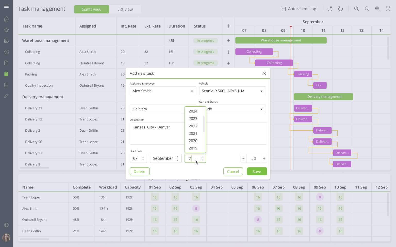
Source: Integrated Scheduler Module For Efficient Task Management
Step 3. Visualization
When you choose to develop your own data visualization software, the stage of designing it may appear to be not as easy as you imagined. That is why using various ready-made solutions or getting help from a company that offers custom software development services can be considered. Both options are especially helpful when you don’t have much experience in developing data visualization software. You can just add the needed widget to your software and release the product faster. If you want to build from scratch and implement your own ideas, you will need more resources, good specialists, and a lot of time, so be prepared for this.
Conclusions
There are many ways and methods of visualizing data to make it readable, efficient, and interesting. The information you have, intended purpose, variety of different tables and graphs that may be utilized – everything impacts your final product. Some of the visualization tools and features may be automated, while others are manually created. This is all that makes your data visualization software yours. So, prepare all you need and make your ideas real.
Contact us if you need help in developing a custom data visualization software or want to use one of our products to make your task easier and faster. Our experts will do their best to make your dream come true.