Summary
The article outlines five fundamental laws of UX design that help create intuitive, user‑friendly interfaces by aligning with human psychology and expectations, such as Hick’s Law, Fitts’s Law, and Jakob’s Law. It explains how applying these principles can improve usability, reduce cognitive load, and ensure a better experience for users across web and mobile applications.
A well-written code and the implementation of innovative ideas are not the only factors that define your custom software as a successful one. Of course, it is important to make sure that a platform or an app is fully functional, has no flaws, tested by the QA department, and ready for users. The technical side of the development is vital, the marketing side and promotion is essential as well. But, if your software provides users with a bad experience because of misleading visuals, it may result in the loss of at least about 1/3 of potential clients or misunderstanding between employees depending on the audience of your platform. This is when the laws of UX design come on stage.
UX (user experience) design is a field, which involves the creation of user interfaces and designs for apps, websites, and products. It takes into consideration any interaction a user has with your product and every element that shapes this experience. The main goal of the UX design is to combine these elements together so that the user will be able not only to navigate through the platform but also will want to come back and use it again. It covers the all-round experience and makes it easier and more efficient. That is why the UX design is an inseparable part of the development process.
To know how to create a thriving product, you need to know the rules of UX design. Therefore, in this article, we will look at the essential laws of UX design that a UX designer should follow and the takeaways for each rule.
Read Also Don’t Let Appearance Overshadow Experience. Seven Common UX Design Mistakes
Parkinson’s Law
According to the statement of the famous British author and historian, the amount of work expands to fill the time available for its completion. It is widely known in different fields and is used by those who want to increase their productivity or the productivity of others. It means that the more time you give for a task, the more complex and daunting it will become so as to fill this time.
Narrowed down to UX, it means that you should limit the time for a user to complete a task to the tempo they expect. For example, a user expects to fill in the form or get some data during a couple of minutes. The more you exceed these expectations and the less time users spend on navigating between elements, the better experience they will gain.
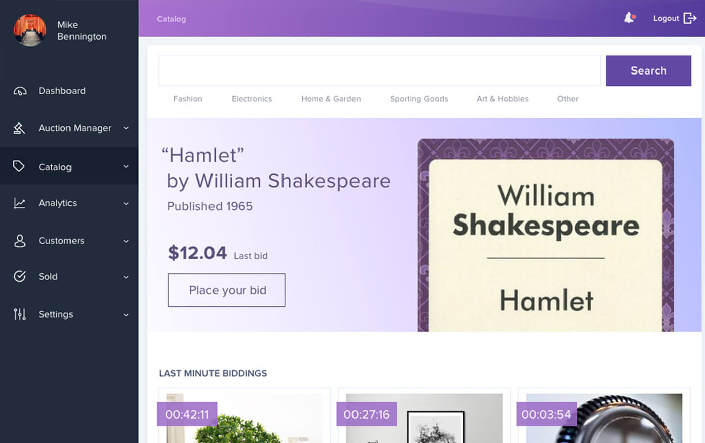
The interface of your product has to be efficient and help users complete an action in a timely manner. For example, you want to develop an eCommerce website and make it easier for customers to find the products they want. Then, don’t forget to implement the autofill feature or add categories with dropdown lists. It will be a great aid for users to save time and head to the cart faster.
Solution: Reduce the time it takes to complete an action to what users expect it will take.

Source: UX Enhancement for Online Auction and Shopping eCommerce Platform
Jakob’s Law
The Internet is flooded with websites that have different UI and UX, so there is an unspoken rule to include similar features and interfaces into platforms, sites, and applications. Thus, a user will know how to interact with the included elements. The law is about the users’ expectations when they visit a new website or use a new app. Users expect it to work the same way as other sites and platforms.
The implementation of previously unused trends to make the elements of your product stand out is good, but the ability to implement something brand new with the usage of old and known features is what you can really be proud of. Users do not care about the rules of UX design and the programming languages that you have used, they just want to get what they want by simply pushing one button. So, this is what you should provide them with.
You need to think as a user yourself. For example, what is the first thing you see when you open an Internet browser? A magnifying glass. Why? Because the primary reason for using a browser is to search for the info you need, and the search bar has this magnifying glass. And why is the magnifying glass exactly? Simply because people use it in real life to see things clearer and closer. Just like we want certain information to come closer to us when we are surfing the Internet.
The same goes for other applications, platforms, software, and websites. The search bar should contain a magnifying glass. The button of a home page is usually associated with an icon of a home. And, the Scroll Back to Top button indicates that this button will bring you back to the top of a page immediately if you click it.
Solution: Think as a user yourself and don’t forget about the patterns that other users are accustomed to.
Tesler’s Law
The other name of this rule is known as the Law of Conservation of Complexity. It means that there is a certain amount of complexity in every system that you cannot reduce. Any process a user performs on your platform can contain some difficulties that cannot be omitted, which is why you need to design not just around them but along with them. It is impossible to develop a site with an abstractive visual, because it will be hard for users to navigate and understand where they should click and why.
Therefore, if you realize that a user will spend a couple of seconds more than they could on any of the features of your website, just leave it the way it is. Following Parkinson’s Law and reducing the time is a good decision, but the golden mean is what should be one of the main UX rules for web design in many cases. It is difficult to achieve, which is why many businesses contact companies that offer UX design services and are able to develop custom software with a visually appealing and efficient design.
Solution: Don’t simplify to the point of abstraction.
Law of Similarity
The human brain tends to simplify things and create patterns in order to function properly. That is why we can sometimes see faces in a couple of dots on the wall or add different elements in one group because of minor similarities. In a design, it is important to understand that the human eye tends to perceive similar elements as a complete picture even when the elements are separated. Thus, if you want to group elements that are in different places, let them share the same shape, orientation, size, or color.
The perfect example of the usage of this principle is the presentation of links on the websites. If you search for something on Google or another search engine, you will see the list of results with the links of different colors. If you visited a website earlier, the link will be highlighted with one color, and if the site wasn’t opened before, it will have another color. Thus, your brain will be able to sort out the information due to the visual presentation.
Solution: Think about creating the systems of similar elements between those that will be used in your software.
Von Restorff Effect
This law also uses your brain against you and helps UX designers to manipulate your actions when you use a platform or an application. Also known as The Isolation Effect, it states that in a group of similar objects and elements, people remember those that differ from the rest.
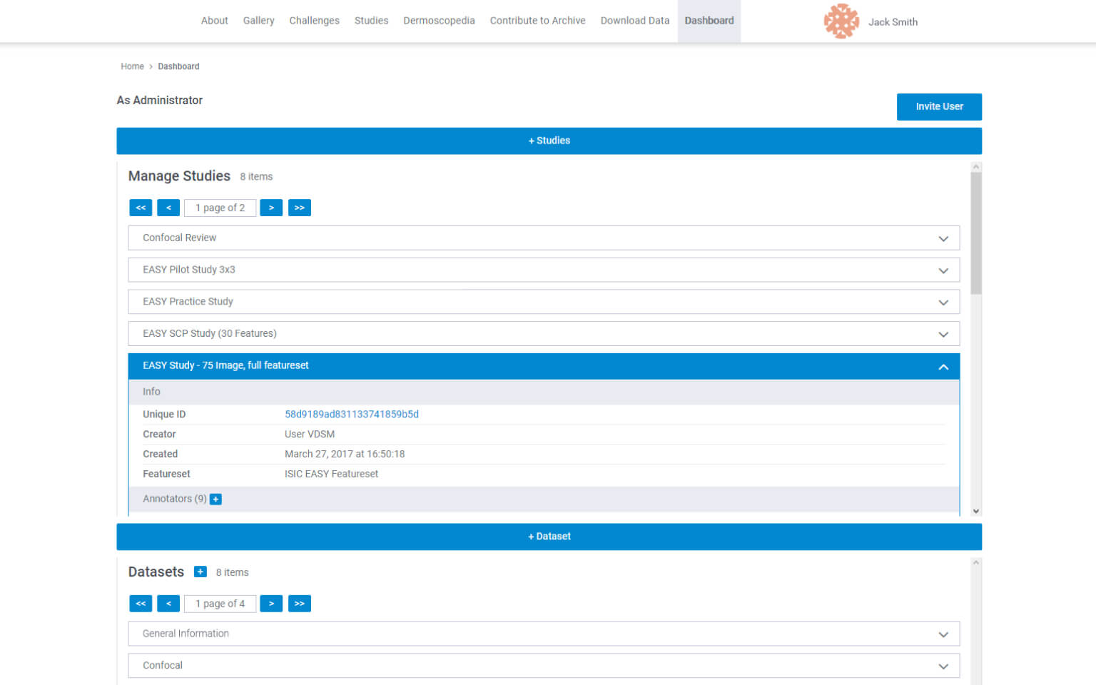
For example, you decided to create a web portal with white color as the base. In this case, it will be easier for users to navigate through the elements if the important ones or the ones that they are able to interact with will be somehow emphasized, will it be the complementary color, other shape, or anything else that will attract the user to click it.
Solution: Build up the hierarchy of the elements and objects on your website by highlighting the important ones.

Source: UX Improvement for Web-based Healthcare Portal
Conclusions
The successful development of an app, software, website, or other product cannot be performed without the UX design. It covers a considerable part of the process, which is why designers should always keep their users in mind. Following the principles of UX design, making software like for yourself, defining goals and target audience – many factors should be included.
If you want to be sure that the UX design of your product fits your target audience and follows the common rules, you can contact us to get advice or help from our experts.