Summary
This article dives into how you can extend a conventional Gantt chart with a Resource Histogram to visualize employee workload and capacity over time. It shows how each resource’s “estimated capacity” vs. actual output can be displayed via colored bars, peaks, and overlays to spot under- or over-utilization. The piece also covers technical challenges (like handling multiple daily intervals and syncing data via APIs), and argues that gentle Gantt enhancements—rather than radical redesigns—can deliver high value.
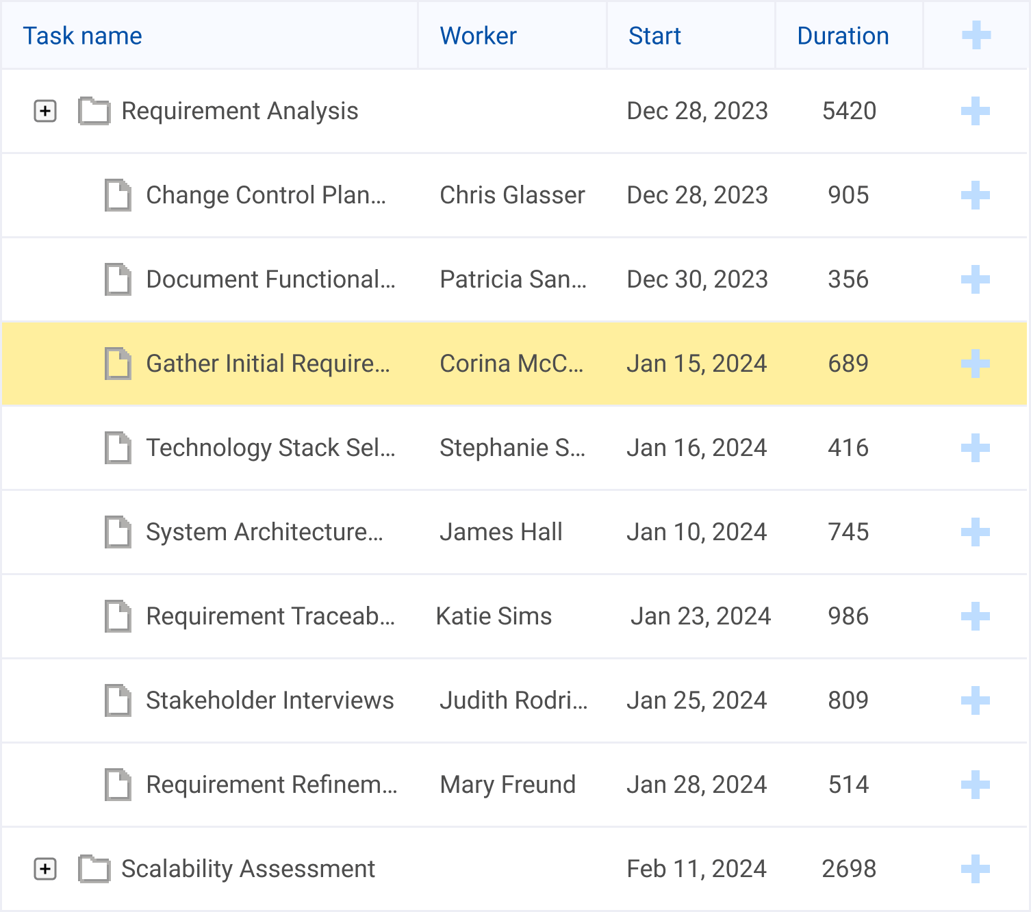
Everybody with experience working with Gantt charts is accustomed to dealing with its “canonical” form, a set of horizontal bars on a time scale. They represent the completion of tasks over a period of time in relation to the time planned for the work and can be either single or linked into projects. Different implementations follow various application requirements and can introduce some adjustments to how Gantt chart elements look. However, the core parts remain the same. There are always horizontal bars reflecting the duration of a planned process over a specific timeframe.
It’s pretty unexpected, but a Gantt chart can visualize not only the duration of a specific process but also changes within the process itself. The element representing a process may not change radically and keep its position within the chart, but it can acquire some additional features, providing end-users with extra value. One example you can find among DHTMLX products is the Resource Histogram, which enables vast customization possibilities.
Familiar Gantt Chart with New Advanced Features
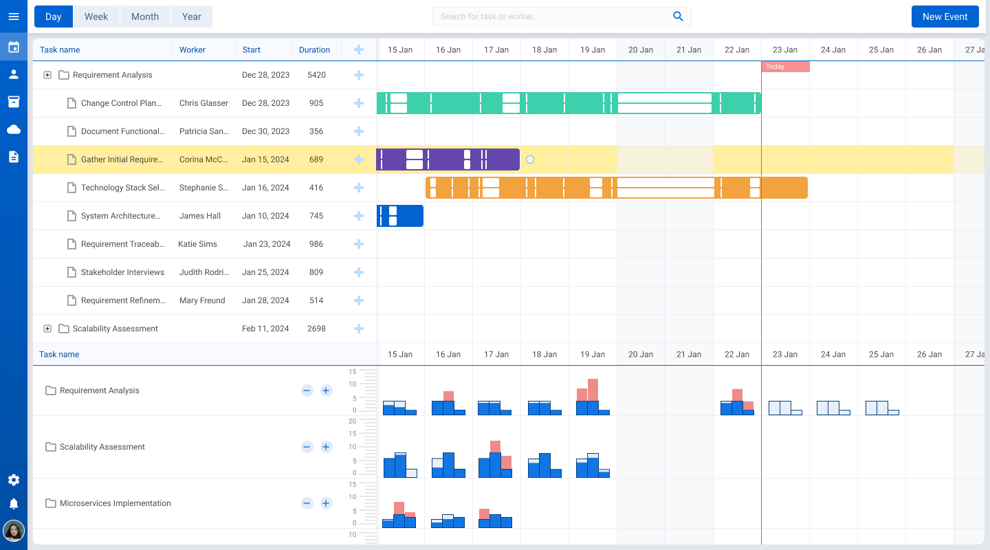
There are countless opinions on how you can improve Gantt charts. However, the main goal is to fit them organically into the application logic and not overwhelm the elegant idea of simplicity on which Gantt charts are based. For example, you might want to add the possibility of visualizing the employees’ timesheets in a new way. Say by making the chart to display the estimated volume of tasks that can be processed by an employee during the day against the actual number of processed tasks. The best way to implement this functionality is to customize the Resource Histogram, one of many resource views that DHTMLX Gantt provides. Plus, you can add a dynamic data scale showing the capacity of each employee’s processes.
Note: From v10 onward, developers can use DHTMLX Gantt’s free Community Edition, which is now licensed under MIT terms.
Now, let’s summarize the features that may suit such a project management application:
- The Gantt chart app shows an employee (resource) and the tasks processed by that resource throughout the day;
- Each resource spends some time working on specific processes, and the app shows the overall duration:
- The time scale displays the resource’s schedule, divided into working and non-working days. The scale is vertically filled if the resource worked during a specific period. If there was a break or a day off, it remains unfilled:
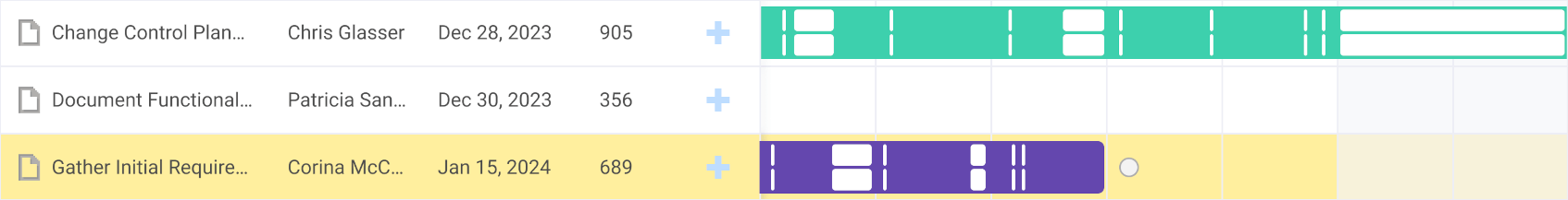
- For each employee, there are several intervals of working time during the day, shown as empty columns:
- For each of such intervals, you can set a maximum estimated duration of work. You can call it “capacity” and configure it differently for each interval;
- To display the volume of the task or process actually completed, you can draw a part of a column with a solid color. For example, you can mark blue everything below the estimated duration, and red can indicate everything exceeding it:
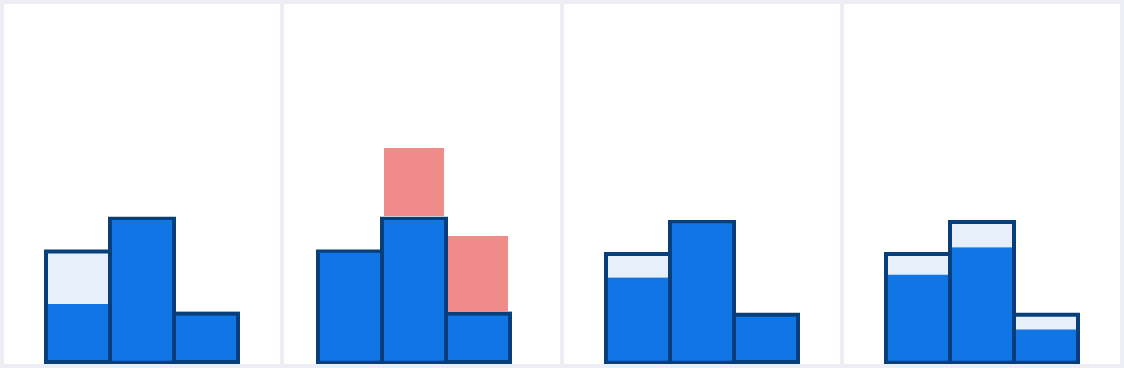
- The maximum processed “capacity” above the set duration dynamically changes the scale for each resource:
![]()
- Therefore, if a resource reaches the peak “capacity” value within a specific interval, the scale will permanently display this peak value.
The following substantial question is where such a system is supposed to obtain data. There are many possible scenarios. For example, employees can use some third-party software to work on their assigned tasks. You don’t need to know such details as what and how employees actually do with their tasks. You can receive necessary data via the API from a third-party server and visualize it as a chart. The chart itself can include any info regarding each employee, such as a specific project and a time segment during which related tasks were processed.
Possible Data Challenges
It may not be hard to get data through the API and display it on the front end how you need it. Unfortunately, there are some challenges you may need to solve:
- Adding several intervals with data for a single day, which is unusual for Gantt charts since they usually display data horizontally;
- Allocating each “capacity” to its interval;
- Rendering visualizations from different data arrays for each resource;
- All data is entered into the accounting and control application on a third-party server to which you are connected via the API. If something goes wrong and you don’t receive data for any reason, you’ll get an inaccurate chart.
Read Also 5 Ways Staffing Firms Lose Time and the Project Management Software That Stops It
Why One May Need Such a Gantt Chart Application?
It’s rather challenging (but not impossible) to build such a Gantt chart for your project management application. The question arises about what these efforts are for and why such an application might be needed. The question is relatively simple: different people find different types of information efficiently to perceive. Some find it comfortable to read endless tables of numbers, while others only understand graphs and charts.
Read Also How Using Gantt Chart Can Change Your Understanding of Project Management
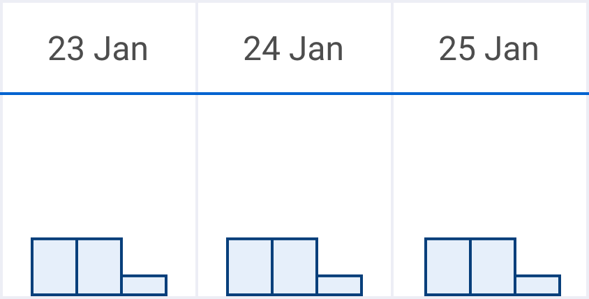
In our case, you can get info from a third-party application, group it individually, and display it as diagrams. You can change the diagram display scale by choosing values from minute-by-minute to six-month periods, where the starting data point is a peak value from one of the several working day intervals:
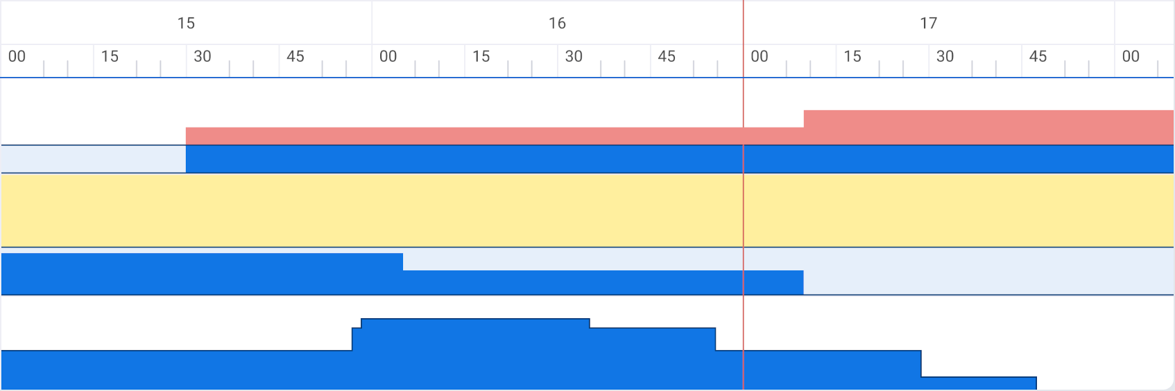
On an even larger scale, a graph with peak values emerges. On a smaller scale, each peak value can be compared to data related to other resources for the same day. Overlaying data on several resources gives an understanding of how heavily loaded different employees were at different times, whose load can be adjusted, who performs the estimated optimal workload, and who exceeds it.
Gantt chart customizations we discussed today can help represent a dataset as an intuitive visualization that is more advanced and flexible than most other applications can offer. Data for each resource can be displayed in a general form and with varying degrees of detail. If it’s different from what an end-user needs, familiar Gantt components are always available. If needed, users can add the display of any additional metric for any resource.
Read Also Best JavaScript Libraries for Data Visualization (Featuring Webix and DHTMLX)
Conclusions
It’s hard to improve something that’s already perfect. In a way, Gantt charts are perfect project management tools that don’t require any significant changes. Nevertheless, if you find a way to introduce some improvements without harming the way the familiar tool works, it can reveal some unexpected benefits. The DHTMLX Resource Histogram allows improvements that are gentle enough not to scare away Gantt chart users and breakthrough enough so they can reconsider their approach to routine operations. Contact us if you want to build a state-of-the-art project management application from scratch or modernize the one you already have.