While running a business, having the ability to monitor dozens of KPIs and metrics is crucial. The task of analyzing and interpreting large amounts of data takes time and resources. Properly designed data visualization tools allow minimizing efforts by representing raw business data in an easily readable form.
Data visualization software allows simplifying the analysis of economic indicators, provide a real-time overview of business processes, help to control the workflow of a company, visualize multiple KPIs at a time, etc. Reporting and decision making become way easier due to access to important information without hours and days of pre-sorting and further analysis. In this article, we’ll consider how effective BI solutions can improve your business processes and increase the efficiency of your company.
The Importance of Data Visualization
The cornerstone of every successful business is data-driven decisions. The understanding of such a state of affairs has led to the demand for self-service business intelligence tools. Using such software, employees can get access to the most relevant indicators gathered by the company during business activities.
The best part about properly designed business intelligence software solutions is that there’s no need for a solid technological background. An employee doesn’t have to spend any time learning complex data processing techniques. Dashboards allow performing sophisticated analyses and getting insights as fast as possible. Such an approach helps to focus on the most valuable tasks instead of making dozens of complex data manipulations.
After the data has become interpretable, the main task is to make it understandable for everyone. At this step, business leaders need the ability to drill down into the data since it can help to see where the problem spots are and how operational processes can be improved to grow the business. Data visualization software is the exact tool that allows bringing business intelligence to life.
Data Visualization Tools in Business
Visualization software for business provides an efficient approach that helps to improve the ability of an employee to understand the info hidden behind the endless rows and columns of numbers. Having properly visualized data before your eyes, you can easily create new insights and ask the right questions. Using such a tool, you can gather tons of important business indicators represented in the form of graphs, charts, and tables. Data dashboards allow getting a real-time snapshot of the current state of your business and decide if there’s a need for your participation.
As an example of the app that allows reviewing dozens of important indicators at a time, you can check this Economic and Investment Research Tool:
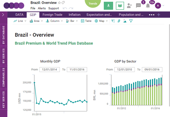
This web application can be used for visualization of a large number of macro and microeconomic indicators. Collected info consists of the recent and historical data related to 128 economics around the world. To simplify the analysis, all this data is presented as a combination of charts, tables, maps, and diagrams. Besides the possibility to review the existing info, any user can create custom workbooks containing the information that is required for creating new insights.
To be successful in the area of data analysis, you should have an opportunity to get access to the info which is updates instantly according to the changes. Nevertheless, in practice from time to time, you can face the situation when there are some bottlenecks in business processes when updates are left to be done by a single factor or a department such as IT.
Properly designed and developed business intelligence visualization tools can get info from decentralized data sources. Such solutions help employees from different departments of a company to collaborate and change the existing data sets. Implementing an end-to-end solution, you can gather the benefits of working with a centralized data repository which can combine data and analytics the way it’s required. Any query that is run on the server by any user will rely on one version of the truth and end contradicting reports.
What Kind of KPIs You Can Monitor With a Dashboard
The exact combination of KPIs and metrics to be visualized on a business dashboard highly depends on the specifics of your business. At the stage of dashboard designing, one of the main tasks is to define which indicators you want to track. While making this decision, remember that business intelligence software should be a response to the needs of your company.
Business dashboards are pretty versatile and flexible tools. You can expand the functionality of your business intelligence software by adding some extra modules. It will allow you to adapt the data visualization app that you use to particular business needs. For example, modules allow implementing the functions required in sales, finance, marketing, social media, etc.
With marketing dashboards, users get access to data coming from different sources. Company employees can efficiently monitor the current progress and performance instantly getting major marketing KPIs. Before choosing the set of metrics to be used, it’s important to define what data channel you’re going to use and who exactly will use the data required making important business decisions. For example, company executives will more likely want to get an overview of every marketing channel.
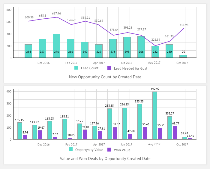
Here’s a little example of KPIs that meet the needs of the marketing department:
- Monthly Sales Goal
- Average Opportunity Value This Month
- New Opportunity Count by Created Date (Lead Count and Leads Needed for Goal)
- Value and Won Deals by Opportunity Created Date (Opportunity Value and Won Value)
An example of a dashboard that allows tracking these KPIs is shown below:
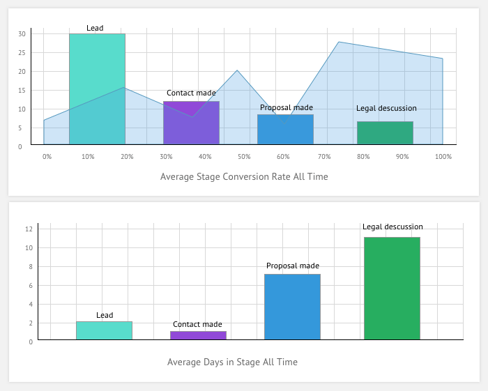
Another example is a dashboard that visualizes average leads conversion per stage and average stage duration:
Examples of Business Data Visualization Apps
Workflow Application For Businesses
As an example of how data visualization software can solve your business issues, you can check this Workflow Application For Businesses. Its main purpose is to allow company members to get a real-time overview of business processes.
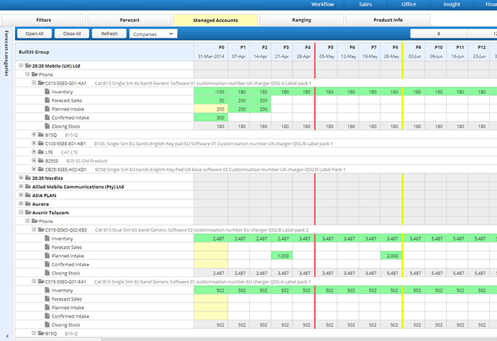
After a particular business event occurs, this business intelligence app can gather and process this new info to provide it to all workflow participants using the central hub. Access permissions allow controlling who’ll get access to the data provided by this visualization app. Visual and numerical reports provide the results of a complex analysis that includes such indicators as sales, customer, or manufacturing information.
Workforce and Facility Management Suite
The Workforce and Facility Management Suite allows controlling the workflow of an organization beginning with contract creation and ending with reporting.
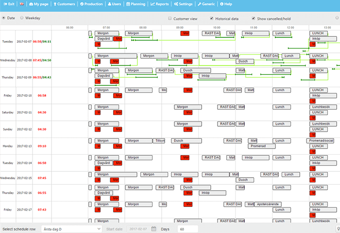
This app is an example of business intelligence software that allows employees to remain mobile. A user can use a smartphone or tablet for filling out the reports. This functionality is required in case your company is dealing with social services and works in the field. The mobile version of the app supports offline mode and SMS/email notifications. This application allows reviewing up to 15 different KPI graphs which is pretty helpful for evaluating the working process and making necessary improvements.
Webix-based Dashboards: Reporting Module
Our company provides Webix customization and development services. For those who prefer custom-made applications over off-the-shelf solutions, it can be a good opportunity for either developing data visualization software from scratch or create a module to be integrated into the existing business intelligence software. On the screenshot below you can see how a Webix-based reporting module can look like:
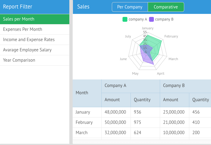
It displays a pivot table that contains the volume of sales made by a particular company or company’s department for a certain month. To make this info more intuitive, developers have added charts that represent business data in easy to read form.
Read also How Webix Data Visualization Features Can Improve Customer Experience
Conclusions
Real-time data visualization tools allow you to concentrate on the important metrics and KPIs instead of dealing with complex technological issues. Using such software, you can get access to the interactive charts, graphs, and tables that represent the current state of your company and allow to make data-driven decisions that will provide you with a competitive advantage. Dashboards are flexible tools that can be adapted to different business needs. Being a non-technical user, each employee will be able to participate and understand the analytics process by compiling data and visualizing trends and occurrences.