Have you ever come to think of how much time a day you use your smartphone and for which purposes? Nowadays smartphones are not just about to call or text somebody – we use them for a variety of reasons. We order a taxi, food delivery, make purchases, and even manage our domestic appliances via various mobile applications. And now our smartphones have turned into a thing you would almost never forget at home in case of going out. Just not long ago it was hard to predict such broad popularity of using mobile devices for purposes that are not limited just by calls and text messages. But now, let’s see the statistics:
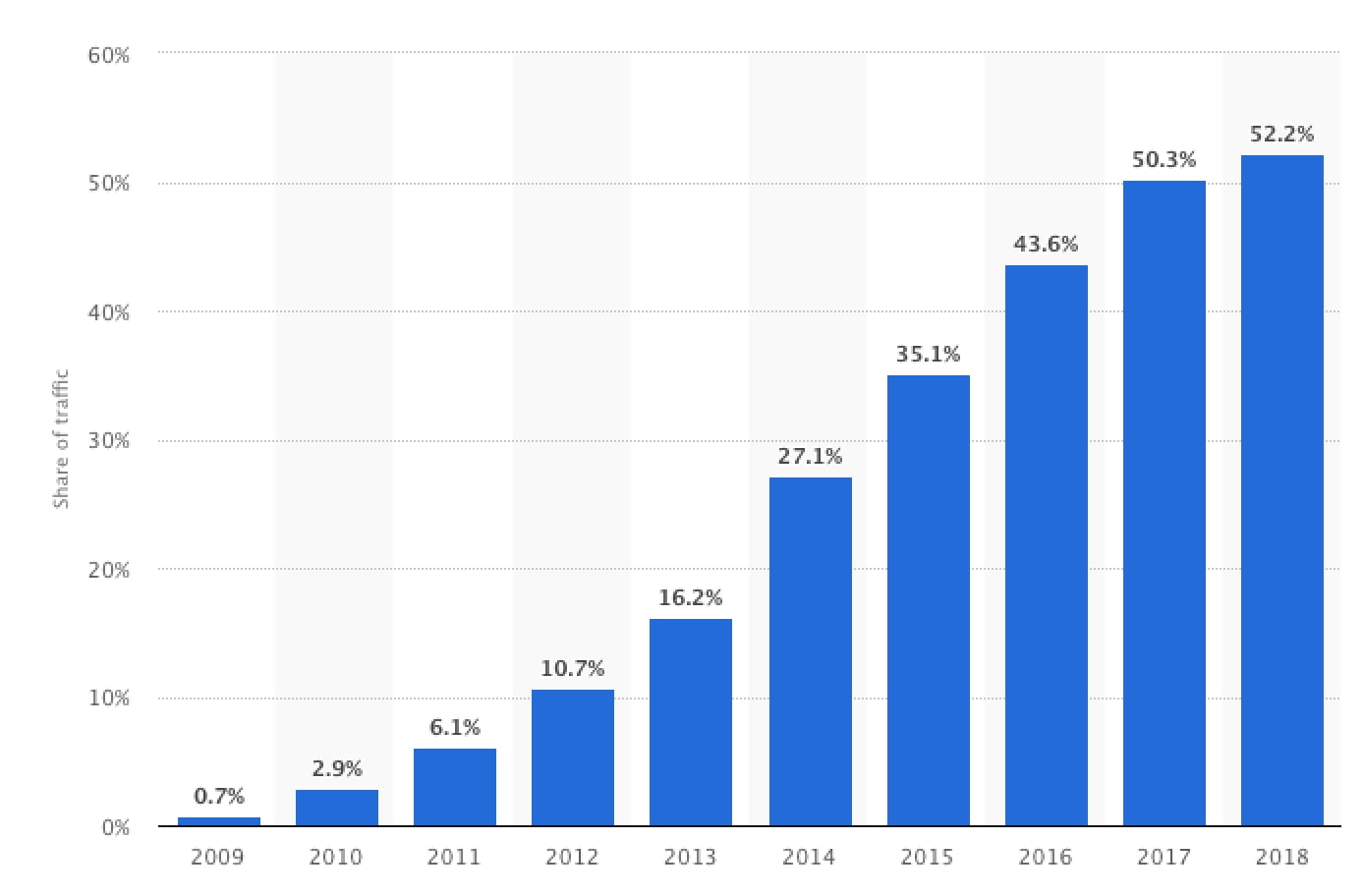 Image source: Statista
Owing to this scheme we may clearly see that share of mobile traffic is constantly increasing starting from 2009.
Mobile Version VS Desktop Version
As we see from the scheme above, the trend of using mobile devices is constantly growing. Therefore the necessity of mobile versions of various platforms and websites appear to meet the changing needs of potential users. But still, even now it’s typical to develop a mobile version only after development of the web version first. And the main disadvantage of such an approach is that web users still remain a priority despite the tendency. It leads to a fact that a number of elements of design and functionality that are perfectly applied on a desktop version turn out to be impossible to implement on a mobile version. And quite often such an attempt may make a website or a web application too complicated to use and navigate.
The Mobile-First concept presupposes the development of the Mobile Version first, and on its base build a Desktop Version.
Mobile-First Design = Adaptive Design?
Of course not, and it’s important not to mix them up. It should be noted that these two approaches do not compete, but complement each other. Adaptive design presupposes scaling of the existing elements to fit the screen size, when the mobile version implies files and elements’ size reduction, which is necessary for the higher loading speed. The issue is that the adaptive website initially presupposes viewing on a desktop, and if there is a necessity to view it via a mobile device, the browser hides or partially deletes the information. Issues happen when most of the content is already downloaded, regardless of the ability of the platform to support certain characteristics.
On the other hand, when Mobile-First approach is used, the main version compatible with all the platforms is initially downloaded, and only after that functionality and styles, available for a concrete browser or type of the platform. It leads to the results that look much better on various devices despite their size.
Read also: Web Development Trends to Expect in 2021
Pros and Cons of Mobile-First Approach
There are always two sides to the coin, and the Mobile-First approach also has its pros and cons. Let’s outline them and discuss briefly.
Pros of Mobile-First Approach
- High loading speed
Mobile-First approach presupposes that a website is designed with a minimum of everything – screen size, plugins and processing power. Owing to such a minimalism loading speed of mobile version is pretty fast and flawless. - Bugs Can Be Avoided
Mobile version development requires less and simpler code, and overrides can be easily added later. Desktop-first approach is vice versa: more complicated code should be written for the desktop version, and overrides for smaller screens are added afterwards. So the message is that coding for large screens is more complicated, and starting from a mobile version will help to avoid bugs for further development. - Content is Priority
Due to the restricted room, it’s completely impossible to include all the elements that can be reflected on a desktop version to a mobile version. That’s why all the space is used for the content useful for visitors. - Increasing Popularity
Mobile device is a thing that we carry in the pocket almost all the time. And it’s much more convenient and quick to look something up on a smartphone, other than open and turn on a laptop. Due to such convenience of usage and thus popularity of mobile devices, there is a high possibility that most users will see only the mobile version of your website.
Cons of Mobile-First Approach
- Significant Difference
Despite the fact that the Mobile-First approach requires less coding, it’s not easy at all. It requires the realization of the difference of this approach and presupposes the deep understanding of the mobile platform and applicable design methods. - Imposed Restrictions
Mobile design is pretty formulaic, that is why there are plenty of restrictions for designers imposed and it’s not that easy to dive into design if they start from working on the mobile version instead of desktop version. Designers face a set of restrictions from the very start of their work, which include a small screen, fewer resources etc. - Desktop Version Can be Seen in the End of the Process
With the Mobile-First approach, clients will be able to assess the web version only when the whole process comes to an end, so trust relationships between the team and the customer are required.
Is Game Worth the Candle?
So does it make any sense to deal with Mobile-First design or focus on Desktop-First sounds more reasonable? To answer this question it’s necessary to take into account the increasing popularity of mobile devices, all the advantages of the approach that were listed above, and target audience of your application. Since mobile devices are used by almost everyone, and the share of the mobile traffic is more than half of the whole traffic worldwide, it’s reasonable to assume that business will only win with implementation of Mobile-First. How exactly? First, as it was already mentioned, loading speed of web pages is much faster, which influences the ranking in Google. The algorithms of the search engine give priority to websites that are adapted for mobile devices, and also takes into account pages’ downloading speed.
Second, it facilitates better user experience. It’s difficult to disagree that low loading speed leads to a premature leaving of a page by a user, and Mobile-First approach is able to prevent such cases.
Conclusions
It’s obvious that Mobile-First design requires more efforts and dedication. But the result will also be impressive if we take into consideration the gradually increasing number of people using mobile devices. Owing to this trend users may reach their goals more easily, despite all the imposed restrictions of this trend. In other words, if you support the mobile version, your potential users have more opportunities, which is beneficial for your business. If you strive to introduce relevant trends in your business, please do not hesitate to contact us.