Summary
The article outlines how modern data visualization is evolving — from static charts to immersive, interactive, real-time dashboards powered by AI, AR/VR (xR), and cloud computing. Key trends include AI‑driven real‑time visualization and predictive insights, interactive/animated dashboards, democratization of data for non‑tech users, data storytelling, and extended‑reality interfaces that make complex data accessible and insightful.
Despite the fact that the modern world has had a hefty amount of technological breakthroughs in recent years, there is no need to run and buy a bunch of VR sets for your employees or implement ChatGPT or similar AI innovations in every system your company uses yet. The technologies are moving fast, but it is always vital to test them and see how they can be useful in each case. Not every business requires to include every possible modern technology solution. It is better to stick to the operations that need to be replaced, upgraded, or changed in any other way in the first place and look for the options that can improve the situation. Chasing two rabbits can lead you to losing them both, so you need to act wisely.
Thus, if you think about implementing some data visualization tools, you need to know which trends are on everyone’s lips nowadays and whether or not they will be suitable for your business. According to the research report, demand for global data visualization market size is going to surpass USD19,25 billion by 2028. So, let’s look at what 2023, 2024, 2025, and subsequent years may bring us.
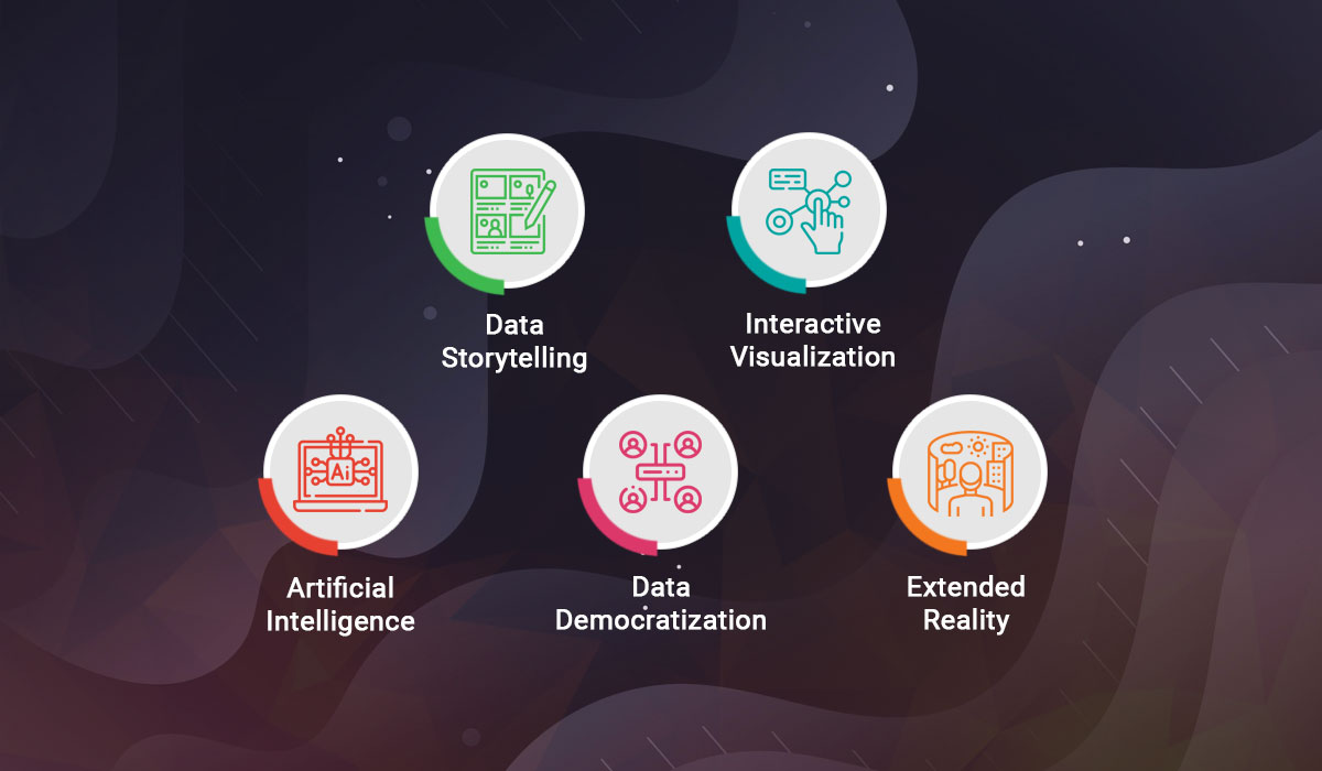
Top Data Visualization Trends to Look Out For
Making a choice is always tiresome, because no one can say what awaits them and if the option is right or wrong. However, the reality is that there are no good or bad choices. There are just choices, and there are reasons behind them. You cannot know if the data visualization software you developed will be helpful or not until you try. But if you choose to use Gantt charts instead of tables or go for pie charts instead of bar charts, it means that there was the reason why you made this choice. Therefore, let’s look at some of the top data visualization trends that can impact your decision and may help you to understand what you prefer for your employees or customers to use. So, let’s look at what 2023, 2024, 2025, and subsequent years may bring us.
Extended Reality (xR)
Technologies change so fast that just 15-20 years ago it was impossible to imagine that all fictional sci-fi stories about virtual realities or the creation of new universes would be real. And now, we have metaverse and different other types of virtual realities that are used in various spheres of our lives. Extended reality, also known as xR or XR, is a term that encapsulates all those realities, including Virtual Reality (VR), Augmented Reality (AR), and Mixed Reality (MR).
Combining these technologies with the traditional data visualization tools can open up a whole new world of opportunities. For example, with the help of VR, you are able to use more space as you can combine several virtual tabs or screens just in front of you and see all the needed data at once without the need to have several monitors on your desk in real life. If one also adds features that will involve other senses, like smell or tactile sense, one can enhance the ability to process data even further. In some cases, it is better to “feel” data to get a detailed analysis, so VR technology can greatly help all of us in the future.
As for the AR, it can be useful for diverse business domains as well. For example, it can be included in the real estate software, when a realtor needs to show how a room can glow up with the furniture in it. It helps customers to understand what they are buying and why the choice they were offered is the best one. And, mixed realities, on the other hand, can be a good option for those businesses who want to utilize several types of realities in their ERP system or any other solution they use.
Read Also How the Metaverse Brings New Business Opportunities and Web Development Challenges
AI and Real-Time Data Visualization
There is no data visualization without the data, which means that you need to be able to analyze it somehow, and automation is the only option when you have loads of data that is impossible to tame manually. Especially, when you need to have the data be gathered and analyzed in real time. Such Artificial Intelligence (AI) technologies as Machine Learning (ML) and Deep Learning (DL) can not only be useful in data analysis itself but in data visualization as well.
If you want to have software that creates real-time complex visualizations, like heat maps or similar solutions, using AI can be a clever move. It can help in identifying patterns and trends and comparing them, automatically modeling and forecasting data to create corresponding visualizations. With AI tools, one can apply algorithms that will sort out and prioritize search queries. It greatly helps in finding the answers you need faster and with higher accuracy.
Read Also From Adaptive AI to New Green Initiatives. What Tech Trends to Watch in 2023
Interactive and Animated Visualization
The more animations, transitions, and interaction your company’s system has, the more interesting it is to use it. In the age of information and its endless absorption, it is essential to use methods that will attract users and push them to choose your solution, product, or service among others. That is why the data visualization in your software should be memorable.
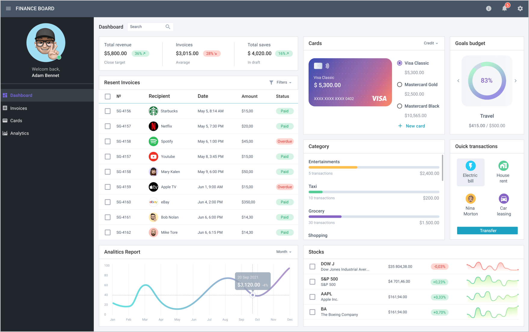
Source: Finance Dashboard Template | Webix UI Library
Thus, implementing dashboards is one of the good examples of using interactive visualization tools. Dashboards can be easily modified with animated charts, 3D elements, scroll-triggered animations, and more. You can add number counters, show-and-hide elements, buttons, and other UI features.
Read Also Key Factors to Consider When Migrating to a New UI/UX
Data Storytelling
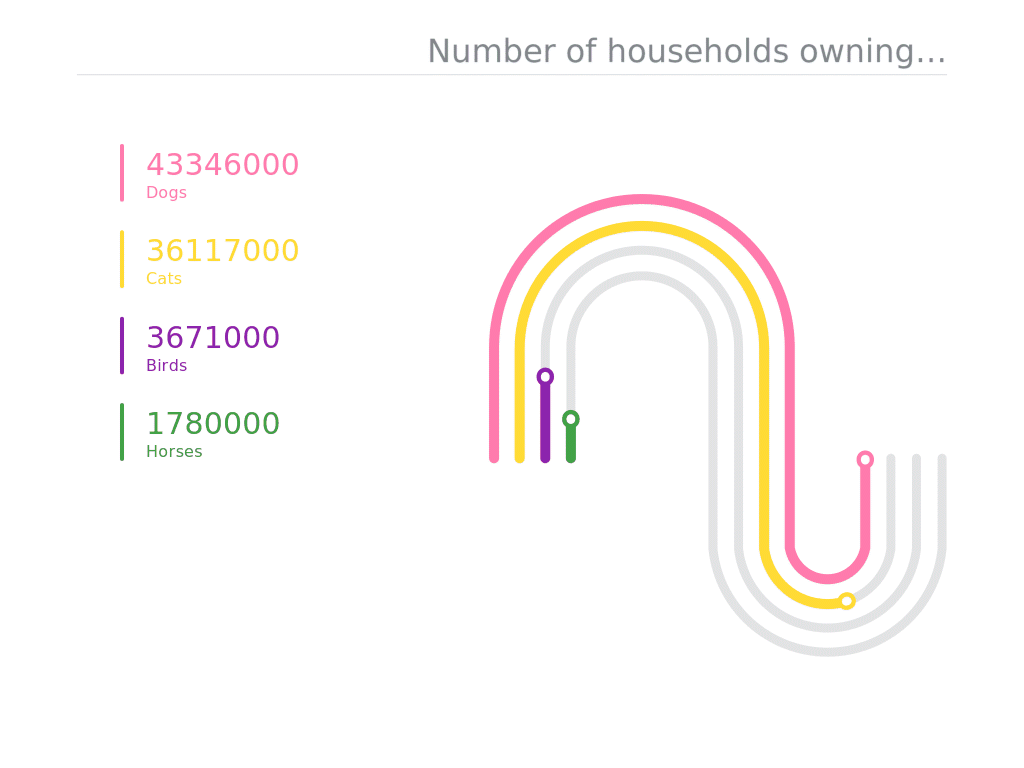
Source: Google News Initiative
Presenting data in an uncommon way is the goal of many, because it becomes more and more difficult to show data the way it will be entertaining and eye-catching for the users or audience. Data storytelling is an approach that has been popular in different spheres for several years, and it won’t go away in the near future. It is about the compilation of narrative based on complex data and analytics. You basically tell your story to the audience and influence it. The concept helps you to add value to data and provide human touch to it. When talking about the development of custom software, usually, this trend is included in dashboards.
Read Also Misleading Data Visualization: This Is What You Should Avoid
Data Democratization
The data is no longer handled by data engineers only, more specialists of your company may need to get access to the data about your business or projects. To make well-informed decisions, it is vital to make data more accessible to all the relevant people. And, data democratization is all about that. Irrespective of the technical knowledge, your employees are able to work with data comfortably and, as a result, build better customer experiences.
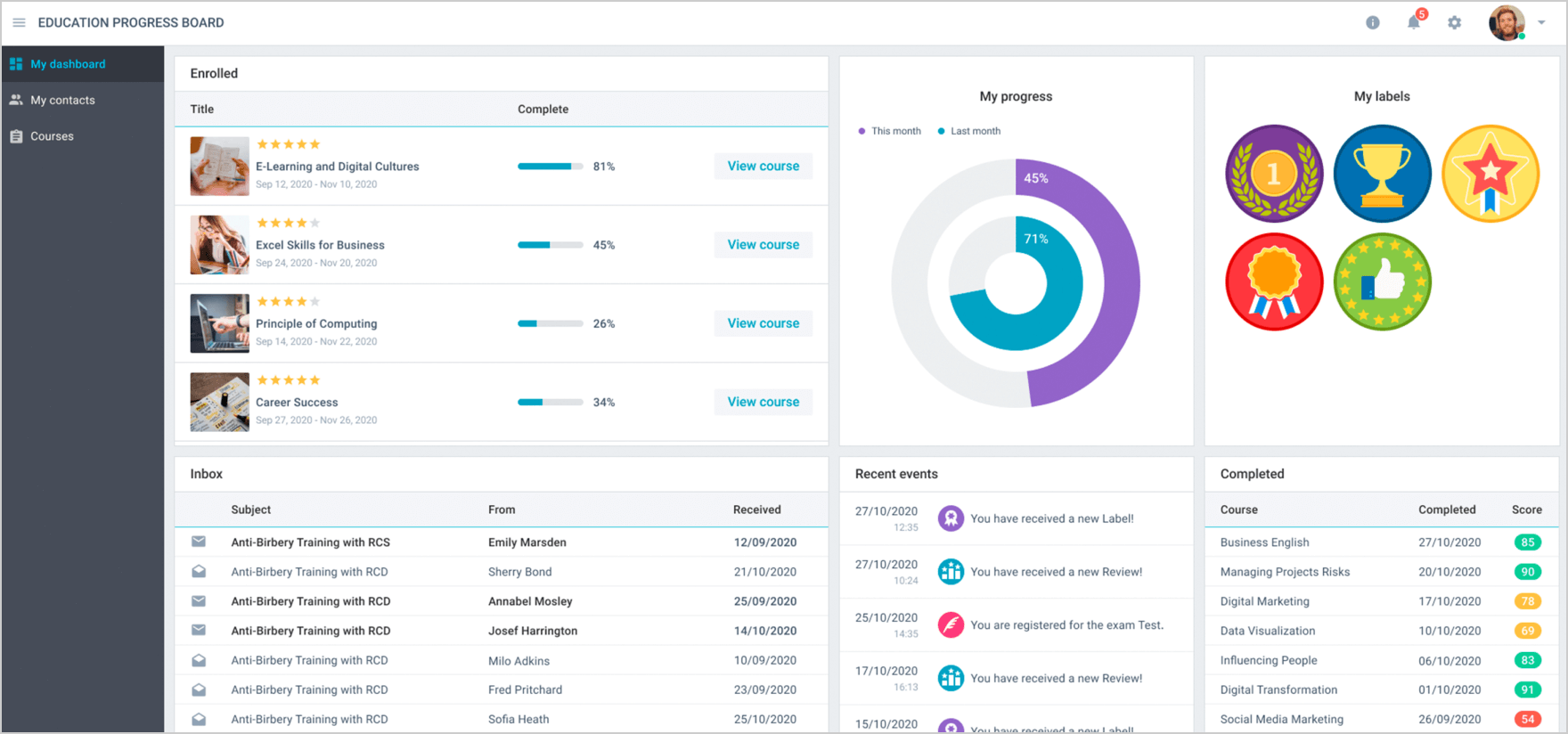
Source: Education Progress Board | Webix UI Library
Considering how having access to data is important to avoid mistakes and to have better communication and analysis, adopting this trend for the visualization tools may be suitable for many businesses. In general, the concept is popular nowadays, because people from one company can work from different places, and everyone should be able to have easy and instant access to pleasantly visualized and clear data. Thus, it can be implemented in project management software, HRM systems, or any other solution your company uses or needs.
Conclusions
It is understandable to have doubts about the tools you implement into your solution. It is not always possible to predict what impact they will have. And, sometimes it is better to fail than never try. However, if you want to have the best result that is possible in your situation and see it fast, you can always turn to the experts that know what they are doing. For example, you can contact us and communicate with our specialists to know which data visualization trend can be perfect for your system. They will also give you some advice on how to make the development and design process less costly.